Can you roast my landing page?
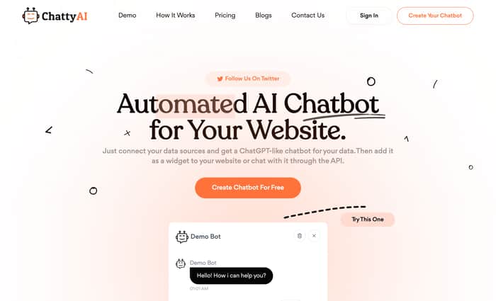
You can simply visit my website: https://chattyai.chat/ and give me some feedback. It will help me to improve my landing page.
Thanks
You can simply visit my website: https://chattyai.chat/ and give me some feedback. It will help me to improve my landing page.
Thanks

Overall design looks nice, with a few things that would be helpful.
But overall it looks great and good job on launching this!
Thanks for your feedback.
Personally think way too much is going on. The "How it works" section is especially horrible as their are tons of overlaps. Also, their is a lack of margin on the site sections.
The site overall is not super great.
Thanks for your feedback.
OMG, I started liking this website.
Wow! Great.
It looks great. Just one suggestion. In the Pricing Plans section. Reducing the font size of pricing might be better. Because it appears that your couldn't wait to earn money. Or try to put Free Plan, Premium Plan, and the Medium Plan on the same line, otherwise there will be a large amount of unused space.
Okay, I will try to do it.
It looks a little like mymind
Wow! Great
yeah!, you are in my mind! 👈(゚ヮ゚👈)
I think it looks great! On my end I am having some technical issues because my Laptops GPU is super weak, lol.
I get like 2 fps when trying to scroll past the chat box after the top header.
Okay, I will check it.
Thanks for your best feedback. I will try to do it.
Here are some suggestions to improve your website:
Simplify the navigation bar by removing unnecessary buttons such as "Home", "How it Works", "Demo", and "Contact Us". If you prefer to keep some of the buttons, consider reducing the font size to avoid drawing too much attention.
Eliminate the "Follow Us On Twitter" button from the hero section.
Review your font pairing carefully. There should be coherence between the logo font, header font and body font. You can read some "Font Pairing" guides.
Focus on improving your website copy. Social proof can help build credibility and trust among your visitors.
There are many opportunities for improvement. I would recommend reading some guides on creating a conversion-optimized landing page first then applying the basics-- then asking again to roast :)
Thanks for your advice, i will try to do it.
Hey @arafathossain congrats on shipping. I am afraid that your Uniqueness/Positioning is not being reflected in the header. How is this different from all the other chatbots out there?
What's the narrative?
I just launched my first SAAS startup. I have some unique plans for this. I will upgrade it day by day.
why thoso sprinkles on the header section , they dilute attension span. and below section is "how it works " it seems like someone in hurry
Thanks For your Feedback.
great landing page
But the button seems to lack some animation?
Which types of animation will good?
I believe some simple interactive effects would be better, not necessarily limited to specific animations. Interactive buttons give a sense of vitality, making them feel alive rather than inert.
Looks pretty nice to me!
Can you clear the 3-number topic? Where, do I need to add the left margin?
Let's Discover our all features.
You’r gonna love us forever.
Position of the texts above looked like it could be improved by adding some left margin. It looks fine on mobile, though.
Okay, Thanks For clear this.
The design looks great btw, some of the testimonials look a little off- is it just a boilerplate at the moment?
Thanks for your feedback. I will try to improve this section.
Maybe adding a hover effect on buttons can give it a little bit more lively feeling.
Thanks for your feedback.
Here is one for you ...
On bottom of page ... in the support section ... option pricing plans ... you inverted the plans ... free plan is not the first counting from the left ... it's different position from home page ... why ?
Pedro
Right! I need to fix it.
Give me some feedback:
https://www.indiehackers.com/post/which-new-features-can-i-add-for-my-chattyai-next-update-6ba13af521
the page looks good man! made a quick video for you sharing my thoughts
https://video.drift.com/v/absQfcKz4de46JIa6V9jBy0O7Nxgv48CkN3CZsWe7cEY/