Can you roast my landing page before I launch?
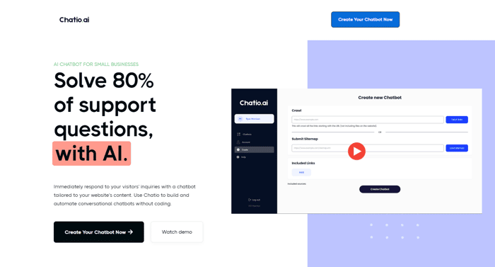
You can just go to the landing page: https://www.chatio.ai/ and please let me know your feedback.
- Is it clear what the product is about?
- Is it clear for whom it is made?
- Is it clear why people should use it?
Thanks a lot for your feedback! 🙏

Overall, it's quite good. In my opinion, when clicking the 'Watch Demo' button, automatically jumping to the bottom of the page for playback is an unexpected user experience. It may also cause users to miss the content in the middle. It would be a better choice to either add a downward arrow to the button or open a pop-up dialog to play the video.
Good point. I've moved the video up. Does this improve the experience?
I think it does but I'm curious about your feedback.
Thanks!
You can refer to this github repo cruip/tailwind-landing-page-template and put the video between the first screen and the second screen, so that the user can easily watch the demo and guide the user to look down.
Or just play the video in the hero section
Super minor but the "articles" buttons should lose the black border to stay consistent with your other solid fill buttons, and likewise I'd use a softer blue to match the background of the article images. The rest of your palette is softer pastel tones and this blue is a bit harsh and has poor contrast with black text.
Love the page otherwise!
Looks good, I would reduce the size of each FAQ row (specifically vertical padding) and maybe have fewer questions listed
Great landing page!
I am a bit overwhelmed by all the CTA above the fold, I think they are taking too much space here. Maybe design a smaller CTA in the navbar when above the fold or remove one in the hero?
Moreover, I'll reduce the FAQ. Having too much questions can lead to the feeling that you are kind of hiding something or fighting to sell your product kinda. I'll stick with 4 to 5 questions.
A part from that, it's great!
Good clean landing page. My only feedback is the video felt long to me. We used this new product called screen studio to record our videos. It zooms in at the mouse click and makes it easier to tell the user story. We were able to cut down our landing page video from 3 minutes to <1 minute. Give it a try. We love it and plan to use it in all our support resources as well
Great idea to create shorter videos. I looked screen studio up but apparently, it works only on a Mac. I found another tool called Tella.tv that does the same for PC
Hey Ryan this is a solid landing page! Well done!
One immediate thought/rejection I had was "what happens if the bot gives a wrong answer or don't know how to answer", that question is not really address after reading through the page and the FAQ, so I asked the chatbot.
The chat button was hard to find for me, I'd put a big button up for that since it's showcasing your actual product.
Good luck on the launch!!
Good point. I'll add that to the FAQ on the page.
yo Ryan the page looks good - i reckon the communication & value props could be made more clear & compelling
here's a video i made for you with some quick thoughts - https://video.drift.com/v/abpgIXBWwOkBp7BYKAXmbjv2zCvYa11MonjL9SlHAbY/
if you wanna execute on these changes right away before you big launch, you can go here
Thanks a lot for your video. I've incorporated your feedback in some parts of the landing page. See the new version here: https://www.chatio.ai/
The design is very clear and the content is also in my opinion applicable. There is just one bug, on my Android device (Google pixel 6 pro) you can scroll to the right, so there is a blank ege. I think this is because of the fixed width of each faq content.
Clarity: Ensure your landing page clearly conveys its purpose and value proposition within seconds. Avoid jargon and keep it straightforward.
Visual Appeal: Make sure the design is visually appealing, with a clean layout, high-quality images, and a color scheme that's easy on the eyes.
Call to Action: Include a strong and prominent call-to-action (CTA) that tells visitors what you want them to do next, whether it's signing up, purchasing, or learning more.
Mobile Optimization: Verify that your landing page is responsive and looks great on mobile devices, as many users access websites from smartphones and tablets.
Load Time: Ensure the page loads quickly; slow-loading pages can discourage visitors. Optimize images and minimize unnecessary scripts for faster performance.
Not bad. good luck with the incoming lunch !
The CTA button is mixed with the page at the first glance. A more attractive color would be better.
You're right. I've removed the 2nd CTA now. There is only 1 CTA right now.
The landing page design is impressively clean and user-friendly. I have a clear understanding of its target audience and the benefits from it.
However, I have one suggestion: consider centering the video at the top for improved accessibility.
Nonetheless, you've done a fantastic job! I'm even considering using this product in the future!
The design of the site is super clean.
My only critiques are that first CTA button "create your chatbot now" is black and blends into the other black elements of the landing page. If you change it to the blue you use as your accent color it would pop more
I redid the css but can't show you an example cuz I'm not allowed to post links yet :(
The other thing I'd recommend is to have a video thumbnail that's distinct from the other color on the landing page. I click on the video thinking that some of the field were buttons i could press
You're doing a great job
HI @rymorrison.
There are 5 calls to action immediately presented, but only 3 distinct actions. 2 buttons are replicated, and the watch demo + play on the video are the same. I just immediately started chatting with the chatbot.
Focusing question for you: What is the ONE action that I most want people visiting the site to take?
Hope this helps!
Craig
I think it may be mentioned in an earlier comment, but the comma after questions is not grammatically correct. So it comes off as odd to me.
In your UI, I would recommend more explicit headings: "Crawl" could be changed to "Crawl this site for content..." and your 2nd heading could be "...filtered by this sitemap" or something. You explain this well in the demo! But calling it out in the UI makes the landing page more descriptive as to what's going on.
Other than that, it's worth shipping!
This is very well built.
The only part I don't understand is the "Trusted by small businesses around the world" section and then goes ahead to list Google, Facebook, YouTube...
haha you're right, it doesn't make sense at all! . That's only a placeholder for now.
I'll replace that for the logos of real customers, once I get them.
Good point though. Thanks.
What do you use for your landing page? Webflow?
Webflow
Sort of...
The H1 is a little weird. Are you really solving my support questions? Or are you automating the answer of them.
I might try to appeal to the emotion of the customer here. You could be saving 80% of my time from answer support questions. You could try to mention the appeal of time saved from not having to answer all of those questions. Show me why the grass is that much greener. Also maybe just a little clearer on the chatbot aspect. Maybe try to utilize ChatGPT or get the opinion of a sales/copy person to really hone in on that text.
From a design perspective its kind of ugly, but I think thats okay. A little logo might help as well, just keep it simple if you do add one.
Careful with the animations loading in. Its fun to play with, but as a user I want info as fast as possible, and if you dont give it to me, I might get bored and go to the next chatbot. Speaking of which, one large thing I was missing was how your chatbot is different, or what you do that no one else does. Would love to see this.
Professional UX designer for what its worth. And all of the feedback said, great job :) and keep on pushing, you got this!
Thanks!
Well finished.. one criticism is it doesn't appear to be responsive on versatile. The assistance visit at the base right of the screen is cut off. Different blocks likewise load two or three seconds in the wake of looking to the part which prompted an uncertainty of there is a blunder and i want something versite for my page
You're right. The app is not responsive, which makes the chatbot look cut off. I'm fixing that later this week.
Nicely done.. one feedback is it does not seem to be responsive on mobile. The help chat at the bottom right of the screen is cut off. The other blocks also load a couple of seconds after scrolling to the part which led to a doubt of there is an error
Thanks. I'm currently working on that. It has to with the app, which is not yet fully respinsive. That's next in my list.
Hey there Ryan,
Few quick notes I see:
1/ It would be helpful to see the CTA in the Hero section without having to scroll.
2/ In the section, “Solve your customer questions, right away” -> the image looks stretched. Maybe find another, more natural looking image.
3/ I’d change “Chatio helps you give the best customer service.” to something like “Give your customers access to 24/7 service.”
5/ I’d also change “Build for small businesses” to “Built for small businesses”
4/ AI Chatbot Demo: - I’d love to see this headline do some more heavy lifting. Something like, “Implement in 10 minutes. No code needed.“ — for businesses worried about difficulties that arise from implementing a new software (I didn’t watch the video, so not sure on the specifics - just something like this)
6/ For the Final CTA, the heading could be improved. Give me a benefit or end with a bang so clicking the button is a no-brainer.
In general:
@QSLIndie did a good job below of describing the what, who, and why aspects I would touch on.
I’d also highlight more that your chatbots will show the right information. Big problem and pain point for companies without proper knowledge management and worried about sub-par AI services.
Do you mean the CTA doesn't appear on the header or that once you click on the 2nd CTA (watch demo) you are automatically scrolled to the bottom of the page?
I've changed the image for one that looks better. I'm not sure is the right one to use though.
I'be changed it to "Give great Customer service on your website".
I've added "Implement in 5 minutes. No code needed." in the header.
I'm not sure about this one. "Build" sounds like I'm asking them to do it instead of showing that Chatio is built for small businesses like them.
Any suggestions?
Looks really nice! Good job!
Hi Ryan,
That’s a nice-looking page, but you asked about commercial aspects: what, who, why. So to answer those questions:
Is it clear what the product is about?
Not entirely
Is it clear for whom it is made?
Not really
Is it clear why people should use it?
Somewhat.
Because:
The introductory section includes "Support questions” and "visitors' inquiries". Which is it? It would be better to have a single focus, or two landing pages.
Also, the usual grammar would use "enquiry" (any type of request for information), not "inquiry" (usually means a formal investigation).
After I scanned the page a little, I could see a pale green header which told me this was aimed at small businesses. But that was not clear in my “five-second test”.
The “Why” isn’t clear. “Solve 80% of support questions with AI”. But, what benefit does that bring to the customer? Do they save time,? Do they achieve greater productivity? Do they reduce queueing time?
A few scrolls down the home page, you have a section: "Solve your customer questions, right away". That is much more compelling commercially and should have greater prominence because that's probably what people want to buy.
Visitors would also be interested to know the price of the product easily. They have to first search the FAQ, then when they find the pricing question, they have to click through to a new page to see the pricing. Not great.
Good luck!
Very good points. I've just implemented a couple.
When I load the page, the first call to action is cut off. It ends at "Use chatio build and"
There is too much space being wasted at the top of the screen, imo. That first CTA should be completely visible, I shouldn't have to scroll at all to see "Create chatbot now".
Just my 2c!
Thanks for the feedback. I've minimized the space between the menu and the hero section. Does it look better to you now?
I couldn't figure out why you might see the fits CTA cut off and why it ends at "Use chatio build and". Could you please add a screenshot?
Just took a look. I usually record videos for these, but your landing page is in a really really good spot.
My only 2 pieces of feedback: you have too many button styles. Simplify it to 2. And the demo video doesn't have a max width, so it's completely unwatchable on my monitor. I'd set the height to 80 or 90 vh, and width to auto if possible.
That's great feedback. Thanks!
I've now changed the button to keep it as simple as possible. The main CTA is either black or white, depending on the background of that section.
I've also resized the video to make it easier to watch. How does it look now?
Way better, and you changed the button in the nav to be black instead of blue which cleans it up a lot. Nice work!