Change 1 thing on this landing page, what would you do?
Hey IH community! I've been running around the landing page feedback group for months. So manyyyyy great feedback! Thank you so much.
I've the landing page (version 3.0) up and running since 30 May. There's 13.8% conversion increased from the previous version.
See the website now: click here
Curious: If you can change 1 thing on this landing page, what would you do?
Excited to hear your opinion!

Really like the look of this @felix12777. Keep up the great work my man!
First things first I really like your landing page! But if I had to choose it would be the example images (around “presentation kit”) on desktop it feels quite chaotic (seeing multiple images with small examples). Especially compared to the chill appearance of the rest if the site.
I would get rid of the "Get a taste" section entirely and instead bring up the two Pro and Basic images. Give me a way to click on each of those to see an expanded view (make it obvious). The repeating Pro image in two sections is a bit jarring.
I agree with the "Get a taste" section, I think this would be a great spot to show some type of short animation either flipping through the slides or how you can easily drag and drop and edit.
Both great feedback @jaymie @josephech :) I actually did this swap from the previous update, also advised from the IH community. I should do some more A/B test on this :) Thank you so much!!!!
I would change the picture above the fold to the right of the headline. You're trying to sell me on the ability to create good looking slide decks quickly. The picture isn't conveying that idea or much of anything to me. I can't see the slides properly in it as they're too small, there's no sense of being able to build a deck easily that it conveys, and it mostly just lets me know the name of the pack.
Some ideas on what to replace it with:
Hey @Zwei love the ideas!!!!! Semi-transparent sounds like something I'd implement next. Thanks for your feedback :)
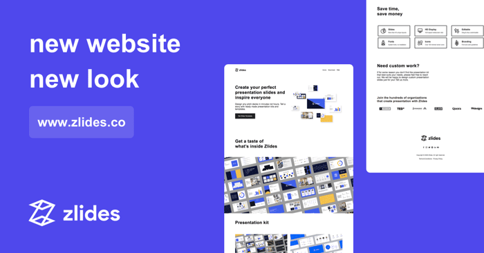
change "new website new look". They appear to be disjointed from everything else on the page... not sure why, maybe font choice? Lack of capital letters?
Het @antarctican thanks for leaving feedback :)
The image above is not the website but visual for this post. You can view my website here
Oh sorry my mistake! :)
If I were to change one thing, I'd make the pricing abundantly crystal clear on the top visible portion of the page. Like have a menu item that says PRICING and put a comparison chart between free vs pro on there. I'm not sure what the stats are but personally if I can't find the price of a product in about 1 click I close the tab and look elsewhere. Just my 2c!
Good luck!
Good observation tho @antarctican - added on my to-do :)
You page is really nice. Like the logo and the big visuals with the examples of the slides. The only one thing I would to is make that
downloadCTA in your header more prominent. Maybe a button of sort?Awesome @gushiguera - Any idea how to make the CTA more prominent?
In the header make a button to stand out from the rest of the items.