Choose my logo!
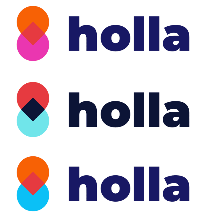
Hey indiehackers!
I'm playing around with a couple of colour combinations for a startup logo, trying to keep it minimal and fun.
What do you folks think? Which is your favourite? Very open to other colour combos if you have some ideas! 🌟

Purely based on aesthetics, #2.
Aesthetics is a good reason with as little as I gave you all to go off! Appreciate the response!
#2 feels the most serious, #3 a bit more "childish", #1 feels like a color mismatch to me. #2 / #3 work both quite well and for me it would depend on your products audience. Nice font anyway, great work.
Thanks marv, it's definitely something to think about - the brand is definitely going for "fun" over seriousness, I do agree with you that #2 catches the eye but might be a bit too serious.
Number two reminds me of duotones!
Thanks @missrogue, big fan of duotones! Planning on using those icons quite a bit on the dashboard!
I would say, not #1.
Thanks man, is it because of the lack of contrast? Which would you choose?
Yeah... lack of contrast between the center and the other two colors, specially the one on top, makes me think something went wrong.
I think #3 still has a bit of the problem but I'm choosing it over #2 because I wouldn't mix color and black in the same logo.
What I would do if I were you is have three colors so that the contrast between top and center is the same as between bottom and center, but without the center being black (or almost black).
Contrast is a funny thing. I found the chapter on contrast on Refactoring UI quite revealing to me.
Disclaimer: I'm a coder with no taste, so, don't take anything I say here too seriously, it's one weak datapoint among others.
It really depends on what you want to say! What's your activity? What kind of tone you want to communicate in? Do you want to be seen as a disruptor or a classic?
Same for the symbol, what does that mean?
If you only want an opinion based on taste, I'd say #2 :)
Awesome man, thanks for the detailed reply!
The idea is an onboarding SAAS product; helping teams to grow. HR software has a wrap for being quite functional and boring, so part of what I want to do with Holla is make something that makes a splash.
Logo is obviously very basic right now 😅 and could do with a Graphic Designer, but I wanted to start riffing and get the ball rolling.
#2. Easier digestible color combination for my eyes :)
I like them all. I think it can be useful to have different color schemes you can apply an aesthetic to. In this way, you keep the hue relationships the same but you can swap out the colors to create different versions of the same logo. I like #3 the best for this purpose.
That's a really interesting point that I hadn't thought of - I like the idea of being able to customise it depending on events, for example Halloween/Christmas.