Cold DM platform - Landing page feedback needed
Hi everyone,
I'm launching soon, and I would appreciate feedback on my landing page. The platform is designed to help sales and marketing professionals connect with their target audiences through cold DMing.
If you have any suggestions or feedback, please let me know. Thanks
Trending on Indie Hackers

The page looks really good! I think you're 90% there. Only feedback i have is marginal:
When i first read the copy i couldn't understand where these DMS would be sent. After i saw that part with the multiple communities, then I saw the potential (at first i understood that i had to know where my target audience was)
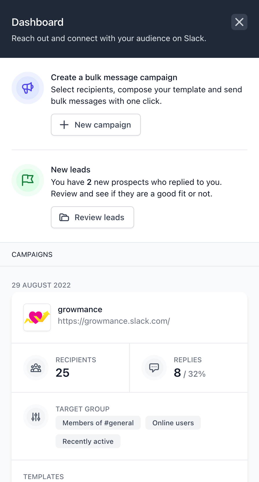
I tried dropping my email to sign up only to realize that it will redirect me to the chrome web store. Maybe you should actually collect emails (so you don't alienate users on mobile (me) or users in different browsers). With their email you can send instructions to install the extension as well as nurture your base
But again, it already looks very good
I really like the aesthetics of the landing page, really clean.
Here are some tips to improve:
Color combinations are really good!
Things that can be improved:
I really liked the color scheme. - which I think is very important for me when I look at a landing page
Thanks, I'm glad you like it ;)
The page looks great visually.
Few things that can be improved -
Hope this helps.
Thanks so much for checking out my page and giving me feedback!
As for testimonials and industry stats, I'm still looking to gather the first few users and see how they like it, but I'm planning to add it asap.
Pricing is yet to be decided, but I agree that it would add some credibility and perhaps some pressure if it was displayed that since the product is in beta, it's free, but it would otherwise cost X USD, so hurry up and use it now while you can...
Thanks again for your input, I appreciate it ;)
Just having a pricing table that says that the tool is worth $9 a month, but free for first 10 beta users should improve conversions...
Make sense, will add a pricing block too 🙌
Like your product idea. I'd propose to put it more clearly on tha landing page that it's for Slack.
Hi! Thanks for your feedback. Tough decision since I also want to communicate clearly that Twitter and Linked are also planned an will be added soon...
Hey, thank you for your feedback!
I'm glad you find the messaging clear! I'll think about reducing the How it works copy as suggested :)
I did not see your social media account icons. You should add them.
Hey, thanks, will add Twitter
I have similar plan with https://chrome.google.com/webstore/detail/quickyreply-quick-reply-t/ojlbhpadmdgmnlbcjadbnaikogeegnce
Interested to chat and explore the collaboration?
Nice one! How is it going, do you have users already?
No I don't have. I am using it personally.
Very clear, great structure on mobile.
Kudos!
Thanks 🙌
Wow really clean, simple landing page!
Love it — Now go out there and start getting feedback + sales.
Best of luck with the startup!
Thank you! :)
I'm on it! I'm using the product to market itself at the moment; let's see how well it will perform... 🤞
Amazing. Do you have a Twitter I can follow? Would love to stay updated with the journey.
Let's connect I'm here: https://twitter.com/pepegombos
Awesome. Followed you!
Okay so the landing page is extremely well made in its simple form.
✅ I instantly understood the idea, and the fact that this works currently only on Slack
✅ Love that you added a community section, because I wouldn't know otherwise where to find these communities
✅ Love the "in-page" demo
👀 Who should be using this? who is ur persona?
👀 Add some testimonials if u can
👀 Add a footer
👀 Add pricing
👀 Make your CTA stand out
👀 Who are you and why you built this?
Hello, thanks so much for your feedback! I really appreciate it 🙌
Who should be using this? who is ur persona?
☝️ great point, will add a block for this
Add some testimonials if u can
☝️ still trying to acquire the first few users, but I'll add ASAP
Add a footer
☝️ will do
Add pricing
☝️ will do
Make your CTA stand out
☝️ thanks, I'll make it pop
Who are you and why you built this?
🤔 Do you think people care about that?
Yes I don't really give money to random people on the internet
Hello Peter,
I shared some thoughts below:
Hero
how it works!CTA Try For Free
How it works
Lead Form
This is just a quick review.
Good luck with your new project!
Thanks for the awesome review Furkan!
I agree with most of them and will improve the site!
Thanks for pointing out the Lead form => chrome store flow is confusing. I'll improve on this for sure. I think I already have an idea of how to make it better.