Company MRR is $3.3 million, but its UI is scary. Take a look yourself!
I am working as a product designer at VWO. Their MRR is $3M, and ARR is $40 million.
I was shocked when I saw their UI; it's 8 years old and outdated, yet they are growing as an A/B testing tool.
When you listen to Twitter design Influencers, they boast about selling beautiful designs.
They want you to believe beautiful design is necessary for your customers. Take a look at Twitter. Every designer posts, "Here is before & After," and they sell beauty only.
I am not against it, but I am telling you this because I meet with many startup founders who waste their time & resources on hiring a designer to design a beautiful UI.
Yet, people don't care much about the UI. They want to do their job.
Solution: Even if your UI is functional and usable, that's enough to move forward and start selling your product to the customer.
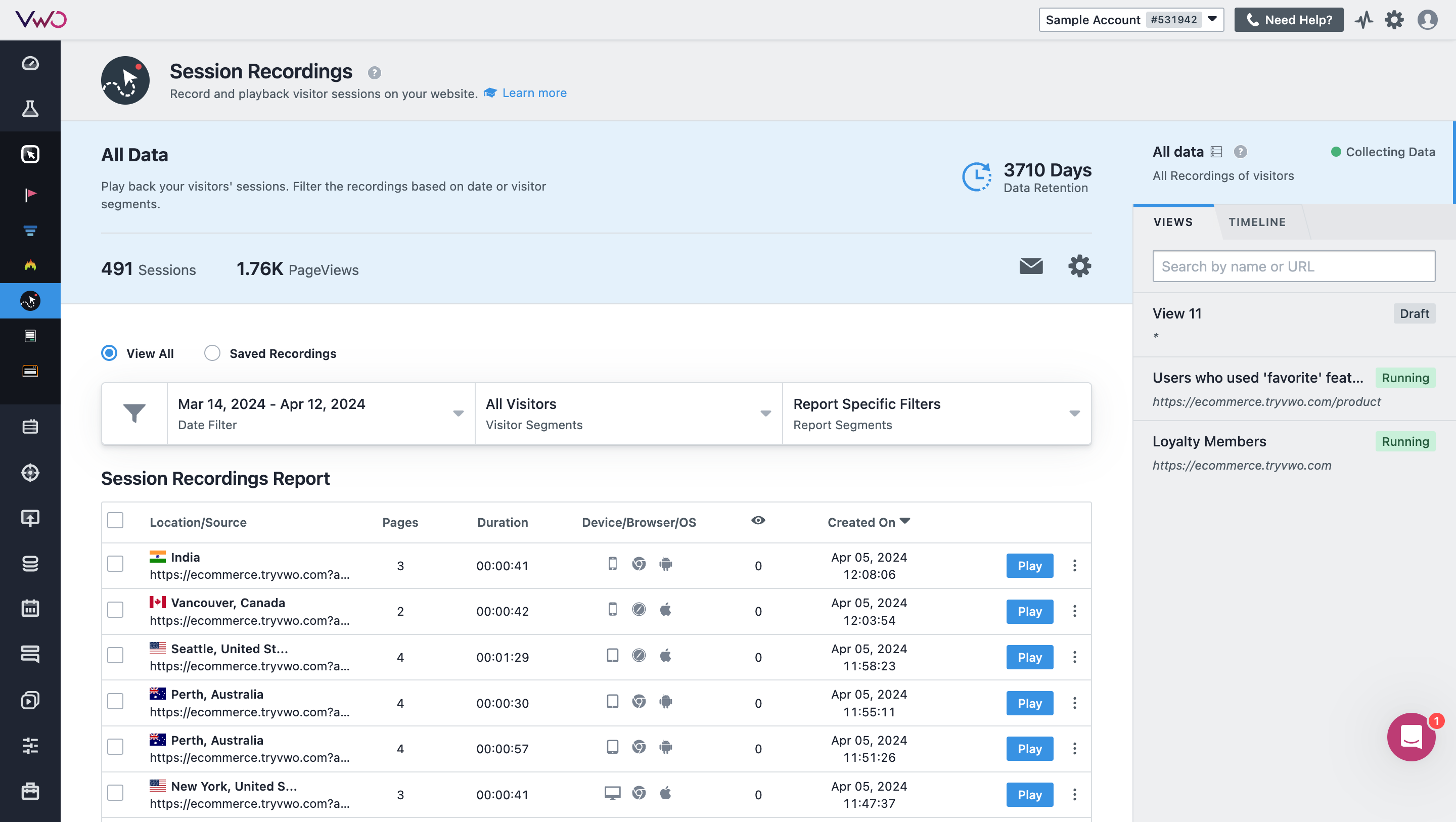

In my opinion, a UI should remove the friction so that the product is usable. But that is something one needs to experience. You can't just show it. Maybe that's why all the examples in public emphasize beauty.
Also, a beautiful design can be completely unusable. Something to consider.
Yes, you got the point!
Anything can be useful or useless depending upon context.
That's not the worst design. It's not intuitive, but it doesn't look bad at first glance.
I agree with you, @msulcs, but if you talk with SaaS founders, most will say it's not looking good!