Creating Login/Signup Page
Hey IndieHackers,
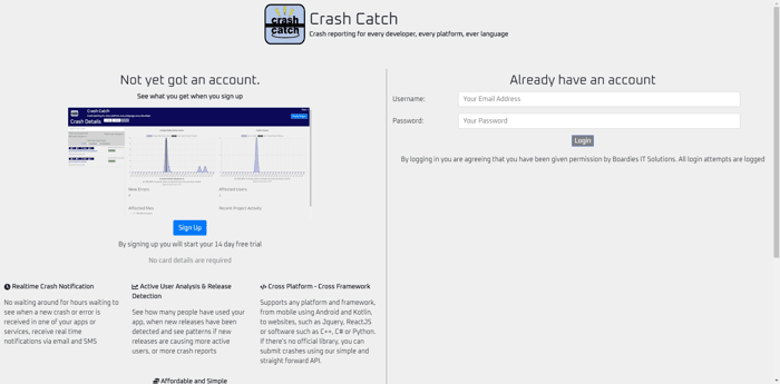
I've created a login/signup page for crashcatch.com. (Not released hence only a screenshot).
The picture on the left I plan on changing with a full width and clearer screenshot.
What's your thoughts on it, any feedback would be greatly appreciated. There's something that doesn't feel quite right, but I can't quite put my finger on what the problem is.

Hi Chris, the problem is you are trying to do too many things on one page.
On the home page, you should be trying to persuade new users to try your product. Videos, screenshots, features/benefits, sales copy, testimonials should all go here. The call to action button should be to signup. You can do this two ways. One way is to have a link to a separate signup page. The other is to have the form directly on the home page (e.g. a email form field with a signup button).
Your login page (I'm assuming this is for beta or early access users) should be on a separate page. To get to this page, just have a Log In link in your header navigation.
Here are examples:
https://todoist.com/
https://todoist.com/users/showlogin
https://linear.app/
https://linear.app/login
https://www.notion.so/
https://www.notion.so/login
Look around at other sites. This is standard pattern.
Hope this helps!
Thanks for the feedback. I can't remember where I saw it but I did see a site so something similar to what I've done, but I think your right, separate page would be better.
Great examples!
I personally like it, and the headline "Stop relying on your customers reporting problems" caught my attention, so I'd consider putting it more above the fold.
Thanks, yea it is a little low down on the screen, didn't notice that before, I'll see if I can raise that up a bit.
if you are asking how to customize the WordPress login page, this step by step guide has you covered. We’ll show you how a user registration tool can revolutionize the entire login and registration process on your WordPress website.
Before we get started, we want to point out that this entire process is possible to do without a plugin. But unless you are a developer yourself, we wouldn’t recommend trying it. You’ll be required to adjust the default WordPress settings and do a lot of coding.
Ready to get started with our plugin method? Great! Here are the main steps:
You may have noticed that the login https://inloggenhulp.com/digid-inloggen-cz/ and registration pages are made in the last 2 steps. Everything we do in the first steps will be needed for us to make those pages
I would reword "Stop relying on your customers reporting problems" to "Identify Problems before your customers do". Regardless, move this up as your headline.
Hey Chris! Congrats on the signup page :)
Just some first impressions on it
Best of luck!
Thanks for the feedback. The screenshot I am planning on changing is just a quick one I threw together. Plan is to make a proper screenshot with a more realistic graph than just a random spike.
The logo I do agree with, I am no go at doing logos and my mum is a little more artsy than I am so it was much better then i could come up with lol, but perhaps I can see if I can get a logo designed.
Now you mention the monochrome I think that's what I was thinking wasn't right but couldn't think of why looks a little boring.
Based on your comment and the one above I think I'll go back to the drawing board a little (or actually quite a lot) and have another go.