Current page isn't converting well, what do you think of this new design?
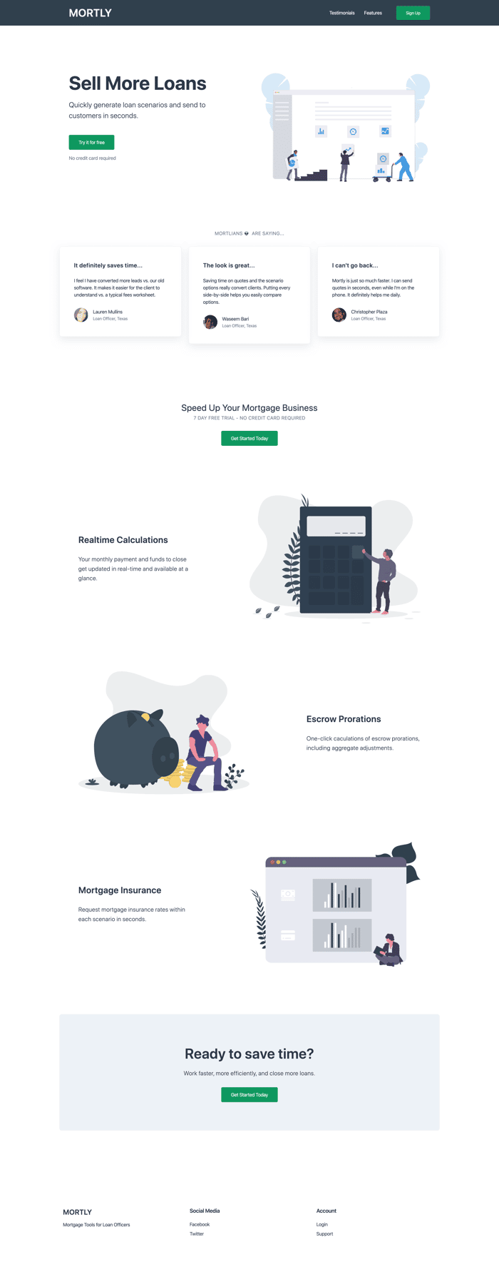
Have to make another pass on responsiveness, but do you think I'm headed in a better direction? Current is at https://mortly.com
Have to make another pass on responsiveness, but do you think I'm headed in a better direction? Current is at https://mortly.com

Very little wrong with the page. Which is really bad news.
It hopefully means that you've attracted wrong kind of visitors, but in worst case it means there is no demand for your product, at that price point.
You seem to be targeting loan officers and perhaps personal financial advisors, but they all probably already use much more hardcore tools for this purpose?
Have you done your validation homework? Is there real need for your product?
I agree with Henri, your landing page is clear, looks good and there is nothing obviously wrong. If it doesn't convert, it's not because of the design or wording.
If you are in the business and know for sure there is a market for your product, then try to interview 10 of your colleagues, understand if they have the same pain point as you.
Perhaps you just need to find another angle to convert.
Good luck!
Thanks for the feedback. I'm actually in the business, created the product for my own need after working with other popular products for years. There's definitely a market, but it's certainly niche. Higher volume loan officers in particular who are fed up wasting time with old, slow software. That's where Mortly comes in.
The new landing page is going to try to convey that more clearly so that it targets the right loan officer (not all of them, in general).
Yeah, I think you should write to your website what you just wrote to me.
The remaining core thing then is just the "quality" of visitor. Different customer segments and traffic sources convert massively differently.
Actually, are you even sure that your conversion rate is low? Have you found any stats for comparable product using comparable traffic sources?
Not yet, just started marketing and learning as I go. Planning to do more research over the holidays to answer those questions.
I'm only going to mention the lack of product screenshots / animated-product gifs / videos as I haven't absorbed all your copy to give a complete breakdown.
My take...
I've debated this before, which is I strongly believe SaaS products should include screenshots of the actual software itself.
It's fine to use illustrations as a compliment to your aesthetic and design — but no screens of the product itself, then for me, no sale.
This is based on the (more often than not) fact that potential customers want to see what they are buying.
It's also a critical opportunity you have to tie the visual UI to your core USPs / value propositions alongside the potential pain-points, wants and needs of your target market.
If you're solving a particular problem and N-sub-problems via features, then connect those dots for the prospect.
Make it easy for them to understand what they are buying, so quantifying the "why" becomes easier for you.
Imagine prospect A comes to your landing page.
Prospect A has N-problems in relation to his/her industry and existing software.
You visually step-your-prospect-through some or all of these problems by connecting copy (problem-solution) to a visual stimuli.
Each time you do this, you are scoring points in the prospects mental model of assessment.
I'm surprised at the amount of times I've spoken about this at length with people who think these types of assets provide no additional benefit. I'm dumbfounded and I always strongly recommend against omitting them.
There's many ways, that I can see, in which you can incorporate real-deal, visual screens of your product along with your existing artwork/aesthetic.
Really appreciate the feedback and guidance.
I’m definitely going to add more product demos but I’m having to learn the software as I go (example are GIFs of features or vector markup of the UI). I may just start with simple screenshots for now and hire a designer later to mock up some custom assets.
No problem.
Simple screenshots are a great start. Personally, I'd make them clickable, as such that they open in a lightbox (or similar) to give someone an immersive feel (i.e. as much detail as possible at a proper resolution).
I often see products incorporate tiny screenshots that either don't link to a higher-resolution version and or where in the case the image is clickable, the screenshot is still too small that it is hard to make out details.
Good luck with these iterations mate, I look forward to seeing the product evolve.
The design is really clean and minimal, but I think the issue here might be with the content and direction of the funnel.
Is there anyway you can show a demo of the product? There isn't enough content to show the average customer what your product can really do.
Maybe try moving the testimonial & "Get Started Today" CTA to the bottom of the page. Let the customer absorb the content about your product, then read the testimonial to close the sale, then provide the CTA.
There is a lot of room for improvement.
The hero headin is salesy and too general.
Your illustrations are clearly stock and not very relevant to your offering.
You are selling a Saas, share some mockups with screens of the dashboard in each use case.
There is no pricing, faqs, terms and privach policy.
More importantly there is no storytelling. You are making people interested in your product.
Overall, it seems like you wanted to spend as little time as possible on your landing page and its copy.
Honestly, I wouldn't want to do business with you because it appears to me that yoy haven't put the work behind your product.
Clearly, the low conversion rstes could be also influenced by wrong analysis on your side (for example, are you counting repeating visitors just once?) irrelevant traffic and low interest in your product, but stil the landing page can be improved a lot.
Thanks for the feedback. I’ll work on the items you’ve suggested.
It's pretty good, only things i can think of is laying out why their current solutions don't work before going into why your solution does.
I would also want to see pricing, FAQ, terms and privacy policy.
Thanks, definitely considered adding a pricing table but didn't see it on the blueprint over here. https://www.julian.com/guide/growth/landing-pages
Maybe a pricing table could be considered the 2nd CTA near the footer?
Julian's guide is great.
Can look at https://saaspages.xyz/ for examples.
The pricing table and FAQ is usually on /pricing.
I also like https://sumit.versoly.com/ template
Love the examples on those links, thanks again.