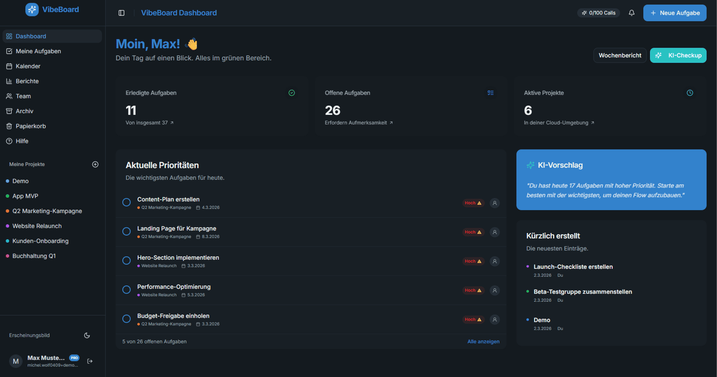
Dark mode is non-negotiable — here's VibeBoard's dashboard at night 🌙
One thing I knew from day one: dark mode has to be perfect, not just an afterthought with inverted colors.
Here's the VibeBoard dashboard in dark mode — clean, easy on the eyes, and fully functional.
What you're seeing:
- Project overview with status indicators
- Task summary and recent activity
- Quick access to calendar, board, and list views
Light mode or dark mode — which team are you on?