Day 4 — designing what happens when a survey DOESN'T work out
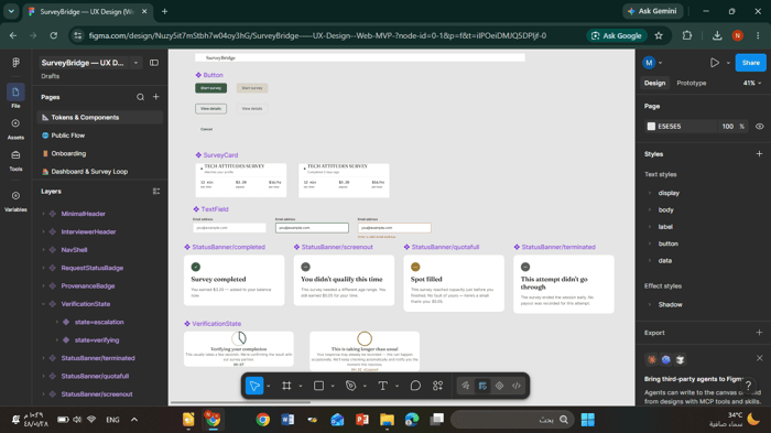
Most survey platforms only design the happy path: sign up, take
survey, get paid. I spent today in Figma designing what happens when
it doesn't go that way:
- You don't qualify for a survey (still get a small thank-you payout)
- A survey fills up while you're mid-attempt (compensated, not just
"sorry") - A "verifying your response" state, since trust in payouts matters
as much as the payout itself
Still zero app code — but I'd rather get these edge cases right in
design than patch them in after real users hit them.
Would love opinions: as someone who's used survey/gig platforms, does
seeing the payout and $/hr upfront (before starting) actually change
whether you'd bother? Or does it not matter much?

This is a useful thing to write about because most founders only talk about the survey when it confirms what they already wanted to believe.
When a survey doesn’t work, I think the hardest question is whether the audience was wrong, the questions were wrong, or the product assumption was wrong.
I’d be curious how you separated those three.
Sometimes people don’t respond to surveys because they don’t care about the problem. But sometimes they do care — they just don’t describe the pain in the language the founder expected.
The follow-up conversations after a failed survey are probably more valuable than the survey itself.
Really good question, and honestly I don't have this fully solved yet
from a single survey. What I'm planning is closer to what you said at
the end: treating the follow-up conversation as the real signal. If
someone skips a survey, I want a lightweight way to ask "was this not
relevant, or just not worded right?" rather than assuming either one.
Appreciate you pushing on this - it's making me think I need that
follow-up mechanism built in from day one, not added later.
That makes sense. The follow-up conversation being the real signal is a good way to think about it.
I’m seeing the same thing with MealRadar now. A broad “do you care about saving money / food waste / deciding dinner faster?” question is probably too abstract. The better signal is whether someone reacts to the exact moment: “I had groceries and still ordered takeout because deciding felt like work.”
That tells me more than a generic survey answer.
Small favor if you’re open to it: could you download MealRadar once and test the first-use/UI flow? No review needed. You get free AI allowances, and no sign-up is required just to test the UI. I’d only want to know whether the problem feels clear or still too broad.
App Store: https://apps.apple.com/us/app/mealradar/id6782612975
Couldn't install it since MealRadar's iOS-only and I'm on Android,
but I looked through the App Store screenshots and the UI reads
really clean. The pantry-match idea — showing what you have vs what
you need with a match % — is a smart way to make the value obvious
in one glance, no explanation needed.
One small thing I noticed: the "Unlock Diets" lock sits right under
the free diet options (No restriction / Vegetarian / Vegan) — might
be intentional, but worth checking if that reads as "the good stuff
is locked" to a first-time user before they've even tried the core
flow.
Can't speak to the actual first-use flow since I couldn't run it,
but visually it looks intentional and put-together.
Thank you for taking the time to study the screenshots even though you couldn’t install the iOS version. Your feedback about the pantry-match percentage was encouraging because that is exactly the kind of “understand it in one glance” clarity I want.
The “Unlock Diets” point is also fair. Even when the basic options are free, placing a lock close to them can make a new user feel that the useful part is being withheld before they have experienced the core value. I’m adding that to the UI review list.
The Android version is currently going through Google Play testing, so it is not publicly available yet. Once it becomes available, I’d be genuinely grateful if you created a free account and gave me the same kind of honest first-use feedback.
iPhone version: https://apps.apple.com/us/app/mealradar/id6782612975
That makes sense on the Android timing — appreciate you explaining
rather than just leaving it unclear. Happy to give it an honest look
once it's out of testing, just ping me here or by email whenever
that happens.
Good luck with the Play Store review — hope it goes smoothly.
Thanks, I really appreciate that. I’ll come back and ping you as soon as the Android version is publicly available.
In the meantime, the iPhone App Store update is now live. I rebuilt the screenshots and positioning around the clearer “fridge full, no dinner idea?” problem instead of leading with “AI cooking assistant.”
Since you already gave thoughtful feedback from the screenshots, I’d be grateful if you had another quick look at the updated App Store page and told me whether the value now feels clearer at first glance.
App Store:
https://apps.apple.com/us/app/mealradar/id6782612975
And once Android is out of testing, I’ll definitely send it your way.
designing the failure states before the app code is the right instinct, and 'verifying your response' is the one that matters most, because on a payout product trust is the product and the survey is just the task. one caution: a verifying state only earns trust if it can actually fail. if it's a spinner that always resolves to 'paid,' people learn to ignore it. if it can catch a rejected response and show why, with the evidence, it becomes proof of fairness instead of decoration. honest failure states build trust, theatrical ones quietly erode it.
on your question: yes, showing $/hr upfront changes behavior, but it changes who starts, not whether. the number it moves isn't raw starts, those probably drop, it's abandonment and 'this is a scam' complaints, because you've filtered out the people who'd have rage-quit at the payout reveal. that's a good trade. and the don't-qualify payout is your real unlock. the universal complaint about these platforms is 'screened out after 10 minutes for nothing.' paying for the screen-out is you designing the exact moment that makes everyone hate the category. i'd put that one front and center.
This might be the single most useful comment I've gotten on this
build so far. You're completely right - a "verifying" spinner that
always resolves to "paid" is theater, not trust. I hadn't thought
through what an actual rejection state looks like (with evidence, not
just a generic "sorry"), and now I think that's a real design gap I
need to close before this goes anywhere near real users.
And yes - putting the "paid even if screened out" front and center
instead of buried in a how-it-works step is exactly the kind of
feedback I came here for. Going to move that up.
I like that you're spending time on the failure states rather than just the successful flow.
For survey platforms, users usually decide whether they trust the product when something goes wrong, not when everything works. Designing those moments deliberately can end up being a much bigger differentiator than adding another survey provider.
Appreciate that - and agreed, I think it's easy to assume the product
differentiator is "more surveys" or "better matching," when it might
actually be how the product behaves in the moments things don't go
someone's way. Trying to design for that on purpose instead of as an
afterthought.
I'm glad it resonated.
Reading your reply gave me one thought about what happens once people start judging the product by how it handles disappointment rather than success. I'd rather explain it in the context of what you're building than try to condense it into a few comments.
If you're interested, what's the best email to reach you on?
Happy to chat more — mohummadsultan0@gmail.com. Also happy to keep
this in the thread if you want to share more of the thought here
too, in case it's useful for others reading along.
Thanks! I’ve just sent it over.
Looking forward to hearing your thoughts whenever you have a chance.
Just checked — doesn't look like it's come through yet (checked spam
too). No rush at all, but wanted to flag in case it didn't send
properly. Email's mohummadsultan0@gmail.com if you want to try again.
Just resent it from hello@beryxa.com.
Would you mind checking again? If it still doesn't come through, let me know and I'll send it another way.