Diagram feedback request
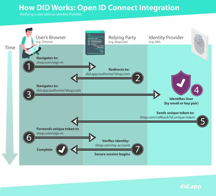
We have been grappling with the thorny prospect of concisely and accurately explaining how our authentication service works. We think we're nearly there with these diagrams which combine copy with infographic as we felt this was the simplest way to communicate this concept. My plan is to weave a support article around these diagrams. Would really appreciate a fresh pair of eyes on these. Thanks :-)

I would make visually distinct the steps that are transparent to the user (e.g., browser redirects) and the ones that require real user interactions. Also, either use numbers or alphabets to number the steps, but not both it makes hard to compare them.
Thank you for your feedback :-) the idea to make the steps that happen automatically without user input distinct from user input steps is a good one. The letters refer to a subset of step 4 (also noted by the colour change to purple and the number 4 on the top left corner) but I get that wasn't obvious so will reconsider that choice. Thanks again.