Did a soft launch! 🌟 Roast my landing page
Hi, everyone
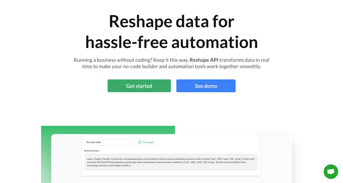
Last week we pushed last pieces of code and did a "soft launch". The app is ready to be used and the landing page is updated to better fit the app.
It would be good to get some feedback. Do you know what the tool does? Does it solve the problem you have at the moment?
A quick excerpt from the page:
"Expectation: a no-code builder sends data to an automation tool, such as Zapier, and it works like magic.
Reality: it’s like the Lego blocks that don’t fit together. Different data formats, excessive or missing info – that’s an ultimate buzzkill for your automation process.
With Reshape API, you don’t need to learn to code or hire a developer to fix this. Reshape API seamlessly integrates into the workflow by reshaping the data as it travels to the automation platform."
Heres the link: https://reshapeapi.com/
Thanks for looking into it!

Nice looking page. It's good that you included a demo. It's something that I wish people did more often.
We hope that the demo will introduce users to the application quickly. Still an experiment, though.
This is a really nice look site and I think it explains pretty well what the product does. Pricing tiers seem fair. I don't personally have a need for this software at the moment, but I'll add it to my list of links in case I ever do.
My only feedback would be to possibly do some sort of accessibility audit on the site to see what small things can be improved. One thing I would suggest is color contrast. The footer link text and the dark background are a little hard to read... at least for my eyes. Possibly make the links in the main navigation a little darker.
Thanks a lot. Will look into the footer
Interesting Idea @arthurleonov , Congratulations
Spent 5 mins on your website and here are the initial impressions:
Hope it helps!
Please feel free to DM me on Twitter (notifykamalraj) if you need any clarification. I can take a look at your app and future versions of the website and give you feedback as well. Hope we can add value to each other as makers!
Really like the idea and super cool landing page! Coming from a dev perspective (probably not your target market, but may help), maybe mention data normalization or validation?
It took me a while to realize you are converting data to match up API endpoints. Or normalizing data with validations. I could be way off here since I'm not the best marketer, but once I realized what your product did, I was like "Oh this is cool!"
Nice looking page! I'd slow the video down just a tad - night be me being slow but it's too fast for me to grasp what is going on.
Thats a fair point. Thanks @ewhicher
Finally, a product video! However, I thought it was an image the first couple of times I scrolled through the page. I think the green button blends in with the green UI present in the thumbnail.
Small thing; maybe put the navigation on a container as well, on my large monitor everything is nicely aligned, but the navigation is full width.
I will think about the nav and the thumbnail. Thanks!