Do you like my Logo?
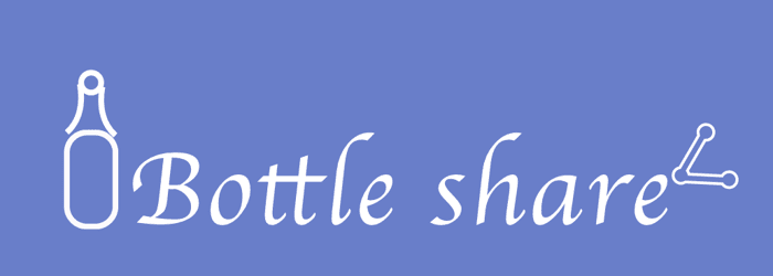
Hello guys. For my side project I created my logo. I must say That I am proud of it. What do you guys think about it. Looking for some honest feedback.
Hello guys. For my side project I created my logo. I must say That I am proud of it. What do you guys think about it. Looking for some honest feedback.

Its not bad, but it could be better! I see a few things that could be touched up, Working with a designer to turn your idea into something unique will make your company stand out that much more! I would be happy to help if youre interested, Its definitely got potential
Couple of points:
The most important aspect in logo design is how your logo looks as an icon, without text. This is how it will be displayed the most: in UI, on FB, in your favicon etc. It is also what is memorable about a logo, underpinning your brand. The issue with your logo is that the iconography is split up by the text. What does this logo look like without text? Your text shouldn't change this, only add to it.
So let's talk about combining your two icons. They are both differently styled, and look like two separate logos. One has a stroke twice as thick as the other. Try to figure out how to bring them together aesthetically, so they look like they were made by the same designer :)
After you address these two things, feel free to message me and I'll continue to provide advice!
Honest feedback, I don't like it, BUT it doesn't really matter, I think you can use it and keep moving with your project.
Have you seen the first logo of twitter or amazon? They ... have changed.
https://www.boredpanda.com/famous-logo-evolution-history-old-new/
Here are some recommendations to take into account if you want to design your own logo:
https://material.io/design/iconography/product-icons.html#grid-keyline-shapes
I think this is good enough to keep the ball moving, once you start making money you can invest in paying a designer.
It's not a bad start, but here are some things to think about, if you're interested in hearing them.
I hope that this helps!
Awesome! What's the side project about?
It's about an online marketplace for supply and demand of whisky samples.