Early Access request is now live
Hello Indie Hackers!
Since May of the last year, I have been building Speetals.
Speetals is a Web Performance monitoring SaaS tool that helps businesses to measure, monitor, and improve their user's experience and recover lost revenue.
After two closed Beta sessions and a ton of feedback, I'm aiming to soon soft launch the tool.
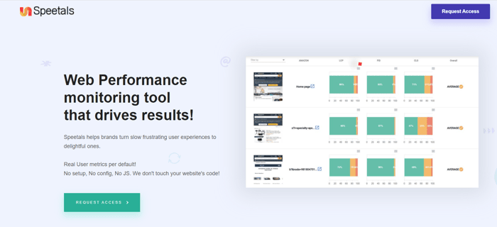
I created a landing page that introduces the features and the benefits of Speetals and allows people to ask for an early access
Since last November, the landing was able to attract 130 people interested in early access which is not bad at all.

Honest feedback:
Overall the page looks a bit dull. The hero image on the right, I am sure delivers something important related to the service, but its very low quality/pixelated (try to recapture a higher quality version of it if possible).
The copy where it says "Speetals helps brands..." is very market-y, I think you only need the two lines below it. This creates the added benefit of moving up the CTA button up as well.
The colors are all over the place, the website uses teal heavily, but your logo is orange/yellow. On top of that you have a CTA button on top right which is purple. So as soon as I landed, the first thing I noticed was the orange logo, Purple CTA on top right and a Teal CTA in the middle. Try to add a bit more cohesion from brand perspective here.
The "Request Early Access" Form looks awful, because on the wider screen it takes up the whole screen, a more compact form would be more visually pleasing, although I am sure on mobile it won't make much difference.
Positives: I like the testimonials being higher up on the page, usually people put them towards the bottom. And you might not have this, but if there are more recent testimonials, it would be nice to update them (the current ones are all from November).
Overall it looks decent! Best of luck with the launch, very exciting! :)
Thank you so much for your honest and useful feedback, @hassanshaikh!
Makes a lot of sense :)