Ecommerce landing page feedback
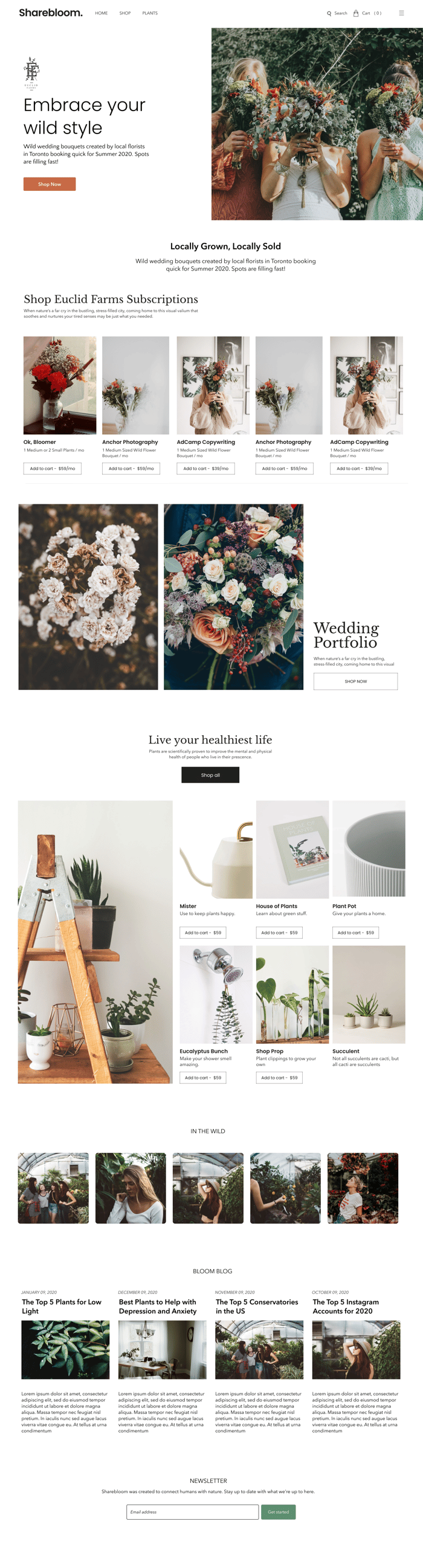
Looking for feedback on a template I've designed for the Sharebloom CMS customers. It's e-commerce geared towards florists and plant studios. Any feedback would be greatly appreciated!
Looking for feedback on a template I've designed for the Sharebloom CMS customers. It's e-commerce geared towards florists and plant studios. Any feedback would be greatly appreciated!

Looks good to me, but I am not your target. Have you put this in front of 20 would be brides or wedding planners in your area? What have they said about it?
Hey @joshdance,
That's a good point, I'm putting it in front of florists who are hosting their website on our CMS, but the market is actually those who are visiting the site. I appreciate the insight, gave me something to think about that I hadn't prior to be honest.
It might be best for Sharebloom the parent page to test these templates out and if they convert, then we can pass it on to our CMS customers.
Great thinking, thank you for this!
I like it overall, I think the weekend point is the 1st section. I’m not a designer, but maybe try playing with hero a little more (change font alignment, maybe make the tiny logo bigger or a part of the background on the text)
Hey @ShineMonk thanks for the feedback! I have a few other hero containers I'm working out so I might implement one of those over this current one. It's not necessarily unique, but my goal was to bring familiarity to potential customers visiting the site. Something to definitely consider.
hey, Thom, the design is really dope it the pictures are well done they create the emotion and make you want to buy great work
i've been developing and studying the ui/ux experience of e-commerce websites for a while and i would recommend changing the following elements:
the search bar make it bigger with direct input and some hints for really famous flowers it will motivate the visitors to use the search bar and navigate more in the website [fun fact amazon search bar is considered one of the most used search engine in the world]
the hamburger menu is a gray zone some says it's okay people are getting used to it and some say that there will be always some boomers and old people at your website and they are not used to this kind of experience remember you need to convert every single of them so make the experience as simple as possible
you might wanna add some extra links categories to make the navigation easier the simple it is the easier your visitor will find and buy your products
i don't think putting the subscription section at the top is a good idea it's a little bit hard to sell for visitors that doesn't know or trust you you will need to move it at the bottom with clear CTA to some landing page that educates them what they will have in the subscription because it's unclear and then you can put a list of product that you want to promote them for the subscription
you can put the top-selling products in the first section after the hero
place the show all under the products not on the top of the section
add read more to your blog post the date under the blog heading because it's less important than the heading
more attractive message for the newsletter 'with what we're up to' is not enough to convert someone to put his email and subscribe you will need to give them more reasons
the footer part is so important don't ever remove it especially in the home page where random people land some of them will need more information about store some will have more questions so leave your contact info and site map for different links and categories that you couldn't include them in the top menu
don't forget your social media links always work on building your following
i really hope that i helped
--Chougrani brahim-- Degital marketer /ui,ux designer / full stack developer
@brahimchougrani really appreciate the well thought-out points you've addressed. I'm going to take a lot of this and implement before we push to development. Thank you, really great actionable points!