Feedback for Tov
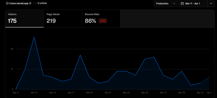
In three weeks, 175 visitors came to the site and none of them registered in the waitlist. 5 people tried the beta version, but then they left.
For context: I built a tool that writes posts for each social network in 30 seconds from one idea. Here is a link - https://trytov.vercel.app

Your headline promises speed, but that's not the pain solo founders feel when they sit down to post.
The headline sells the wrong benefit.
"Post everywhere in 30 seconds" frames the problem as time. But the actual frustration is that copy written for LinkedIn sounds flat on X and wrong on Reddit. Speed is a byproduct of solving that. When a cold visitor reads "30 seconds," they think scheduler, not adaptation tool, and move on before the subheadline explains otherwise.
Two CTAs are doing opposite things above the fold.
"Try free beta" and "Join waitlist" sit side by side. One says the product is available. The other says it isn't. A visitor who wants to try it has to figure out which one applies to them. That moment of confusion is usually when the tab closes.
The body copy uses a concept the buyer doesn't reach for.
"Tov keeps your voice, changes the platform language" requires the reader to already know what "platform language" means and why it matters. The person you're selling to doesn't think in those terms. They think "my posts feel copy-pasted and nobody engages on the second platform." The product solves that exactly, but the framing assumes the reader shares your vocabulary for the problem.
These are the three that jumped out immediately. There are usually more. Drop your URL at https://briefd.it and I'll send the full breakdown free, PDF in your inbox.
Thank you for such a detailed feedback! I've already dropped the url
175 visitors / 0 waitlist / 5 beta triers who left is a specific pattern, and the hero actually tells you why. Three things:
The hero copy itself ("Stop rewriting the same idea five times every week") is strong — you've nailed the pain. The leak is after the pain, in how the page asks the visitor to commit.