Feedback on design
Hello, guys
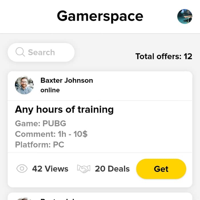
Can you please share with me your opinion about these two designs? In first one I have used Proxima Nova only. In second one I have used Proxima Nova (bold texts) and Open Sans
What do you think about it and maybe you have any other suggestions regarding font?

I prefer the first one on the left (only 1 font). Perhaps the subtext (“Game: PUBG / Comment: 1h - 10$...”) should have smaller weight.
The 1st one actually eye catching.
When i first see the both picture the 2nd is looking grayish and the 1st was looking clear to me.
I like the first one as I think the highlighting is better shown here than on the right side.
I prefer #1 better 😋
Left side.
Try smaller font on all the text below the line. Maybe with less weight on Game, Comment, Platform, keep the same weight on PUBG, 1h-$10, PC. Also remember the $ comes first i.e. $10 not 10$.
This comment was deleted 6 years ago
This comment was deleted 4 years ago
This comment was deleted 3 years ago
This comment was deleted 5 years ago