Feedback on UI screenshot
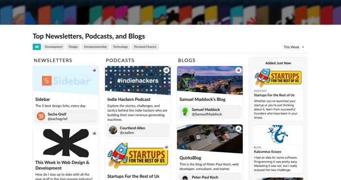
Hey guys! I'm working on a discovery tool for newsletters, podcasts, and blogs. The home page displays the current top entries as cards in columns.
I'm taking the advice of many here and trying to share and get feedback as I build. Any feedback on the card layout in this screenshot? Anything would be helpful.

😉
Thanks for the feedback, that's definitely an improvement I could make!