FontDiscovery 🖼️ 23: Communicate Friendly Wonkiness with the Font Fraunces

I'm Hua, a designer and bootstrapping founder building Typogram, a brand design tool. As part of running Typogram, I create this digestible weekly guide with fonts, colors, and design ideas to help founders, creators, and makers step up their game in marketing and get creative!
Hi there👋
How are you? This weekend I did a lot of renovation in my new home. I have no wifi there so it was incredible to be unplugged from the digital world (the trendy word for this is now metaverse!?). I hope you had a nice weekend! I would love to hear what you did.
In this issue
- Fonts: Fraunces, classic yet charmingly wonky font
- Design idea: What is Variable Font
- Color Inspiration: Garden of Earthly Delights
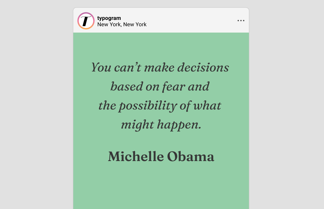
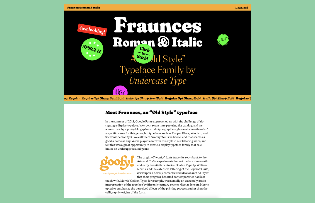
img: sample of Fraunces
Font of the Week
A True Classic
Similar to EB Garamond, Fraunces is also what's considered an “old-style serif.” An old-style serif communicates traditional values. Comparing Fraunces to Playfair Display, you will notice that Faunce retains the classic seriousness of the serif but lacks the stylish gracefulness of Playfair. But if we compare Fraunces and EB Garamond, though both are old-style serifs, Fraunces offers more personality with "wonky" letters and angler uppercase. Is your project giving investment advice with a saucy attitude? Or reconsidering traditional business, like Misfit Market with grocery shopping? If you are looking to communicate a classic voice with a twist, Fraunces is a fantastic choice.
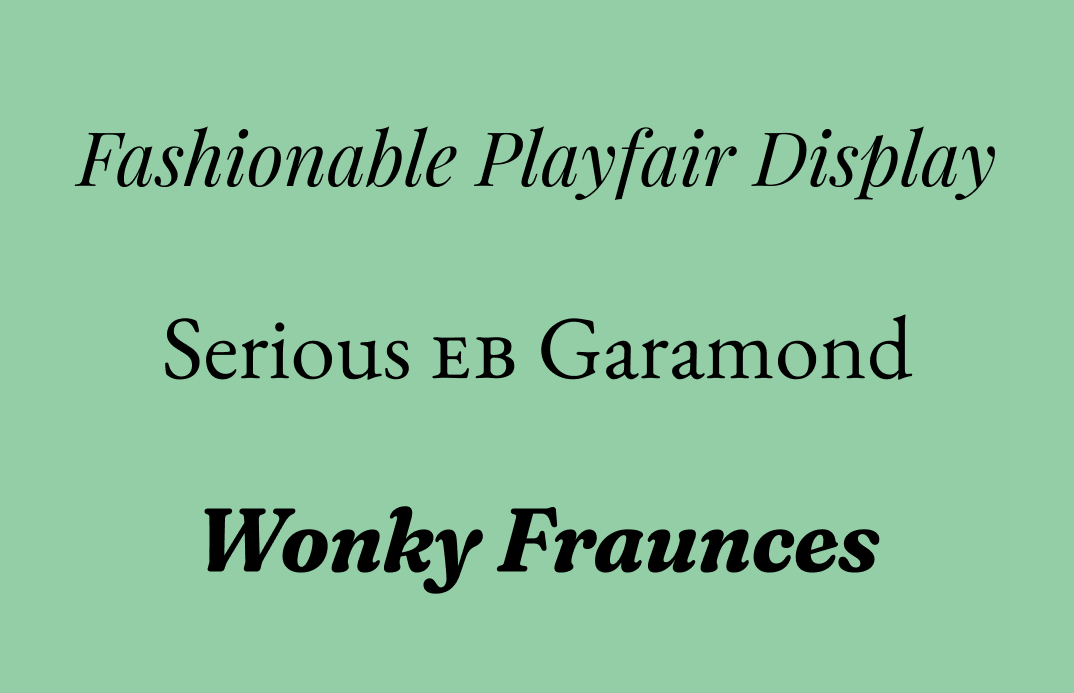
img: compare Frances with several other serifs
Font Details
- This font has three versions: 9pt, 72pt, and 144pt
- 6 different weights, each with regular and italic versions
- Each “pt” version also comes with several different stylistic versions available, thanks to variable font (see design idea this week for a more in-depth explanation)
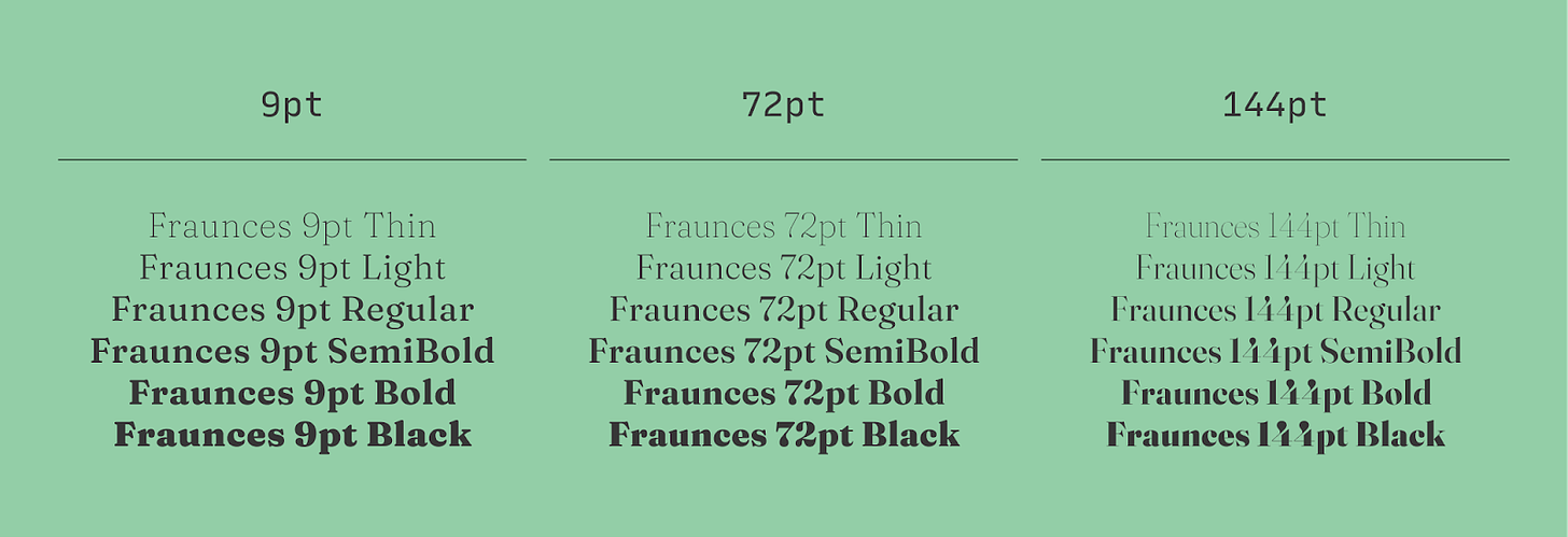
img: 9pt, 72pt, and 144pt versions of Fraunces, each with six different weights, not pictured: italics for each weight
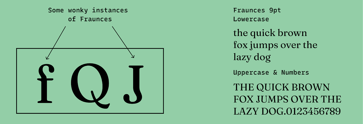
img: some wonky instances of Fraunces
Specific Usage Tips
How do I use it for logos?
- Communicates classic vibes with friendliness and comforting wonkiness.
- It’s perfect for heritage or classic brand that wants to have a warm, slightly offbeat personality.
How do I use it for marketing?
- Use “9 pt” (9px) version on small paragraph text. This version has optimized readability for small sizes.
- Use “72 pt” (72px), for large size, better for headlines on the landing page.
- Use “144 pt” (144px), is eye-catching for hero page graphics.
img: example of Fraunces; source: FontInUse
Design Idea of the Week
What is Variable Font
Variable font is a new font technology that allows a font to “generate” infinite weights and styles based on predefined parameters by its designers. Usually, if you select a font, you will often have limited weights, such as “regular” and “bold.”
But with variable font, you can have infinite weight choices because you can have everything between regular and bold. This interpolation also works for font styles, which is the case for Fraunces. As a variable font, Fraunces has four types of axes:
- Weight: adjusts the thickness of the strokes.
- Optical Size: adjusts thin strokes and letter spacing to optimize rendering for any given font size. Usually, the bigger the font size, the thinner the thin strokes.
- Wonkiness: this exaggerates some wonkiness traits of certain letters.
- Softness: this controls stroke thickness. More softness means stroke becomes thicker and more consistent overall, causing it to be softer, rather than crisp and sharp.
Typically, variable fonts come with traditional static versions, making them more compatible with most design apps. These static versions are more than enough for many cool projects. Nevertheless, if you use the variable font version of this font, you can customize the parameters for each axis in CSS to create your unique flavor of the font for your designs!
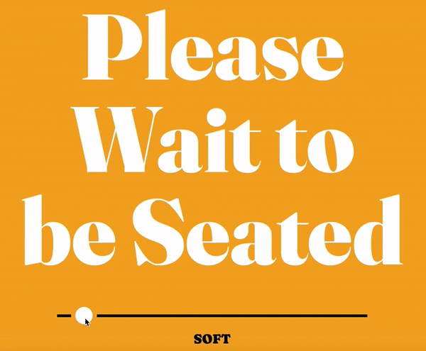
img: Fraunces being interpolated on soft axis; source: undercase
Color Inspiration of the Week
We will extend the classic yet offbeat theme this week into our color inspiration by featuring this wonderful yet strange painting: Garden of Earthly Delights, created by Hieronymus Bosch between 1490 and 1510. This painting is filled with extremely enigmatic and intricate symbolism.
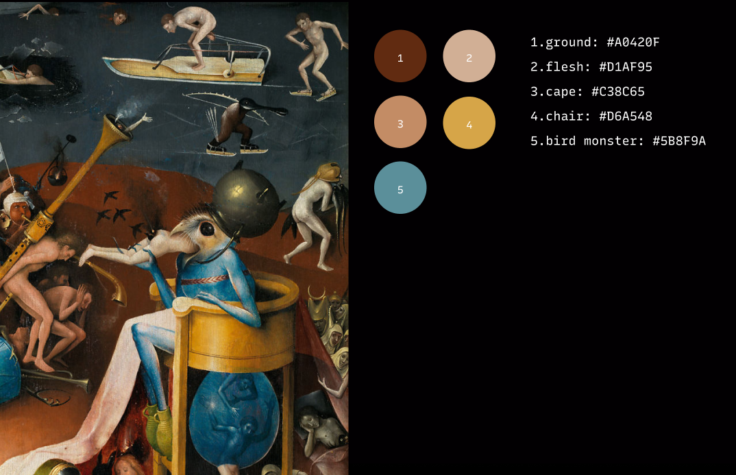
img: a detail of Garden of Earthly Delights
Creative Prompt
Can you create a visual for Twitter or Instagram using Fraunces or the color palette we featured today?
Thank you
…for reading and hanging out here this week! Fraunces is available here.
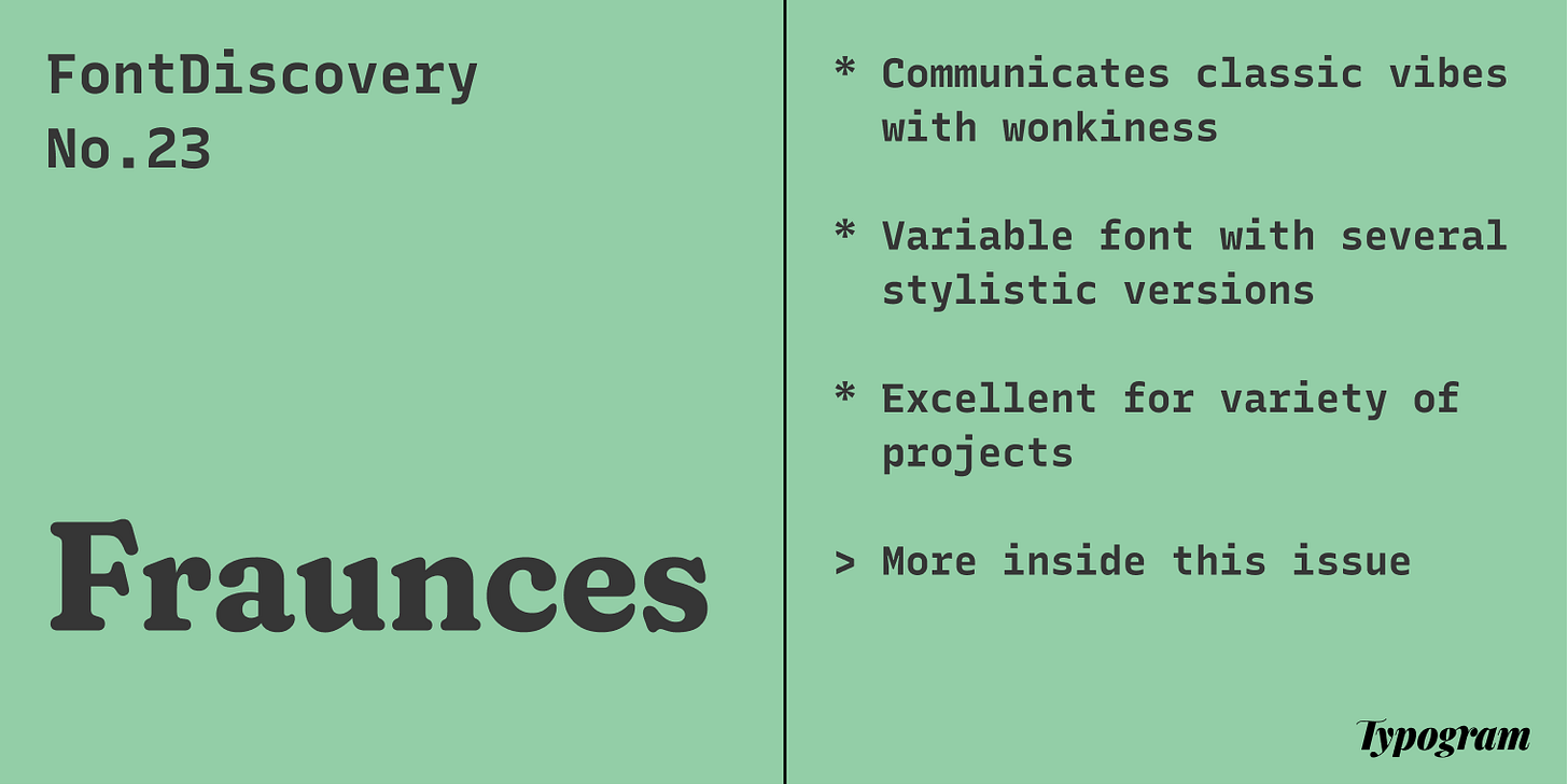
img: Fraunces infographic
If you enjoy this series, you can subscribe here:
Have more questions about design and fonts?
Please email me [email protected] or find me on Twitter at @HuaTweets.
You can also read the past issues on Typogram's blog.
