FontDiscovery 🖼️ 49: How to use Fredoka One for Holiday Graphics
I'm Hua, a designer and bootstrapping founder building Typogram, a brand design tool. As part of running Typogram, I create this digestible weekly guide with fonts, colors, and design ideas to help founders, creators, and makers step up their game in marketing and get creative!
Hey Everyone 👋
I hope you had a restful weekend! It is the first full week of December - there are only a few days left of 2021. How was your year? I would love to hear about it via reply.
Without much ado, here is our font of the week. This week, I featured another font you can use for razzle-dazzle holiday graphics that needs some extra joy and magic this time of the year. I hope you enjoy it.
P.S, in case you missed it, last week I reported the good news that FontDisocvery is nominated for the Creativity award on Hackernoon, a top tech blog. I would really appreciate your support if you can vote for me! It only takes 2 seconds~
👉 Vote for Hua Shu
In This Issue…
- Font of the Week: Fredoka One
- Design Idea of the Week: Unicode
- Color Inspiration of the Week: Holiday Pine
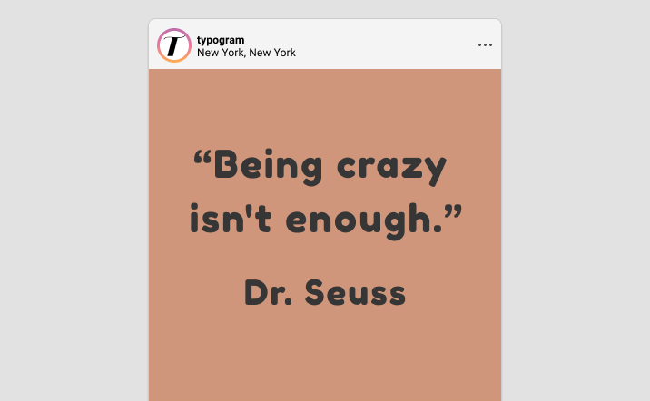
img: sample of Fredoka One – Do you have a friend who could profit from the weekly design tips, just like you do? Please consider forwarding or sharing FontDiscovery with your friend by clicking on the button down below.
Font of the Week
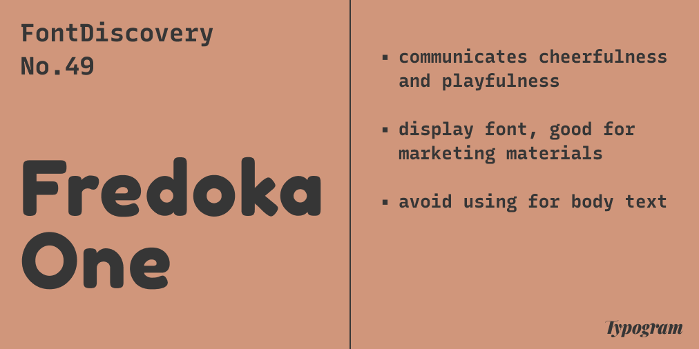
Fredoka One Overview
For letters with rounded caps, we have covered Nunito and Dosis. Today, we’ll meet Fredoka One. Fredoka One is an ultra-bold and round sans serif that speaks to a sense of cheerfulness and bounciness. Compared to these two fonts, Fredoka one is much heavier in font-weight and more cheerful. Its joyful voice reminds you of fonts that you see in children’s books, child products, or sweet and “cheery” food brands like Dunkin Donuts.
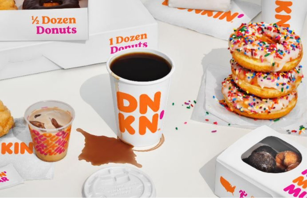
img: Dunkin Donuts is a branding that uses round letters in their font; source: Dunkin
Font Details
- Extra bold stroke width and rounded caps
- Only available in one weight
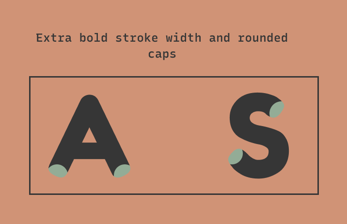
img: font detail - extra bold stroke width and rounded caps
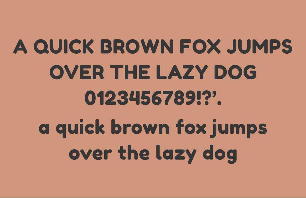
img: Fredoka One only has one weight
How to use Fredoka One for logo?
Fredoka One is a good logo font. It is bold enough to view in small size without the shapes, especially the counter spaces, like the small spaces inside the“e,” breaking down. It communicates cheerfulness. Its thickness makes this font extra inviting to read. A bonus tip: increase letter spacing to help the letters become more legible and visually pleasing.
How do I use Fredoka One for marketing and branding?
Fredoka One is playful and eye-catching for branding and marketing while inviting to read. It is best to be used sparsely and for attention-grabbing copies. It is perfect for Social posts, wrapping paper, t-shirts, and showpieces graphics. Since Fredoka One is a display font, it is not suitable for body text. Its boldness comes across as bulky and not reading-friendly in paragraphs at the reading size.
img: Fredoka One in use on a cookbook “Cook without Gluten for Children”, source: FontsInUse
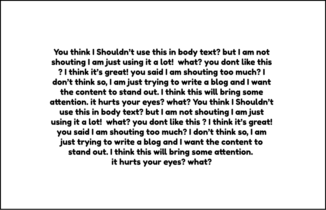
img: Fredoka One looks very bulky in paragraph text
Design Idea of the Week
Emojis Usage Trend
This week I was delighted to discover Jennifer Daniel's newsletter about Emojis and Unicode Consortium, a nonprofit organization responsible for digitizing the world’s languages and maintaining them.
In this post, she talked about which emoji gets the most used and which the least in 2021, and guess what? My favorite, "Tears of Joy" isn't dead! (Apparently, this emoji is what divides Millennials and GenZ according to GenZ Tiktokers).
Another thing that surprised me is the least usage of country flags, which I thought sports fans would totally use like crazy. This article was a fabulous read and really made me think of how people communicate.

Color Inspiration of the Week
Holiday Pine
This week, please enjoy the colors of pine cones for the holiday
{Tree Truck #693B2C | Plan Beige #D0967B | Seaweed #2D3329 | Soft Mint #93AC96}
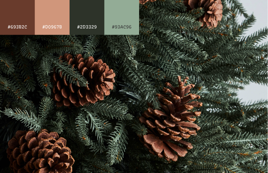
img: fresh pines
Typography Jargon Buster!
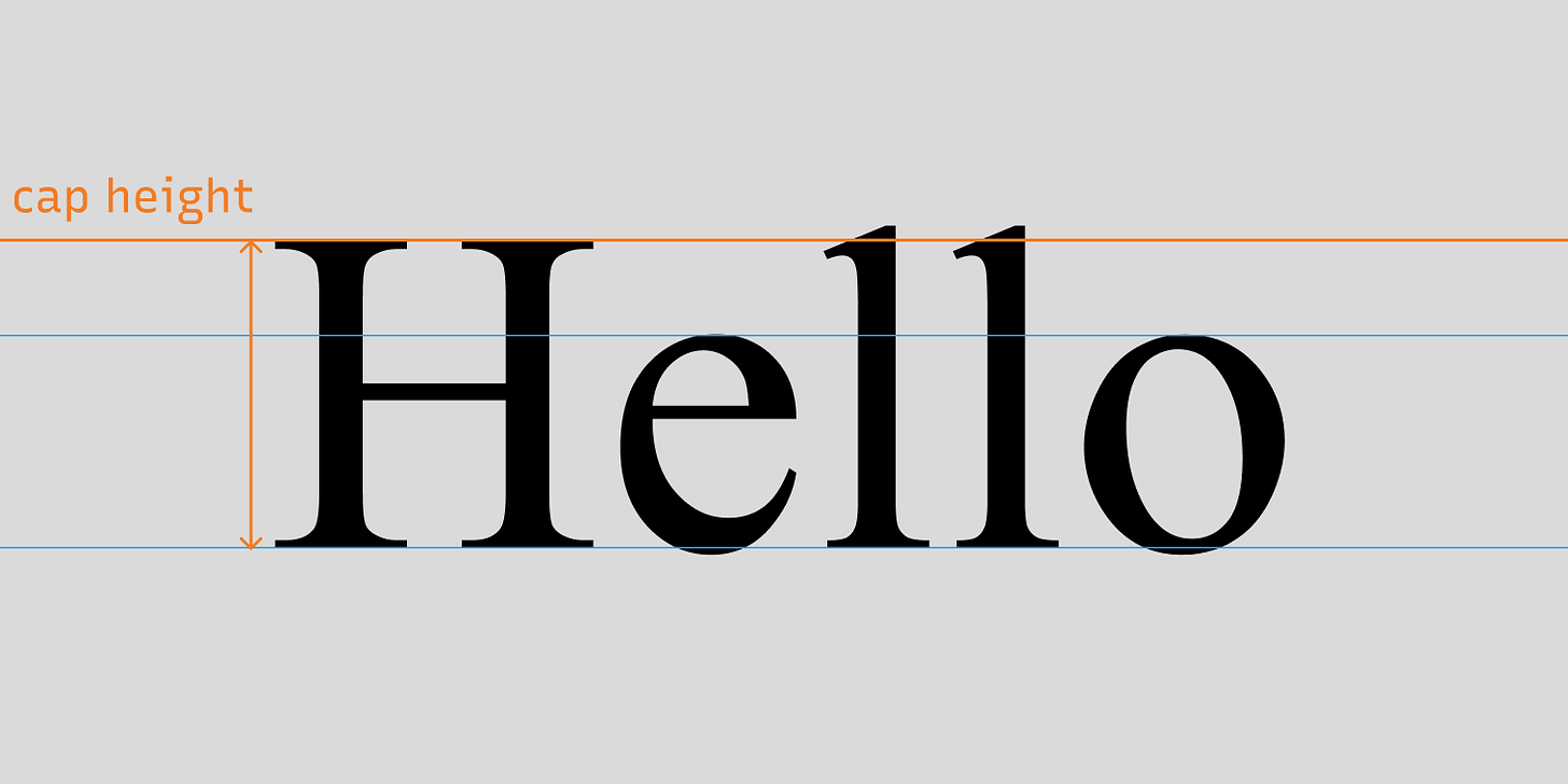
Cap Height
The height of capital letters from the baseline.
img: cap height of the font
Creative Prompt
Can you create a holiday card with Fredoka One?
Thank you!
Thanks for being here for another week. Fredoka One is available here.
img: Fredoka One infographic
If you enjoy this series, you can subscribe here:
Have more questions about design and fonts?
Please email me [email protected] or find me on Twitter at @HuaTweets.
You can also read the past issues on Typogram's blog.
