FontDiscovery 🖼️ 53: F is for Friends | The Branding Design of Facebook, Part 1
I'm Hua, a designer and bootstrapping founder building Typogram, a brand design tool. As part of running Typogram, I create this digestible weekly guide with fonts, colors, and design ideas to help founders, creators, and makers step up their game in marketing and get creative!
Hi Everyone 👋
As promised, New Year, new Fontdiscovery content! This week I am soft launching a brand new series in the newsletter highlighting branding design case studies. These studies will highlight a company, tell the story around its branding, logotype, or logo design as examples, ideas, and inspirations for your company or creative projects. I am thinking to send out these studies once a month in the placement of a regular Font of the Week post. This is still in the brainstorming process, if you have any suggestions or feedback, feel free to let me know via comments!
For today, we’ll kick off the series with Facebook. Facebook has a special place in my heart (Even though it may be a love-hate relationship). It was my first social media network. It was cool, exclusive, and invite-only, and I had to get one of my friends to make me an account. While dying to be on the platform, I was also worried that no one would accept my friend request.
F is for Friends: The Branding Design of Facebook, Part 1
- Rebranding Time: 2015
- Rebranding Reason: needing a quick refresh but retains its original flavor.
Over the years Facebook has gone through several rebranding to spiff off its image. In this post, we’ll take an inside look at how Facebook tried to rebrand itself in the first twelve years after officially naming itself "the Facebook."
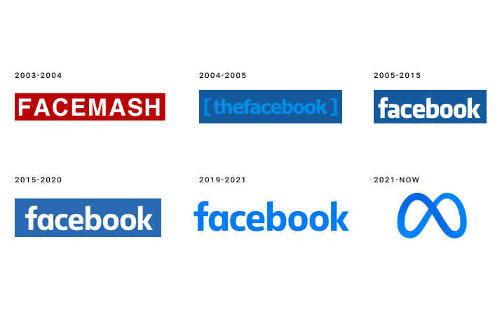
img: The evolution of the Facebook logotype
Know someone who might like this post? Share it with a friend. That would make my day!
The Context for Rebranding
A lot has happened to Facebook in its first twelve years.
From its birth in 2003 as “FaceMesh” to 2015, Facebook bought Instagram, IPO’ed, and became a network with more than a billion users. The platform is becoming more and more scrutinized for its collection of data, ads, user privacy issues, the authenticity of the information. Facebook needed an update with the public.
What Was Facebook’s Previous Branding Design?
After it had changed its official name from FaceMesh to “the Facebook” the company adopted this logo:
img: the Facebook original logo
Over the next few years, Facebook grew into a giant network. It drop “the” in the naming and became “Facebook.” It slowly tweaked its logo by making small and incremental changes. Few iterations happened around this time, looking similar to:
img: Facebook made small, subtle tweaks to this logo from 2005-2015.
And then in 2015, a still subtle, but slightly more obvious rebrand happened:
img: Facebook logo rebrand
What’s the Difference Here?
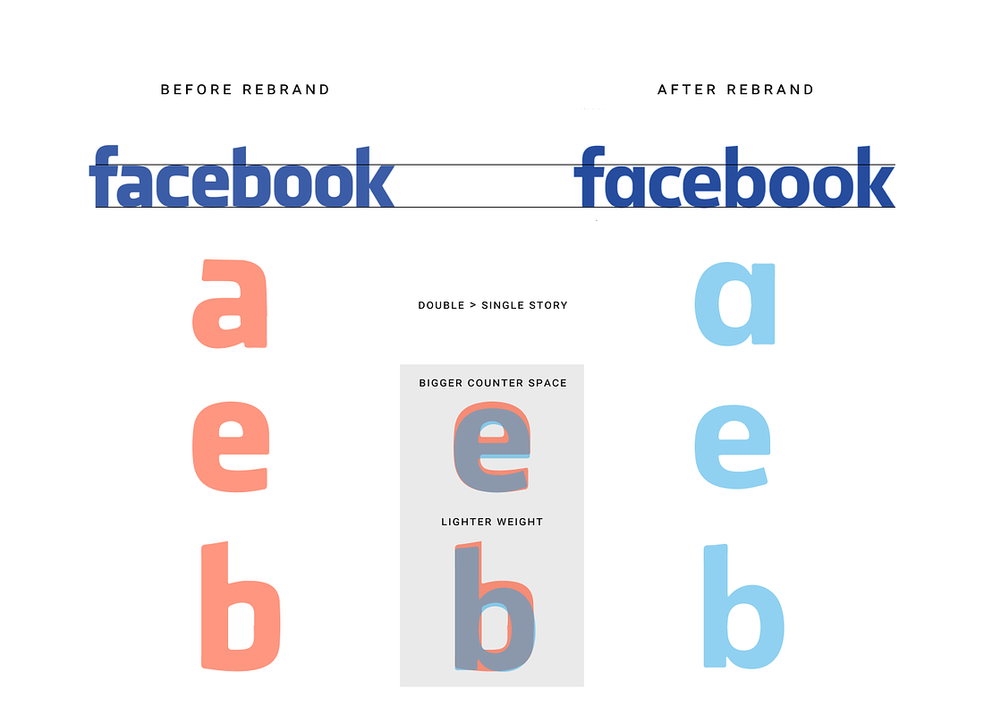
img: logotype difference after the 2015 rebrand
Branding Design Before & After
- “a” becoming a single story
- “O” became rounder
- Bigger counter spaces in letters
- More stroke variation, and lighter weight on the rebranded logo
From a Brand Designer’s Perspective
- A single-story “a” makes the logo design look more modern and friendly in a sans serif. Its calligraphic counterpart, the double-story “a” is considered a more traditional structure that adds a more serious tone to design.
- A more circular “O” can make the design appear friendly.
- When counter spaces are bigger, the logo font has more negative spaces. These negative spaces give the branding design more breathing room and make it approachable. The lighter weight also helps with this.
- Bigger counter spaces are also more mobile-friendly since the spaces won’t break down on smaller screens.
- Stroke variations make the font more humanistic - it reminds the audience of creation by the human hand through calligraphy.
Success?
In my opinion, this rebrand did a good job refreshing the Facebook brand, updating it to be mobile-friendly while retaining its original character. In addition, the custom logo font was optimized for mobile due to increased counter spaces. When the rebrand launched, the difference was small but noticeable, generating additional marketing buzz.
That’s it for now. Next week, we’ll go back to our regular Font of the Week Series. What do you think of this rebrand and our new series? let me know via comments!
If you enjoy this series, you can subscribe here:
Have more questions about design and fonts?
Please email me hua@typogram.co or find me on Twitter at @HuaTweets.
You can also read the past issues on Typogram's blog.
