FontDiscovery 🖼️ 54: A Excellent Font for Your Next Web App
I'm Hua, a designer and bootstrapping founder building Typogram, a brand design tool. As part of running Typogram, I create this digestible weekly guide with fonts, colors, and design ideas to help founders, creators, and makers step up their game in marketing and get creative!
Hi Everyone 👋
Welcome to issue 54 of FontDiscovery! I hope you had a wonderful weekend!Over the weekend, I pushed an update to our newsletter. I created an alphabetized glossary page of jargon buster terms, including the ones we have covered. I thought this might be handy for us to refer back for specific font-related terms. I plan to keep this page updated as we go, feel free to bookmark this page.
In This Issue…
- Font of the Week: Barlow
- Design idea: Branding Trends
- Color Inspiration: Mt.Fuji
img: sample of Barlow – Do you have a friend who could profit from the weekly design tips, just like you do? Please consider forwarding or sharing FontDiscovery with your friend by clicking on the button down below.
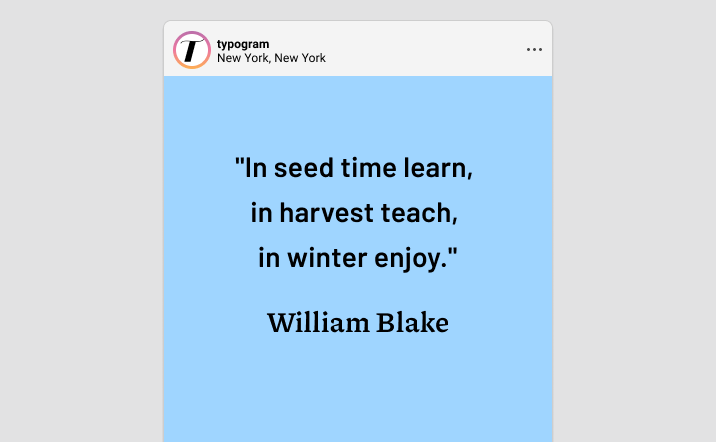
Font of the Week
About Barlow
Barlow is a practical sans serif with friendly quirks, perfect for startups.
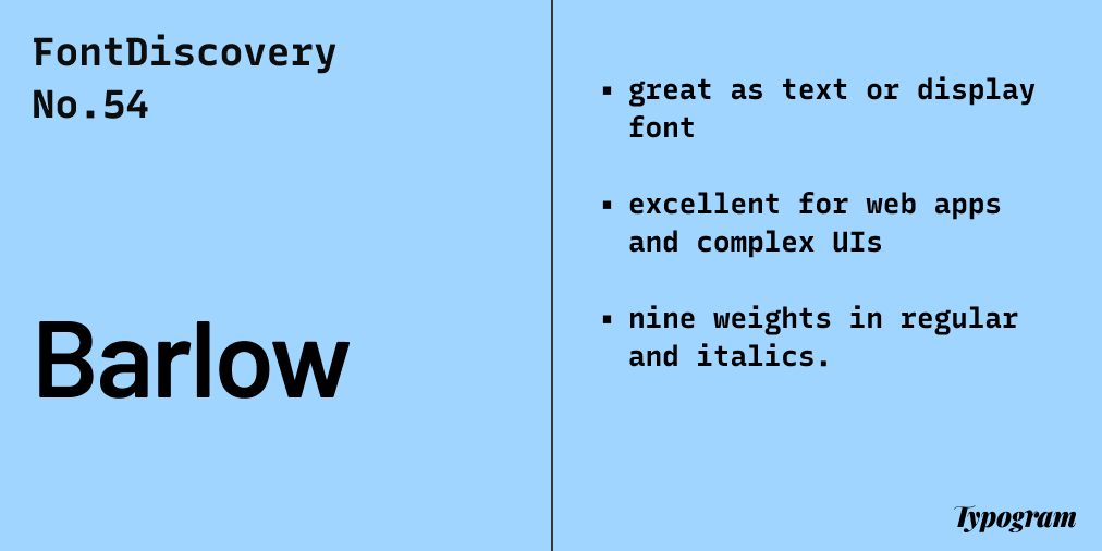
The California highway signs and buses inspired Barlow. Even though its style took a more practical approach, it still brings a sense of extra friendliness. It is a superfamily of fonts spanning across normal, semi condensed, and condensed versions, each with nine weights in regular and italics. By having so many weights and styles, Barlow is perfect for complex app interfaces.
Barlow belongs to a category of fonts known as Grotesque Sans Serif, one of the earliest sans serif styles to be popularized. Because of this, Grotesques usually have a lot of visual quirks. The term grotesque also became a synonym for sans serif.
Font Detail
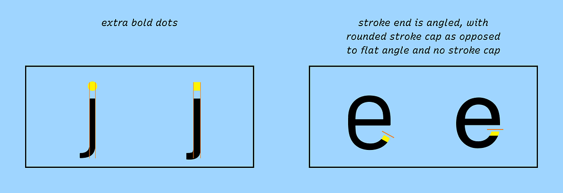
- Extra bold dots on “i” and “j”
- Slight stroke contrast
- Stroke end is angled, with rounded stroke cap as opposed to flat angle and no stroke cap
- Comes in regular and italic with nine weights. It also has Semicondensed and condensed versions.
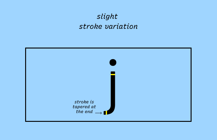
img: font details of Barlow
How to use Barlow for logo?
Barlow has a good balance of friendly and functional. It is excellent for tech companies looking to create logos communicating simplicity and warmth brand personalities. Medium, Semibold, and Bold are especially great for startup/business logos.
How to use Barlow for marketing and branding?
Due to its many weights and styles, Barlow is perfect for complex websites, app interfaces as text, or display fonts. Its multiple weights can support complex information hierarchies like text-heavy projects. Because this font is relatively neutral, you can use a serif, with more font personality, like Bluu Next, to spice it up or a more classic serif, like Cormorant Garamond, to stay objective.
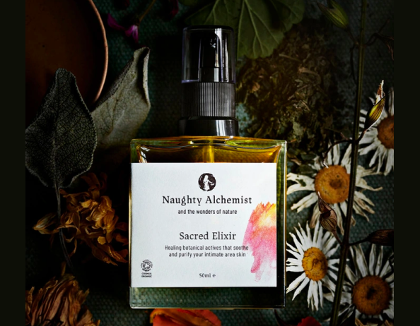
img: Barlow on Perfume packaging; source: FontsinUse
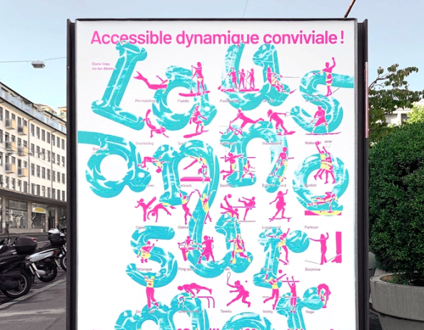
img: Barlow on a graphic poster; source: FontsinUse
Design Idea
Branding Trends
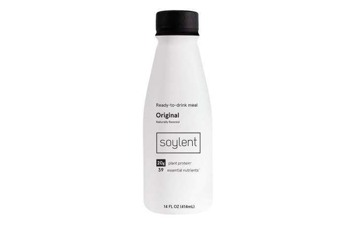
Companies go through rebranding to update or change the public’s perception of them. Last week, we talked about the rebranding of Facebook. However, have you ever noticed that there seems to be a trend among industries? In recent times, there is a trend of startups having minimalism branding, in which startups are seen increasingly with minimalist, sans serif branding. (Why is that? We’ll talk about it in one of our future branding posts : )
img: soylent is an example of lifestyle startups with minimalist branding; source: soylent
Color Inspiration
Mt.Fuji
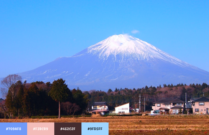
As winter is getting progressively colder, we share a color palette of the beautiful Mt.Fuji.
Crayola #709AF8 | Sakura #F3BCB9| Bark #462C2F | Pale Sky #9FD5FF
img: mt.fuji; source: wikimedia
Jargon Buster
Bracket
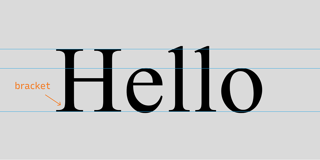
Bracket is the area where a serif and a stroke are connected.
img: bracketing in letters
Creative Prompt
Try making a marketing graphic with Barlow or with our color pallet this week!
Thank you
…for reading and hanging out here this week! Barlow is available on Google Fonts. It also has Semi Condensed and Condensed versions.
img: infographic of Barlow
**If you enjoy this series, you can subscribe here: **
