FontDiscovery 🖼️ 55: This Font is Perfect for Reading on the Web
I'm Hua, a designer and bootstrapping founder building Typogram, a brand design tool. As part of running Typogram, I create this digestible weekly guide with fonts, colors, and design ideas to help founders, creators, and makers step up their game in marketing and get creative!
Hi Everyone 👋
I hope you are having a great week so far. Welcome to another week of FontDiscovery!
Remember Coding Font? It is a project my co-founder Wenting and I launched a few months ago. Last week, we finally got the coding font blog up and running! In the first blog post, we wrote about our three top favorite coding fonts to increase productivity and decrease eye fatigue.
Without much ado, here is our issue!
In This Issue…
- Fonts: Zilla Slab
- Design idea: How to Moodboards
- Color Inspiration: Snowy Mountains
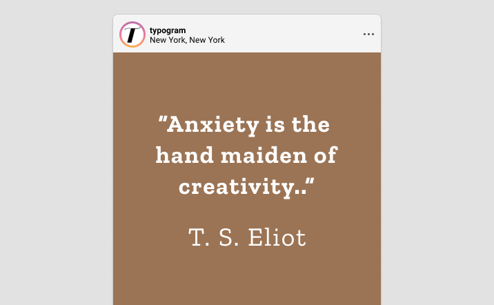
img: sample of Zilla Slab
Do you have a friend who could profit from the weekly design tips, just like you do? Please consider forwarding or sharing FontDiscovery with your friend by clicking on the button down below.
Font of the Week
About Zilla Slab
Last time we shared Barlow, an awesome font for body text. This week, we go over Zilla Slab. Like Barlow, Zilla Slab is also an extremely versatile font with several weights that work perfectly for any web project. In fact, Zilla Slab is Mozilla’s brand typeface, used in their branding, headlines, and throughout their designs. My favorite thing about Zilla Slab is that it’s beautiful and editorial, uniquely optimized for reading experiences on the web.
Zilla Slab is inviting, clean, and functional. It is a contemporary slab serif with a humanist influence, minimal bracketing, and a very pronounced serif. It has a highlighted styled, which is excellent for blogs and any website with lots of textual information.
Font Detail
- Pronounced serif
- Minimal bracketing, looking clean and crisp
- Five weights, two styles in regular and italic
- Hight light version
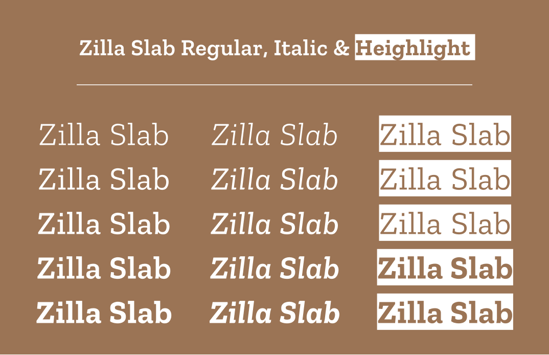
img: regular, italic, and highlight versions of Zilla Slab
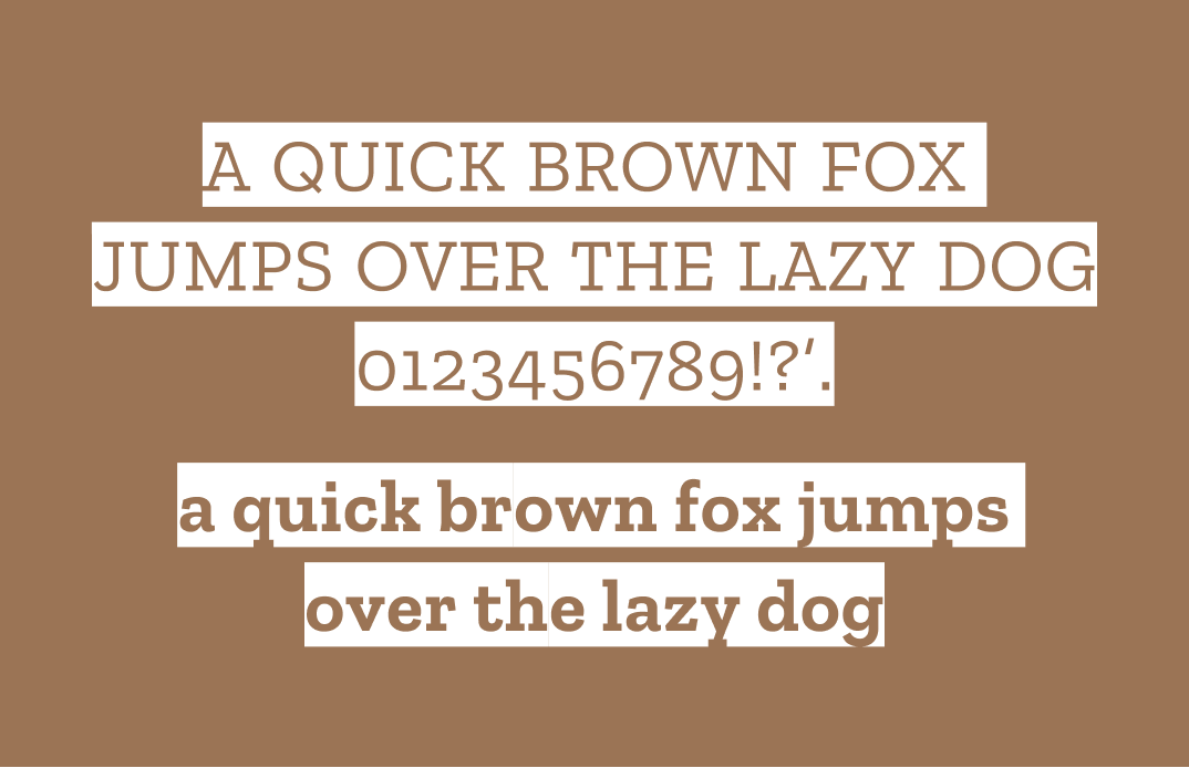
How to use Zilla Slab for logo?
Zilla Slab is clean and contemporary. The regular and bold versions are great for logos, especially for startup/tech blogs, or editorial projects. The highlight version can also be interesting to use.
How to use Zilla Slab for marketing and branding?
Zilla Slab can pair with sans serifs, like Barlow. Its italic is based on a cursive broad-nib writing style that doesn’t disrupt the reading flow. Zilla Slab also has a highlight style of font perfect for marketing copies. These design elements optimize the reading experience and make Zilla Slab great for web UI and marketing graphics.
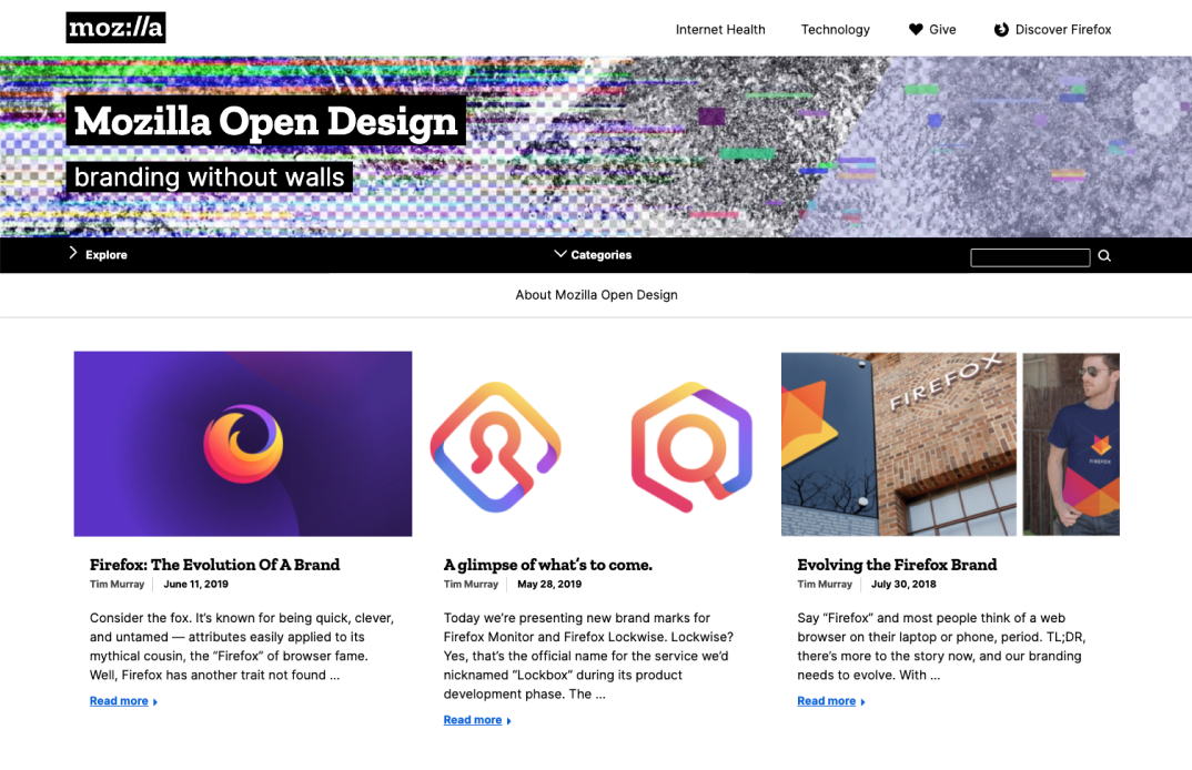
img: Zilla Slab being used on Mozilla’s website as logo and header font; source: Mozilla

Design Idea of the Week
How to Moodboard
A mood board is an intentional collection of visual materials and imageries that gives you ideas references and helps build your visuals idea, branding, and design projects. A visual library is good for several things:
- If you don’t know design, you can learn by looking at good examples
- Create a massive collection of design inspirations, learnings, references, and examples for you to experiment and remix for your projects.
- Discover new designers, references, and trends
- Develop the habit of looking at details
In this process, you can go as granular as you like. For example, suppose you are making a website. You can have a collection of general things like great landing pages examples and a collection of specific examples like landing page interactions, landing page copies, or landing page color palettes.
To learn design, we improve by looking at references- we need to train our eyes. We can understand and develop aesthetic vocabulary, find inspirations, and have better ideas about how design projects can evolve.
Color Inspiration
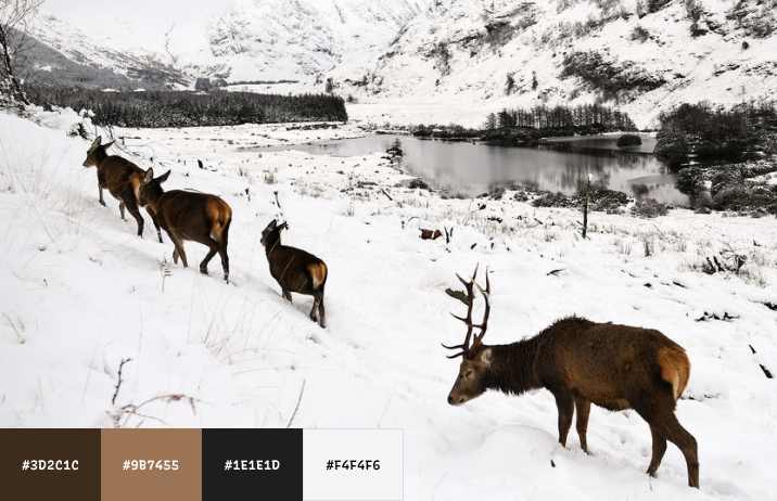
Snowy Mountains
As the weather gets colder, enjoy this winter landscape outdoor color palette as our color inspiration of the week! You can use this for your startup, branding, design, or web projects.
Chocolate #3D2C1C |Mocha #9B7455 |Raven #1E1E1D |Snow #F4F4F6
Jargon Buster
Counter
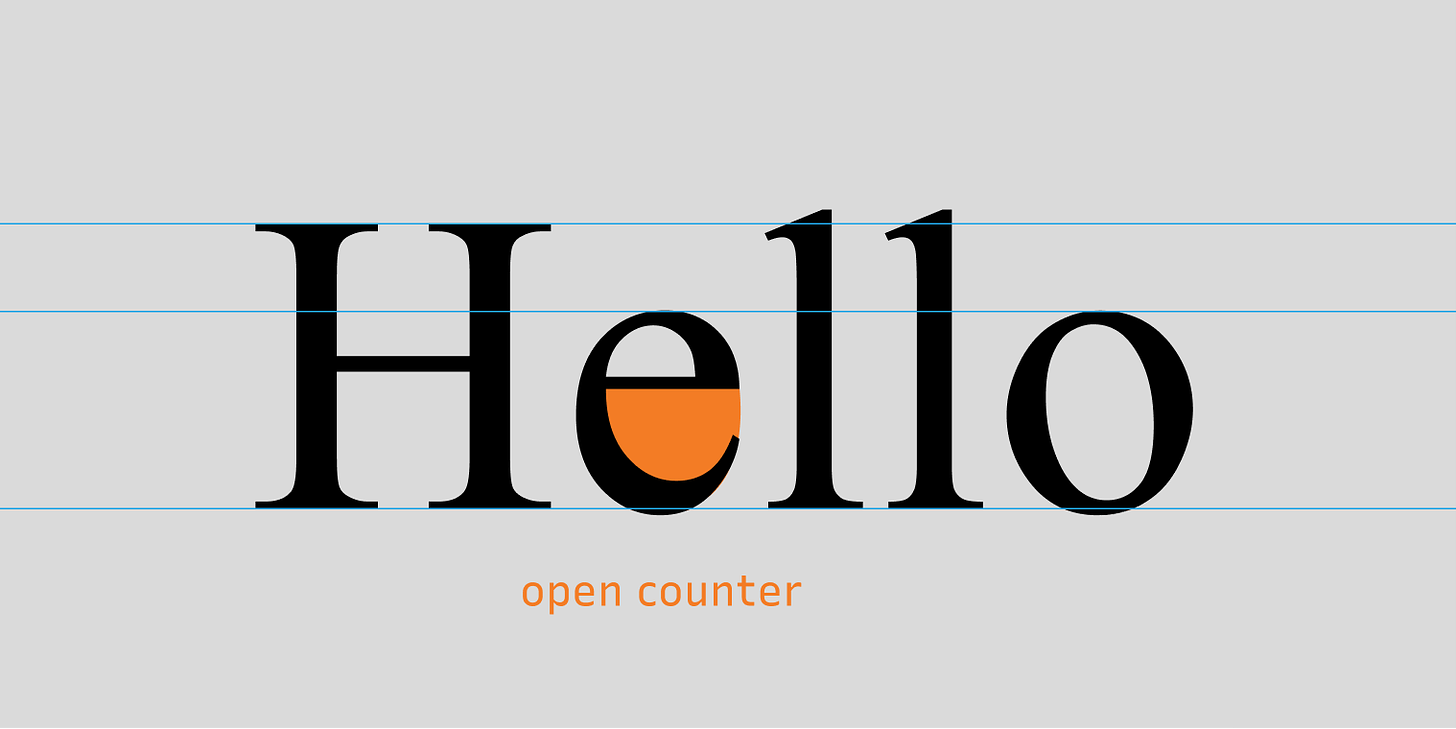
Counter is an area that is partially or entirely closed by other parts of the letters. There are two types, open and closed.
Open Counter
Open Counter is when the area is partially closed.
You can also check out the jargon buster glossary page.
Creative Prompt
Create a mood board with Zilla Slab!
Thank you
…for reading and hanging out here this week! Zilla Slab is available here.
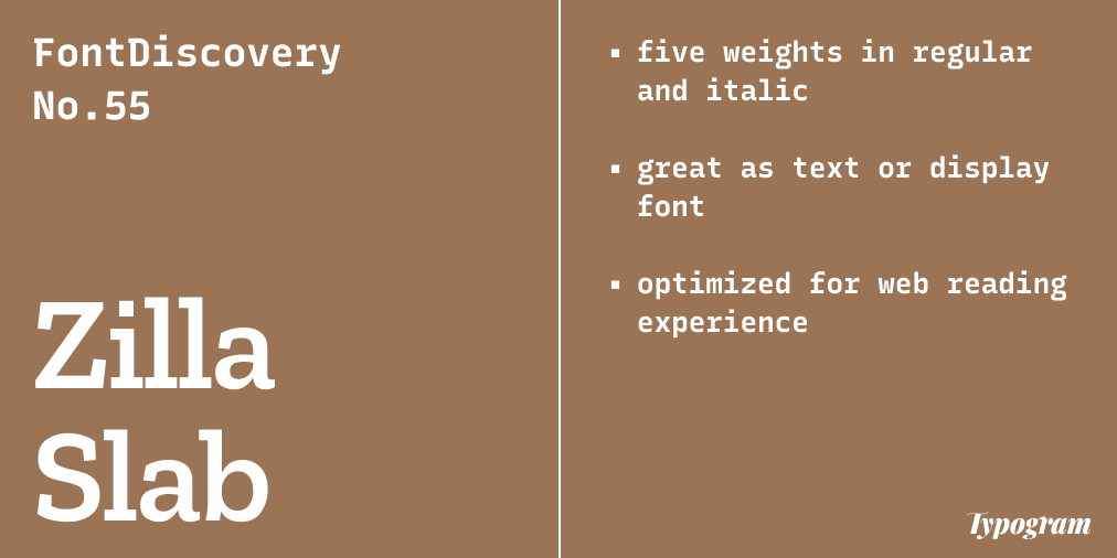
img: infographic of Zilla Slab
If you enjoy this series, you can subscribe here:
Have more questions about design and fonts?
Please email me hua@typogram.co or find me on Twitter at @HuaTweets.
You can also read the past issues on Typogram's blog.
