FontDiscovery 🖼️ 56: Use This Dainty & Eye Catching Font to Get Attention
I'm Hua, a designer and bootstrapping founder building Typogram, a brand design tool. As part of running Typogram, I create this digestible weekly guide with fonts, colors, and design ideas to help founders, creators, and makers step up their game in marketing and get creative!
Hi Everyone 👋
Happy Lunar New Year! This weekend, a huge snowstorm happened where I am. We haven’t had snow like this in a while so I was super excited. It kept me focused (by burying me inside the house) on the two main projects I have been working on: a preorder page for Typogram and on the next branding post for our series.
Also, I have a really exciting font to feature this week.
Let’s check it out!
In This Issue…
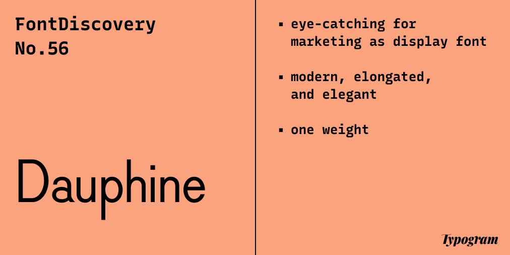
- Font of the Week: Dauphine
- Design idea: Landing Page Marketing Example
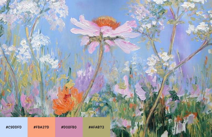
- Color Inspiration: Spring Flowers
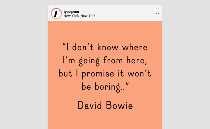
img: sample of Dauphine– Do you have a friend who could profit from the weekly design tips, just like you do? Please consider forwarding or sharing FontDiscovery with your friend by clicking on the button down below.
Font of the Week
About Dauphine
In the past two issues, we went over Zilla Slab and Barlow, both had font personalities that leans towards neutral. Today, we'll be looking at a more visual and graphic font with a more unique, tone appropriate for artsy and creative projects.
Dauphine is a very eye catching sans serif. It was inspired by letters from cartographies from the end of the nineteenth century to the mid-twentieth century created by French and American industrial designers and cartographers. It is condensed and elongated, looking elegant and dainty with geometric quirks.
Font Detail
- Consistent strokes
- One weight
- Elongated shape with geometric qualities
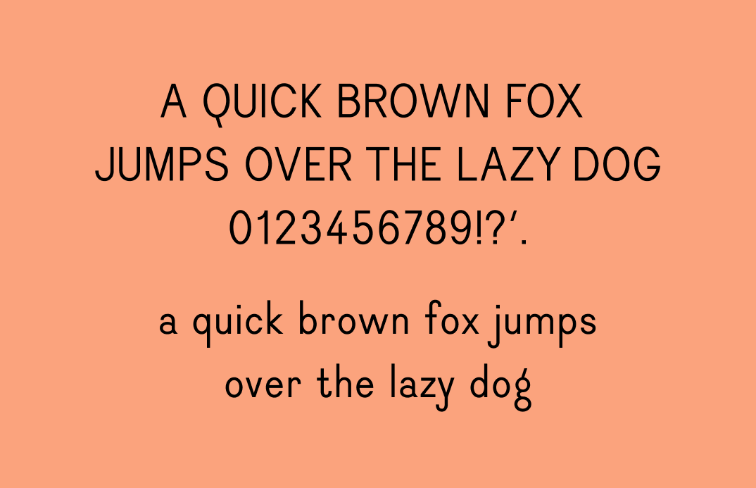
img: The character set of Dauphine
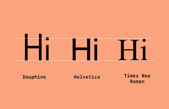
img: Compared to Helvetica and Times New Roman, Dauphine has a more elongated shape.
Specific Usage Tips
How to use Dauphine for logo?
Dauphine was the branding typeface for an art school (École Supérieure d'Art et Design) in France, which has open-sourced this font for projects. This font is perfect for marketing design, and brand kits that want some fun and extra attention. It is elegant and eclectic, combining geometric characteristics with its elongated shape, great for artsy and creative projects.
How to use Dauphine for branding and marketing?
This font can pair with Dosis. It is excellent for marketing graphics and display font on merch and other swag items.
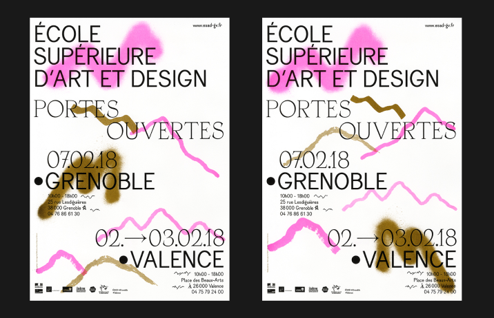
img: Dauphine being used on an art school poster; source: FontsInUse
Design Idea
Landing Page Marketing Example
As I have mentioned previously, a big project I have been working on recently is the launch of Typogram's pre-order page. I did a lot of research on what makes a good landing page that converts to users. This article is the best I found on this subject – it explains how to combine design and copy to make an effective landing page for your users. If you are making a landing page, I think you will find this helpful.
Color Inspiration
Spring Flowers
Cloud #C9DDFD|Soft Orange #FBA37D|Deep Pink #D08FB0|Muted Grass #AFAB73
Jargon Buster
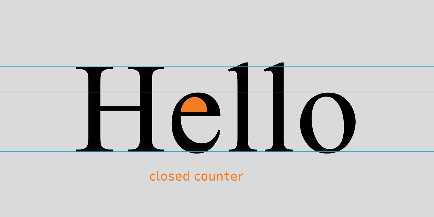
Counter
Counter is an area that is partially or entirely closed by other parts of the letters. There are two types, open and closed.
Closed Counter
Closed Counter is when the area is completely closed.
You can also check out the jargon buster glossary page.
Creative Prompt
Create something with Dauphine!
Thank you
…for reading and hanging out here this week! Dauphine is available here.
If you enjoy this series, you can subscribe here:
Have more questions about design and fonts?
Please email me hua@typogram.co or find me on Twitter at @HuaTweets.
You can also read the past issues on Typogram's blog.

Didn't understand much. But, totally worth reading.
thanks for your feedback and kind words, Atul! always looking to improve my content - what would make it easier to read?
It's not your fault, mate. You write this amazing post. I didn't understand because I am not much into design stuff. :)
haha, thanks for letting me know, Atul : ) feel free to ask me if you ever have questions about design stuff!
Yes, I will keep you in my mind!
Same exact feedback, I didn't understand much but looks really well though out, wish I knew more about typography to enjoy this content
thanks for your kind feedback, orliesaurus! I'm trying to improve this content - what specific thing about typography would be a good entry /starting point you'd like to learn more about?
I don't know specifically as I am not a font-expert, but I feel like there's too much to unpack from one of this threads for folks who aren't experts.
Maybe make it shorter and dumb it down in terms of language used.
ex typeface: what exactly is a typeface? a font?
ex brand kit: is this just brand guidelines?
thanks for your detailed feedback Orlie! it's super helpful - you having me a lot ideas!
I do have some posts on my blog similar to the ones you gave, but it's not part of the newsletter series I post every week. However, I think you hit a really good point - maybe I should include links to intro knowledge at bottom of these posts to make it easier to read, as well as writing a more generalized post about design knowledge to make it more friendly.
dimming down language is a challenge I'm trying to be better at, however, I always have trouble with it - what words/jargon/phrases stand out to you in this post? this feedback would help me a lot!