FontDiscovery 🖼️ 68: Use this Geometric Variable Font for Your Creative Projects!
I'm Hua, a designer and bootstrapping founder building Typogram, an easy logo design and editing tool. We just launched our pre-order. As part of running Typogram, I create this digestible weekly guide with fonts, colors, and design ideas to help founders, creators, and makers step up their game in marketing and get creative!
Hi Everyone! 👋
I hope you had a fantastic weekend! This week I am working on a premium blog post for codingfont. As I have mentioned last week, one of the goals I have is to improve our content on the blog and on FontDiscovery in the next few months. This post will be the first experiment, and I'm excited to share more next week 🙌
Today, enjoy this popular post on the font Jost from our archive, an incredibly useful geometric font for your creative projects.
img: sample of Jost

Do you have a friend who could profit from the weekly design and font tips, just like you do? Please consider forwarding or sharing FontDiscovery with your friend by clicking on the button down below.
From Futura to Jost
We can’t talk about Jost without mentioning Futura. Futura is a Bauhaus-inspired geometric sans serif. Bauhaus is an influential art and design movement that embraced simplicity, bold lines, and geometric shapes. Futura exhibits these qualities through its letterforms. The circular letters, like "O", and triangular letters like "A" are nearly perfect. The strokes making up the letters have very little contrast, much like bold, solid lines of Bauhaus.
Jost is inspired by Futura but designed with the digital era in mind. It retained the geometric qualities and added additional design elements, such as the contrast in thick and thin strokes, for more favorable usability on digital screens.

img: left– The commemorative plaque for the 1969 moon landing is typeset in Futura. source: NASA. right–movie poster for 2001: a space odyssey typeset in Futura
Font Details
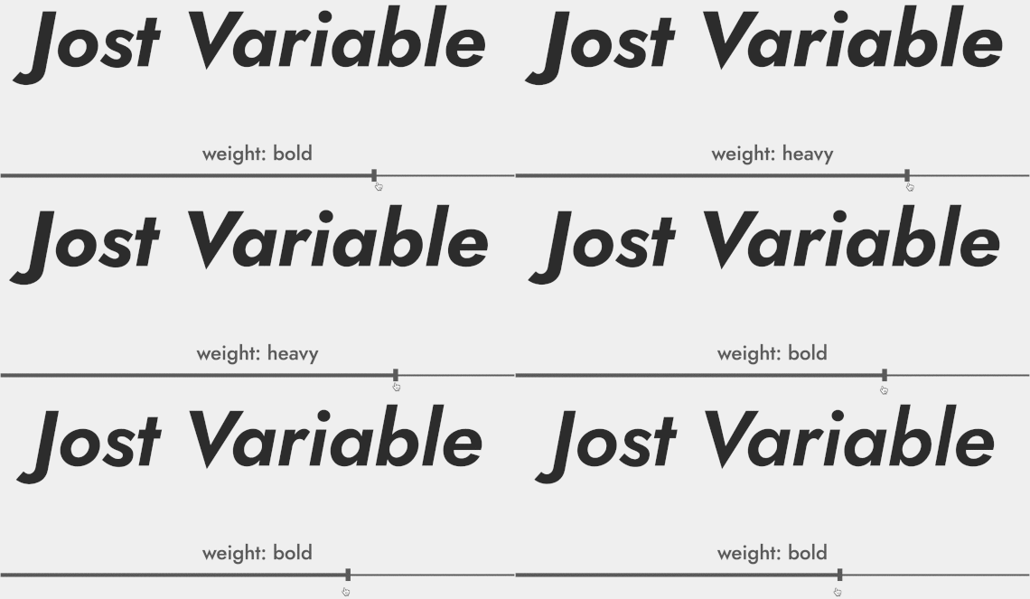
Jost is highly geometric, like Futura. If you look at the “O”, it’s almost a perfect circle. In addition, Jost has alternate style characters for the letter "a" to give you more options when creating logos. It is also under active development as a variable font, a cutting-edge font technology where you can store multiple variations of a type family into a single font file.
img: left – O’s in Jost are nearly perfect circles. right – “a” is available in both single-story and double-story styles.

img: Jost variable font version. You can interpolate weight and italic slant so you can choose the amount of bold and slant in the letters. This is supported on most browsers. source: https://indestructibletype.com/Jost.html.
How can we use this for logo and branding?
There is friendliness and perfection to this font. The nearly perfect geometric shapes like “O” give it extra wholesomeness and joy. It is excellent for a brand that looks to be happy and cheerful.
How can we use this for marketing?
The Light and Regular weights of Jost are very lovely. It can be fun to use the Light or Extra Light in large sizes for emphasis in your marketing graphics.
Jost's many weights also make it a good candidate for many different types of projects. It can support a more complex information project, like a landing page. If you are thinking about using Jost for text-heavy projects, be mindful that the more geometric aspect of Jost will jump out of the page occasionally.
img: an example of combining different weights of Jost

Quick overview
⭢ Font Details
- Alternate lowercase “a”
- Long ascenders and descenders
- Interrobang (maybe you can find an excellent way to use it in your brand?)
- Variable font available
img: interrorbang is an unconventional punctuation mark that combines question mark and exclamation mark
⭢ Logo & Branding
- This font is cheerful. Its geometric shapes jump out at you.
- It's perfect for a brand that emphasis on shapes, modernity, and happiness.
⭢ Typography System(marketing, presentation, and website)
- Have enough weights to support more complex projects
- It can pair with Source Serif Pro or Piazzolla

Cautiously avoid
Making line-height too tight. Jost has large ascenders and descenders and will look much better with relaxed line-height.

img: ascender and descender of letters
Creative prompt
Can you create a visual using Jost?
Phew, you made it.
Jost is available here.

If you enjoy this series, you can subscribe here:
Have more questions about design and fonts?
Please email me hua@typogram.co or find me on Twitter at @HuaTweets.
You can also read the past issues on Typogram's blog.
