FontDiscovery 🖼️ 71: A Kooky Script to Catch Eyes
I'm Hua, a designer and bootstrapping founder building Typogram, a brand design tool. As part of running Typogram, I create this digestible weekly guide with fonts, colors, and design ideas to help founders, creators, and makers step up their game in marketing and get creative!
Hi Everyone 👋
Hope you had a nice weekend. This week we feature langar, a script font we have featured in the past. I also just launched a complete revamp of the Typography Jargon Buster series on Typogram's blog with interactive examples!
✨ Check it out 👉 Brand New Typography Jargon Buster! ✨
In This Issue…
- Font of the Week: Langar
- Design idea: Variable Icons
- Color Inspiration: Spring Sakura
Do you have a friend who could profit from the weekly design tips, just like you do? Please consider forwarding or sharing FontDiscovery with your friend by clicking on the button down below.
Font of the Week
About Langar
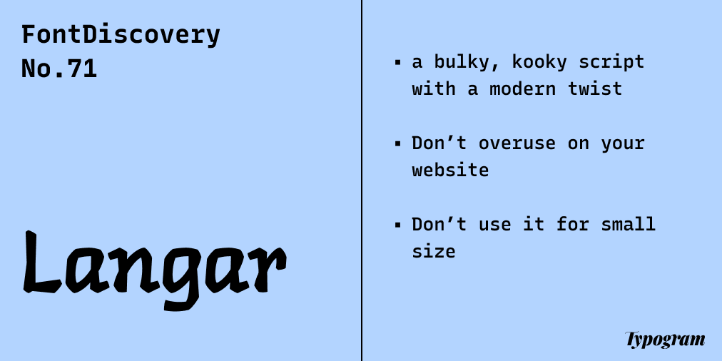
Langar is a script font and carries on a modern, kooky tone. In general, script fonts are deeply personal. They are digitized versions of handwriting and bring a personal touch. In the olden days, people wrote calligraphy with a nibbed pen, so most of the scripts were thin and elongated. Some are elegant. Some are crisp and sharp, and some are vintage and decorative.
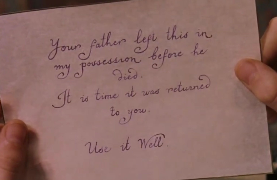
Dumbledore’s magical script from the movie, Harry Potter
However, Langar looks as if it's written with a thick marker (It takes inspiration from Gurmukhi), which is uncommon compared to the more traditional scripts. All of this tells you Langar is a little bit of contemporary hodge-podge. It's kooky and bold (notice how thick Langar's strokes are, compared to Zapfino, a popular elegant script).
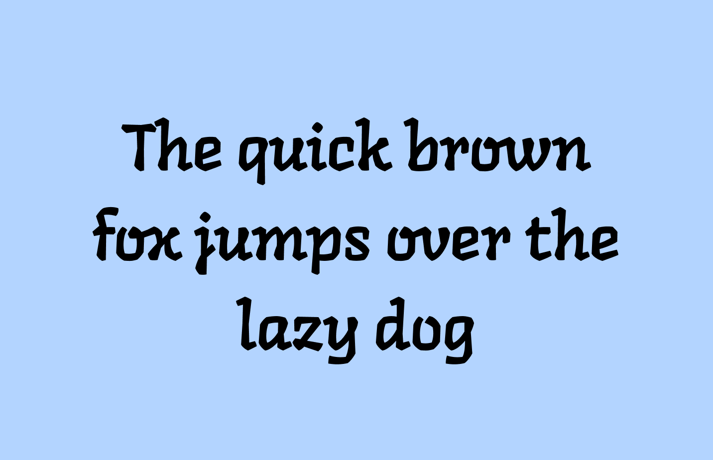
Langar is single weight
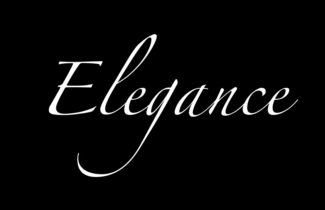
Zapfino is a very popular script you’ll find on lots of Birthday cards
Font Detail
- Casual script with calligraphic and modern influences
- One weight
Specific Usage Tips
How to use Langar for logos?
Use cautiously. Casual, bold, and kooky means this speaks to an alternative, younger, and bold audience. Is this your target audience?
How to use Langar for marketing and branding?
It is ok to use Langar for header-level information. But remember, Langar will always add a tone of bold and kooky. The strokes are also very thick, so best to be used in large sizes. Langer is not something that should be used everywhere on your site. When everything is bold and kooky, it can get overwhelming for a user. Please don't use this font for body or UI text -- it is not suited for small sizes.
Design Idea of the Week
Variable Icons
Recently, Google completely revamped its material icons with Variable Font technology. Variable Font is a font technology that allows a font to “generate” infinite weights and styles based on predefined parameters by its designers.
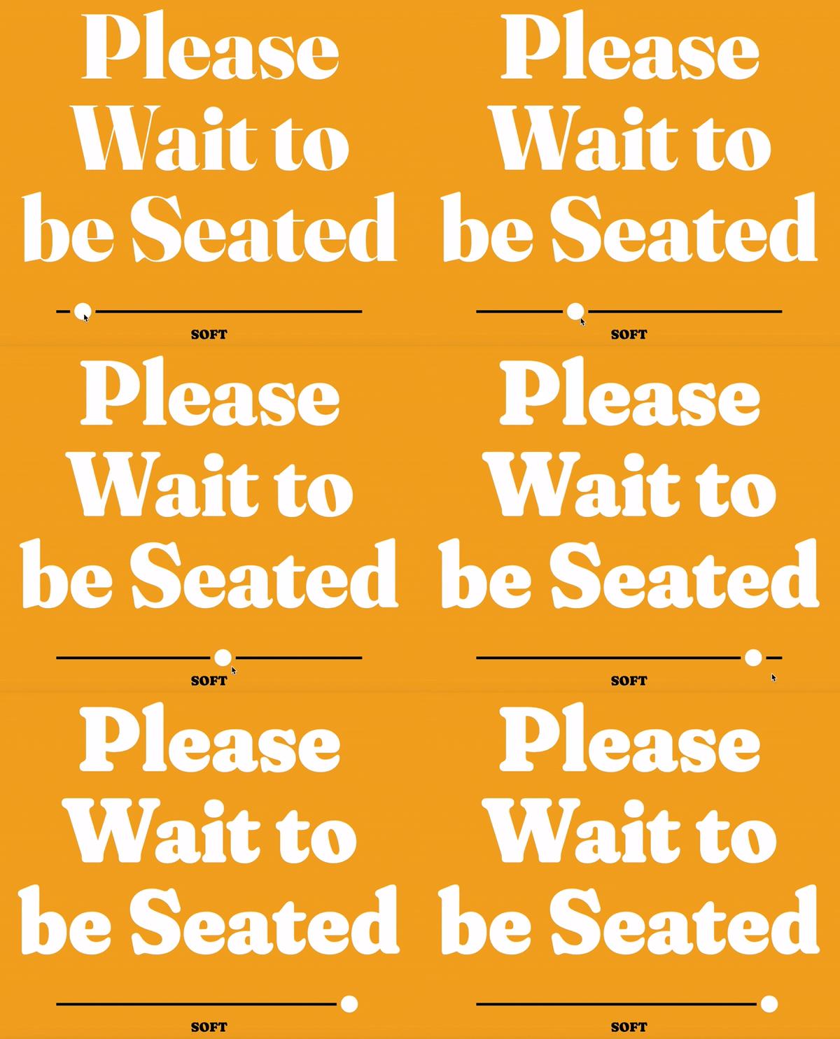
Usually, if you select a font, you will often have limited weights, such as “regular” and “bold.” With Variable Font, you can have infinite choices for things like weight, slant, and even styles. This is very useful for icons. When you download a new icon to fit into an existing set, sometimes you need to spend time tweaking it to make sure the new icon blends in. With icons created by variable font technology, this manipulation gets easier. You can also use this technology to animate icons. If you want to learn more about the tech side of Variable Font, check out this blog post from my past project, Anicons.
Color Inspiration
Spring Sakura
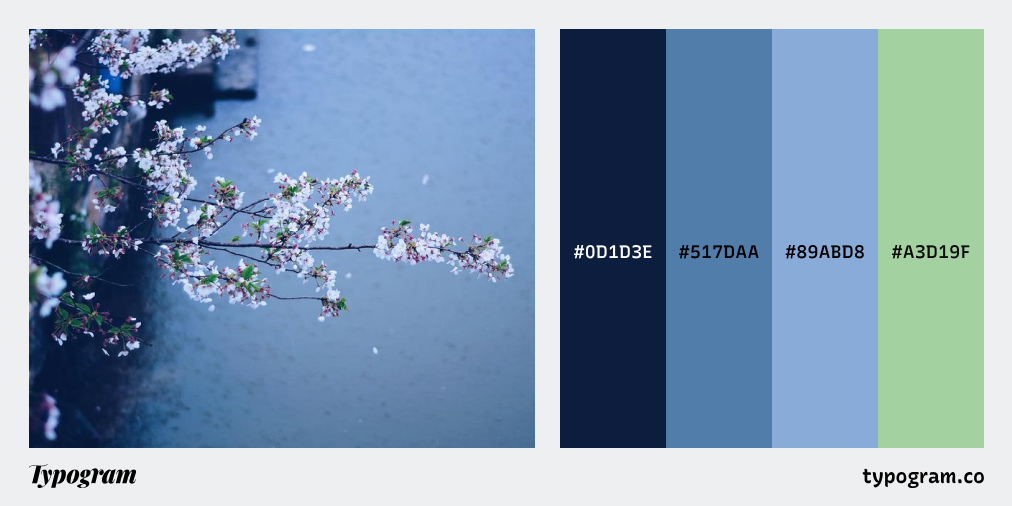
This week, enjoy this color palette from late bloom cherry blossoms.
Navy #0D1D3E | Steel #D9BFE2 | Cornflower #F5C387 | Granny Smith #A3D19F
Creative Prompt
Create something with Langar!
Thank you
If you enjoy this series, you can subscribe here:
Have more questions about design and fonts?
Please email me hua@typogram.co or find me on Twitter at @HuaTweets.
You can also read the past issues on Typogram's blog.

Love this digest format! Packed with really useful tips and insights. I've subscribed to get more :) Thanks for sharing.