FontDiscovery 🖼️ 74: A Graceful Slab Serif Font For Your Branding Projects
I'm Hua, a designer and bootstrapping founder building Typogram, a brand design tool. As part of running Typogram, I create this digestible weekly guide with fonts, colors, and design ideas to help founders, creators, and makers step up their game in marketing and get creative!
Hey Everyone!
Hope you had a good week!
Last week we launched Symbols to Copy. It was featured in the Hustle Newsletter and several other big newsletters. If you are like me and always wasting time searching for tricky symbols, it might be useful!
I was also interviewed by the no-code community, Makerpad. In the interview, I shared the story about Typogram and how we use no-code tools in our startup. Check it out if you feel like!
This week, we feature a brand new font, Josefin Slab. Let’s get to it! ★
In This Issue...
- Josefin Slab
- Serifs Styles You Must Know To Improve Your Design
- Color Inspiration of the Week: Baroque Palette
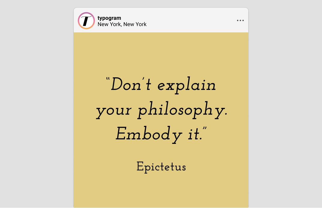
Sample of Josefin Slab
Font of the Week
About Josefin Slab
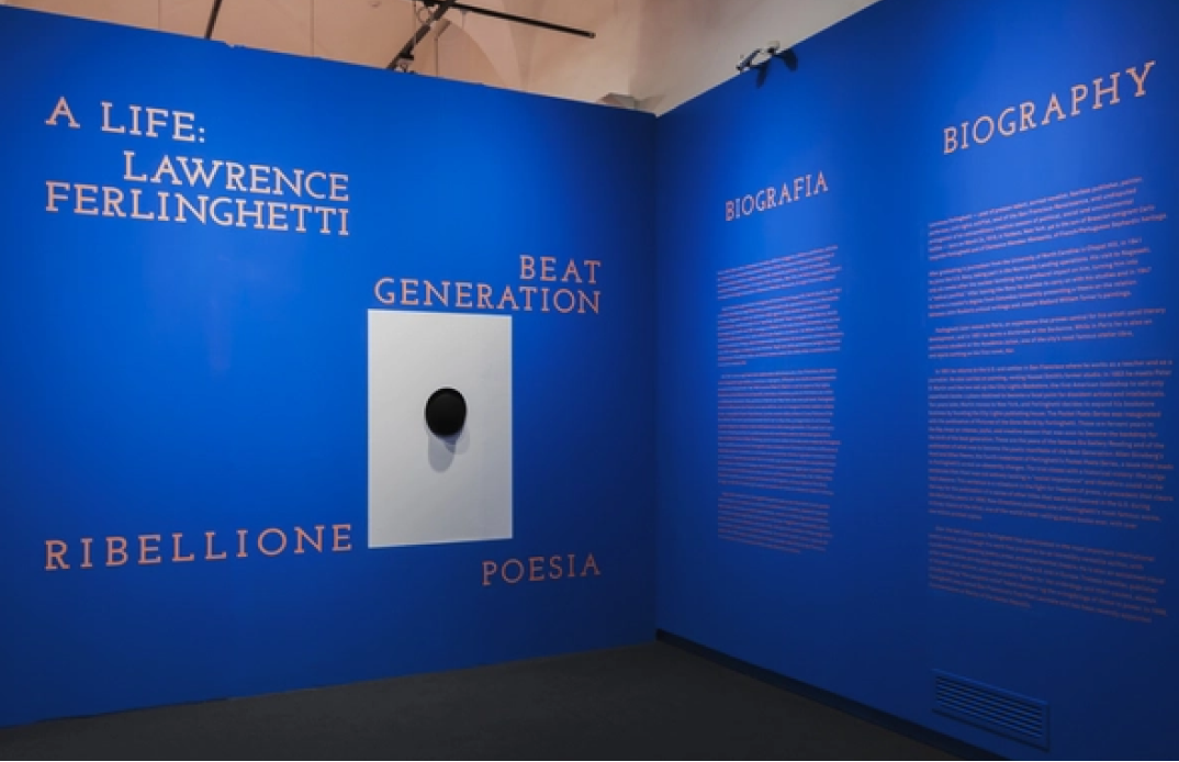
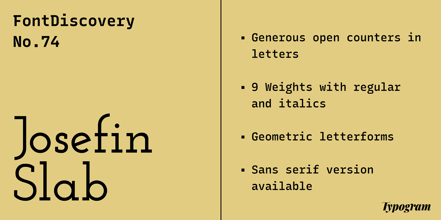
Josefin Slab is a delicate, elegant slab serif perfect for speaking in an elegant tone. A slab serif is a serif font with large, block-like serifs.
Compared to Zilla Slab, a slab serif we have featured in the past, Josefin Slab is more dainty and graceful. Visually, its letter shapes are geometric rather than calligraphic. They are representations of beauty ideals like the perfect circle, giving Josefin Slab an extra vibe of classicalness. In addition, large open counters in lowercase letters signify an easiness and grace.
Font Details
- Generous open counters in letters, like “f” and “g”
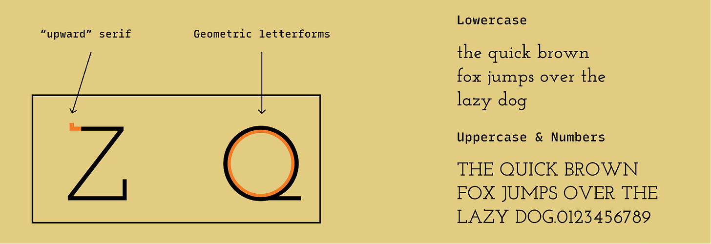
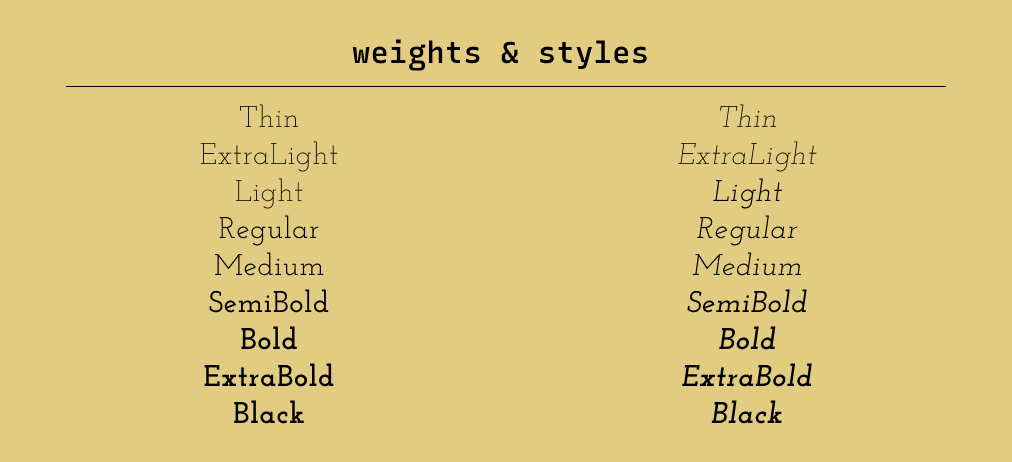
- Nine Weights split with regular and italic versions
- Geometric letterforms
- Sans serif version
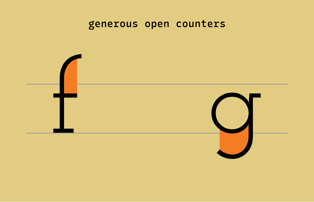
Type details of Josefin Slab
Different weights of Josefin Slab
How to use Josefin Slab for Logo?
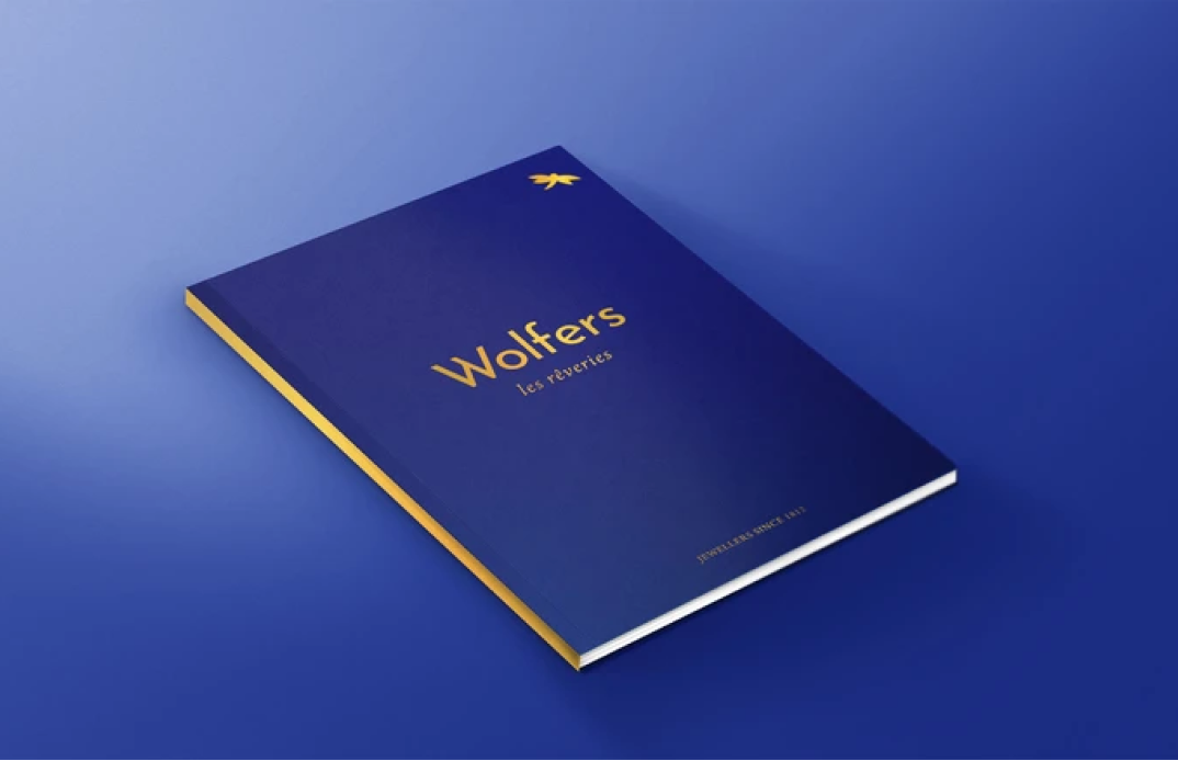
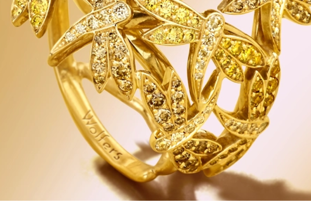
Josefin Slab is perfect for logos looking to appear elegant. Avoid using lighter weights. Use Bold Weights starting from SemiBold so that the shape of letterforms doesn’t break under small scales.
How to use Josefin Slab for Marketing and Branding?
Design Idea of the Week
Interactive Typography Jargon Buster: Serifs Styles You Must Know
The newest typography jargon buster is out!
x-ray effect to illustrate our serif terms

Color Inspiration of the Week
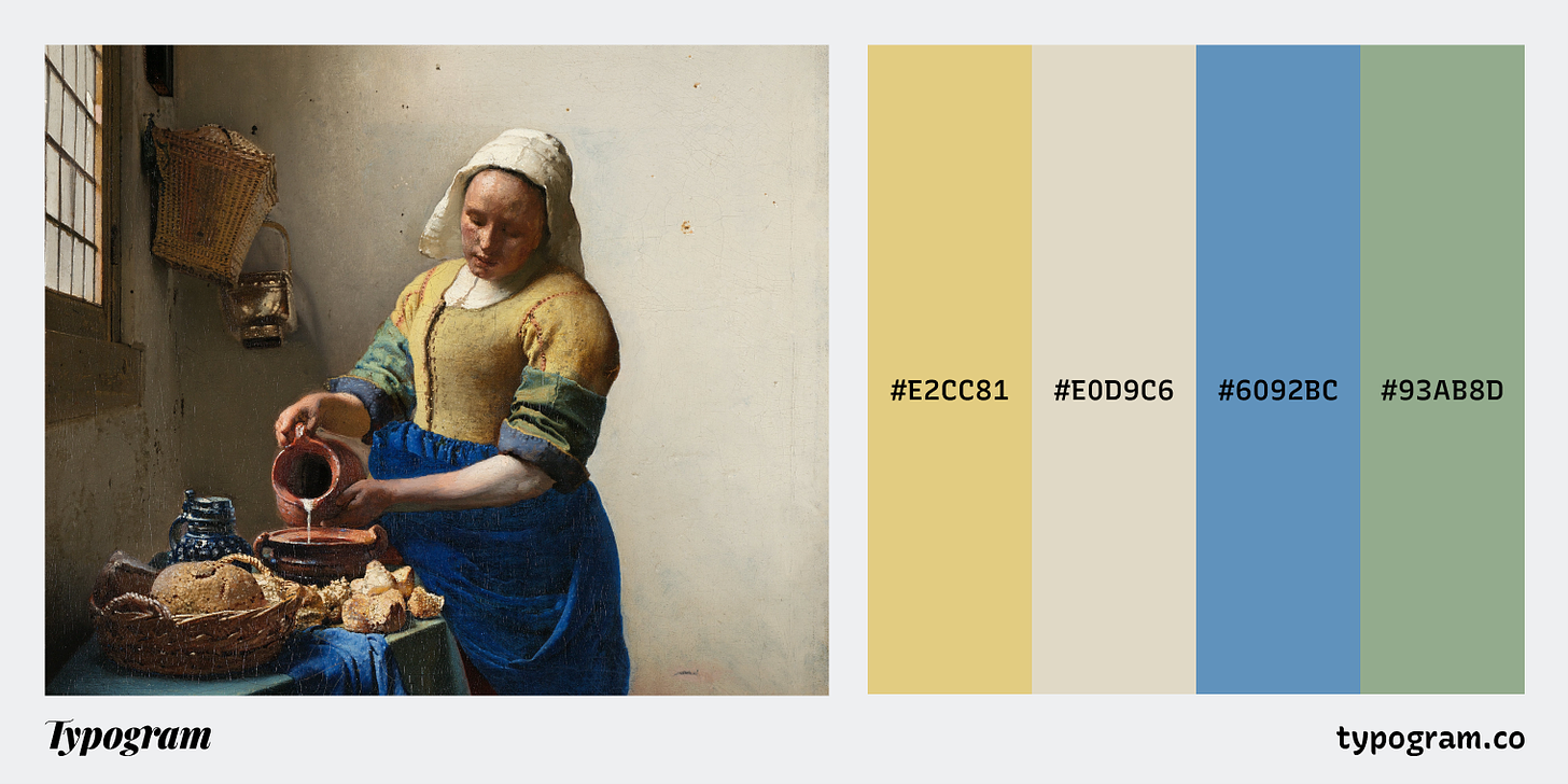
Baroque Palette
The MilkmaidJohannes Vermeer
Mellow #E2CC81 | Beige #E0D9C6 | Carolina #6092BC | Sage #93AB8D
Creative Prompt
Create something with Josefin Slab!
Thank you
If you enjoy this series, you can subscribe here:
Have more questions about design and fonts?
Please email me hua@typogram.co or find me on Twitter at @HuaTweets.
You can also read the past issues on our brand new archive!.
