FontDiscovery 🖼️ 84: Trick Eyes with this Font
I'm Hua, a designer and bootstrapping founder building Typogram, a brand design tool. We just launched our pre-order, check it out!⭐
In This Issue…
- Font of the Week: Fast One
- Design idea of the Week: What is DALL-E?
- Color Inspiration of the Week: Grand Canyon
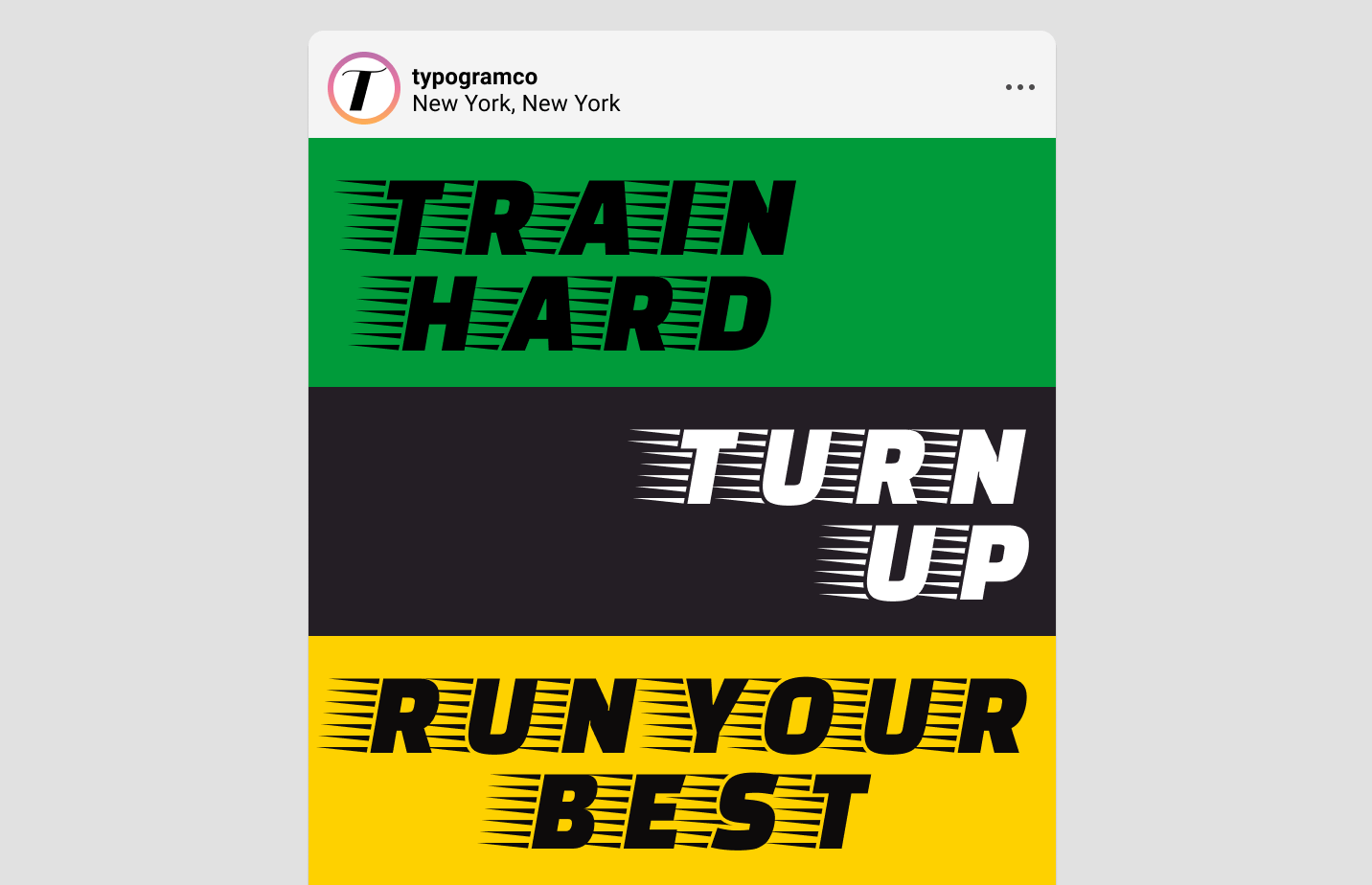
Sample of Faster One
Do you have a friend who could profit from the weekly design tips, just like you do? Please consider forwarding or sharing FontDiscovery with your friend by clicking on the button down below.
Font of the Week
The Speed of Technology
Before personal computers revolutionized the desktop publishing industry, phototypesetting. was a popular method that publishers used to generate text. Phototypesetting used the photographic process to generate text on a scroll of photographic paper. Before this, people were using a heavy and challenging process called hot metal type. This new method enabled people to get creative, which led to many decorative and “experimental” fonts.
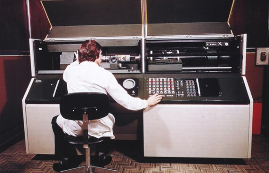
A phototypesetting machine being operated
About Fast One
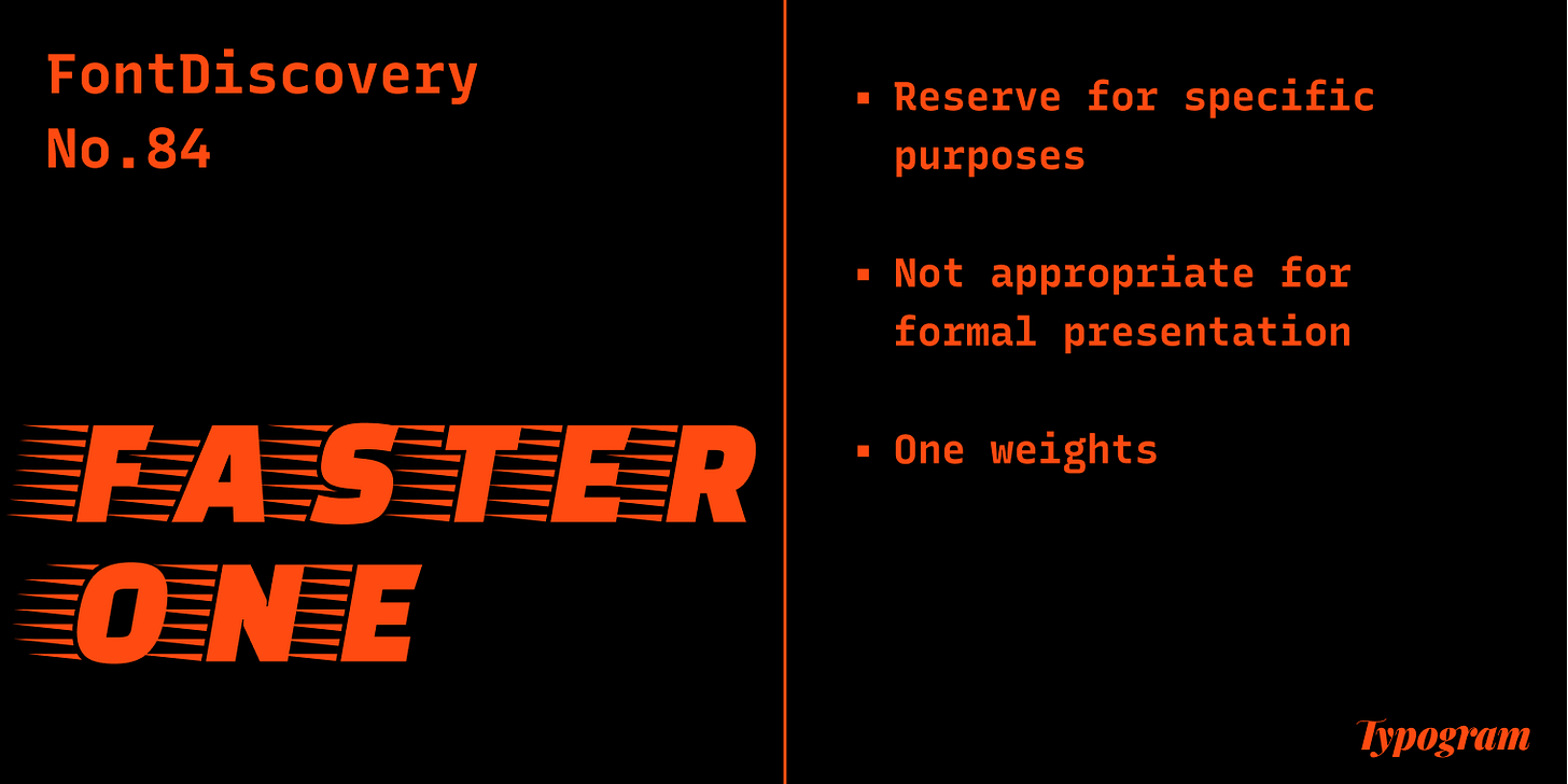
The style of Faster One is influenced by this era. Faster One is a display font, meaning it is better for flashy purposes, like Bungee we profiled a few issues ago. If we look at this font carefully, we'll notice that the letterforms are very thick. Bold shapes communicate strength and energy. Looking at spaces inside the letter O, we'll notice it is more "square" than "round." This gives the font additional balance and adds a touch of strength and power. The decorative lines simulating velocity also add a hint of humor and kitsch. There is almost a superhero vibe about it.
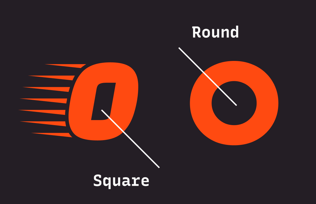
Space inside the letter O; left – Faster One, square; right– Futura, round
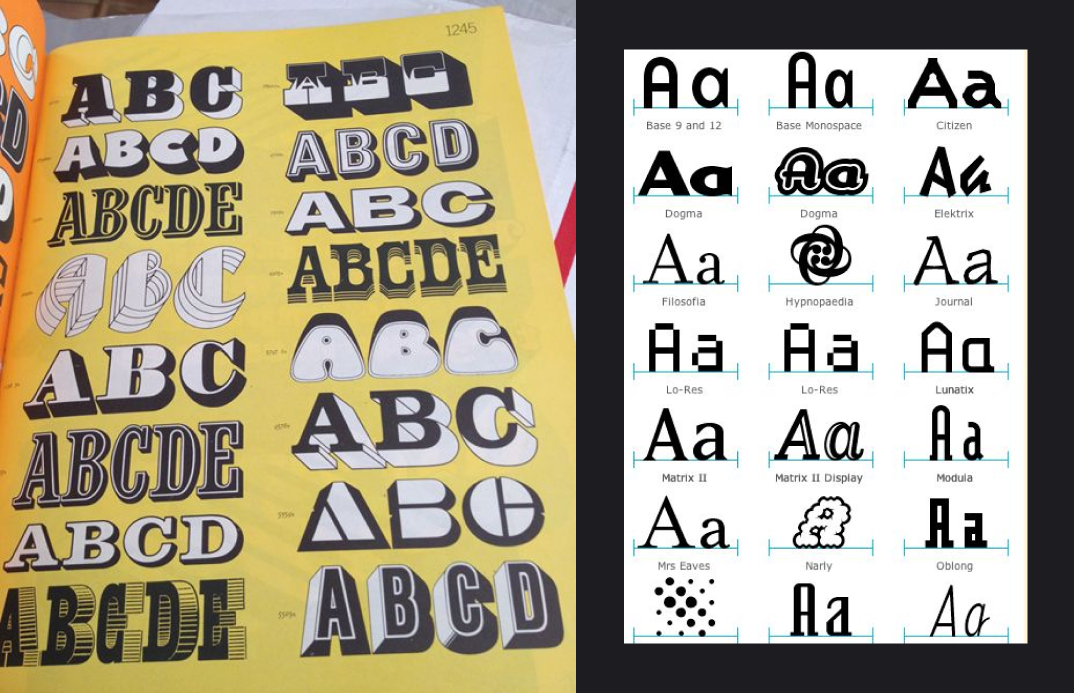
Left – phototypesetting fonts; right – digitalized fonts inspired by left
Should I use Faster One for Logos?
I would use this font for a very appropriate brand, like athletic apparel or streetwear. Faster One does have a fascinating character that can be fun for decals, streetwear, packaging, or anything with a more "graphic" purpose. It’s more for statement-making, rather than displaying long quotes and large bodies of text. It is definitely not for a serious presentation.
How to use Faster One for Marketing Branding?
This is a display font. Use for showy purposes only, like social media.
Cautiously Avoid
Any long text or quotes. This font is hard to read in paragraphs
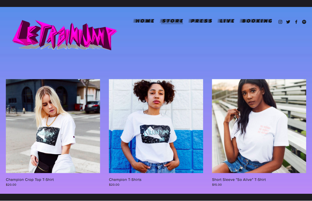
Faster One used as the menu font on a streetwear site
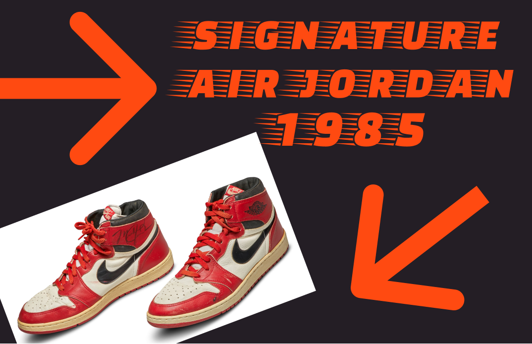
A fun graphic using Faster One for Air Jordans
Design Idea of the Week
What is DALL-E?
If you have paid attention to tech blogs and forums lately, you might have heard of DALL-E. With a name inspired by the famous surrealist artist, Salvadore Dali, DALL-E is trained to generate images from a text-based description input, and people have been creating crazy visual results with it. Learn more about it here.
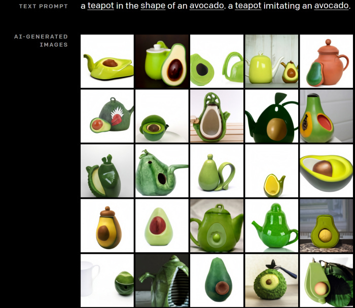
“A teapot in the shape of an avocado“ generated by DALL E; source: Medium
Color Inspiration of the Week
The Grand Canyon
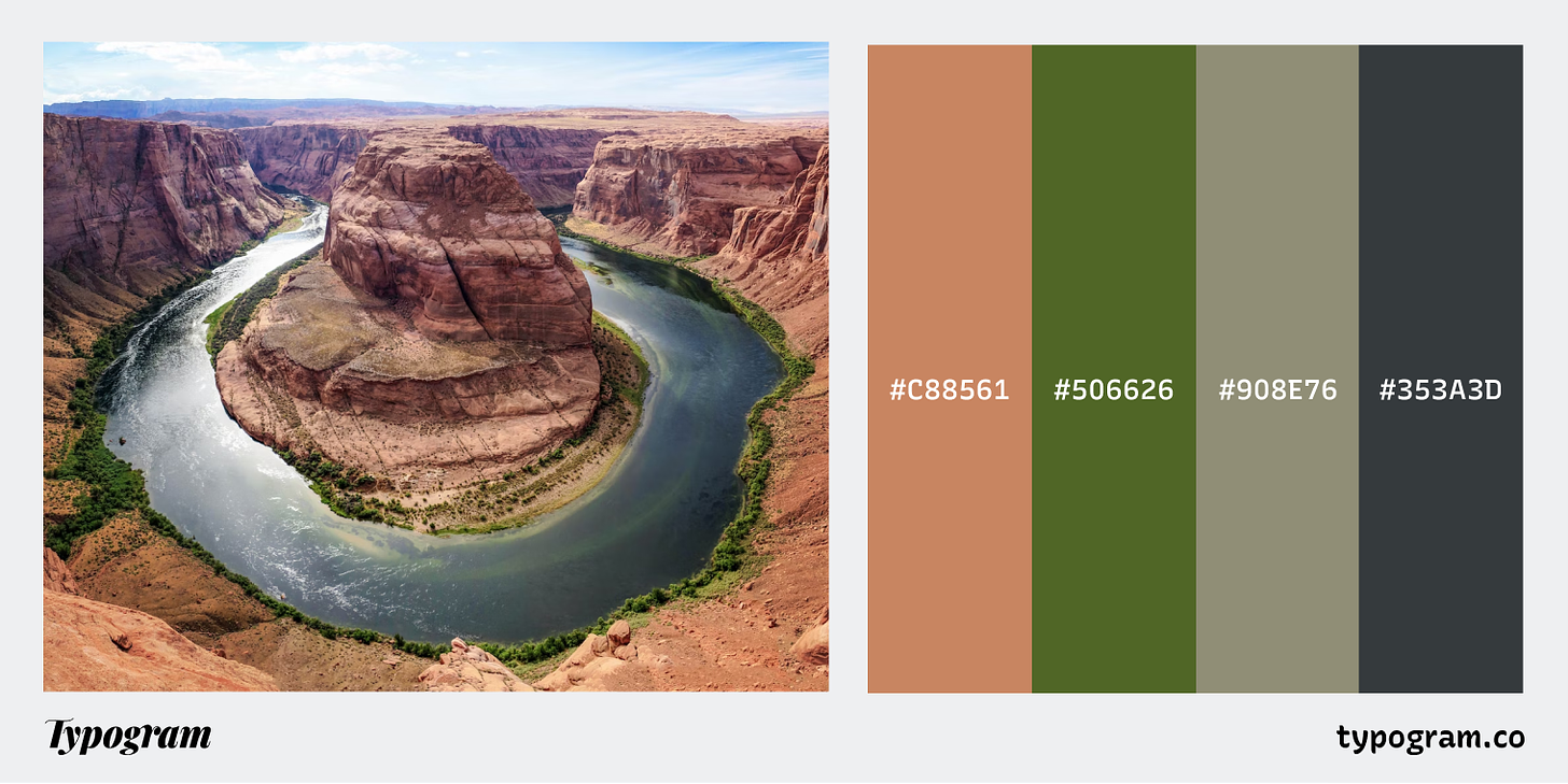
This week, enjoy this beautiful earthy color palette from Grand Canyon!
Soft Brick #C88561 Pine #506626 Sage #908E76 Charcoal #353A3D
Creative Prompt
Create an Instagram graphic with Faster One and see what happens.
Thank you
…for reading and hanging out this week! Faster one is available here.
If you enjoy this series, you can subscribe here:
Have more questions about design and fonts?
Please email me hua@typogram.co or find me on Twitter at @HuaTweets.
You can also read the past issues on our brand new archive!.
