FontDiscovery 🖼️ 88: Improve Reading Experience for Your Users with this Font
I'm Hua, a designer and bootstrapping founder building Typogram, a brand design tool. We just launched our pre-order, check it out!⭐
Hi Everyone 👋
Hope you had a fantastic week! Last weekend I took a nice walk by the waterfront. Sometimes when I work I get into a super hermit mode where I don’t like to go out very much. I wonder if this is true for everyone, or if it’s just me being an introverted person. If you work from home, I would love to hear what you do.
Recently, we posted our end-of-summer product update sharing what we are working on for Typogram. If you are curious, you can check it out here.
Here is our issue this week!
In This Issue…
- Font of the Week: Bitter
- Design idea: The Art of Asking Questions
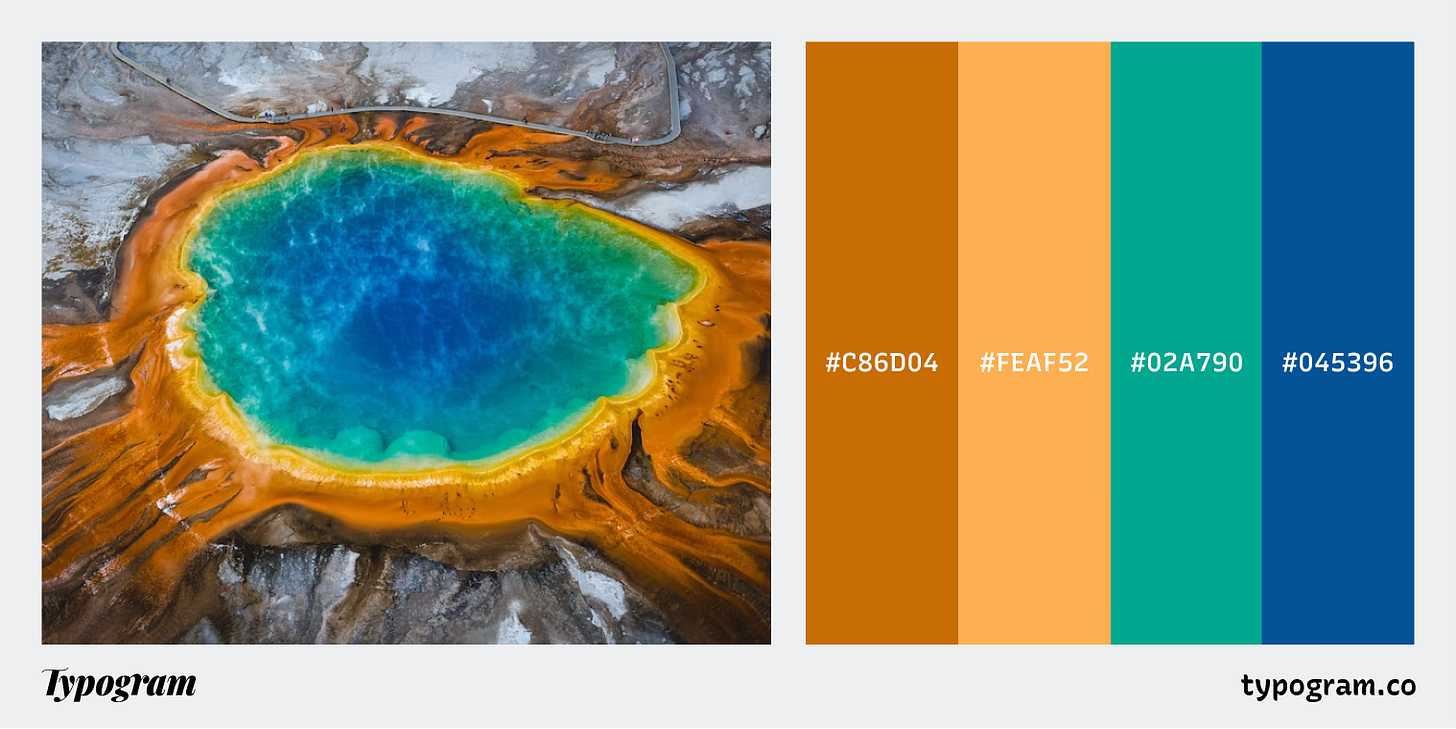
- Color Inspiration: Yellowstone National Park
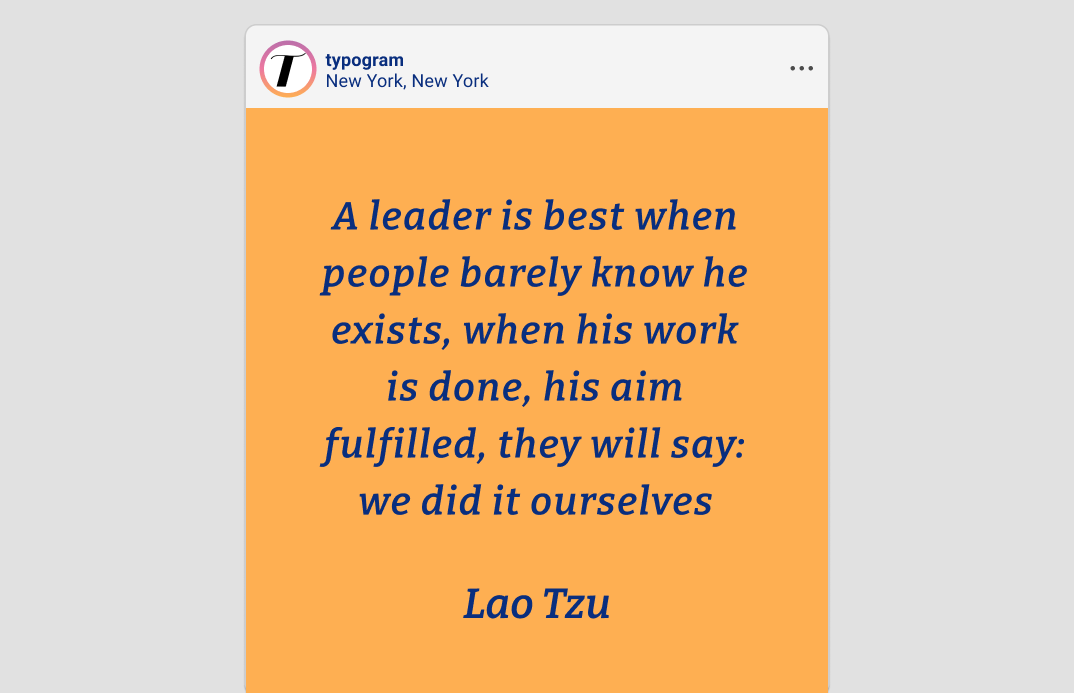
img: sample of Bitter
Do you have a friend who could profit from the weekly design tips, just like you do? Please consider forwarding or sharing FontDiscovery with your friend by clicking on the button down below.
Font of the Week
About Bitter
Bitter is a highly versatile slab serif designed for optimizing reading experiences online. Bitter is designed with practical principles in mind, and most design choices are made with considerations for digital environments rather than aesthetics.
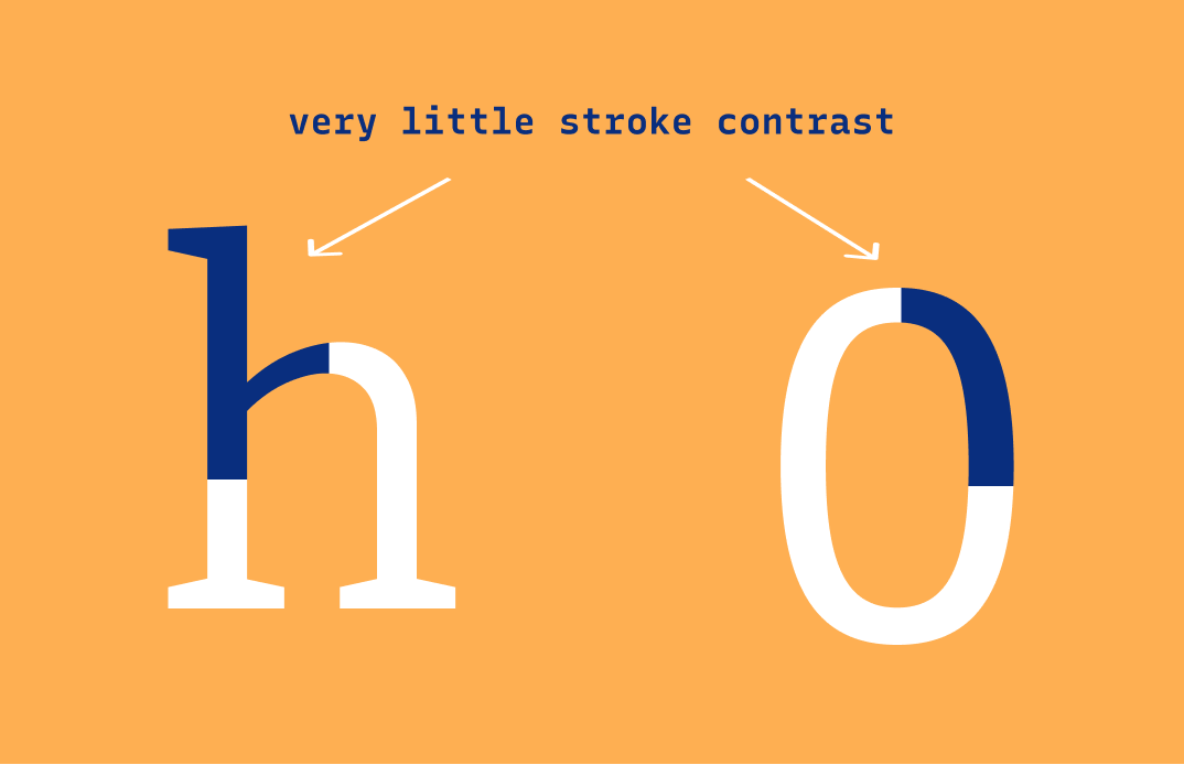
My favorite design feature about Bitter is the minimal contrast in stroke width. This makes Bitter look contemporary and modern to the eyes while contributing to its overstrength as a screen font for reading.
Font Details
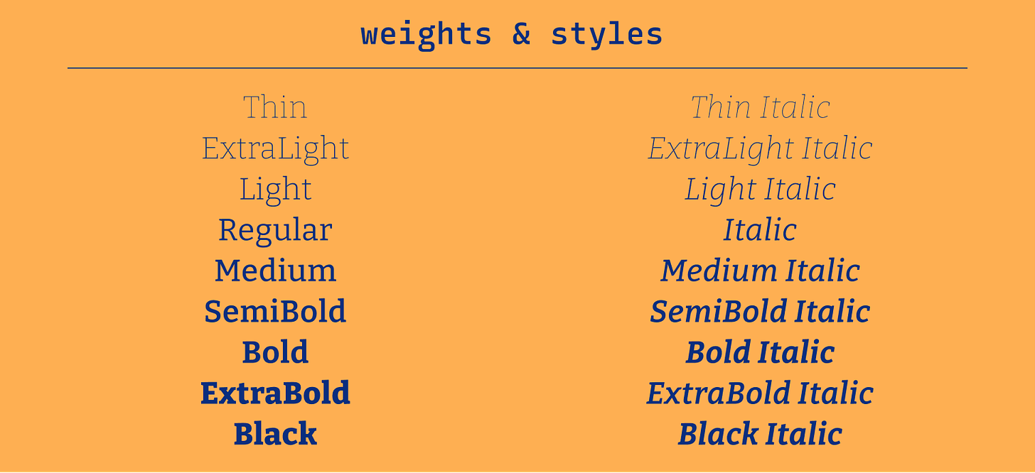
- 9 weights with respective italic versions
- Low stroke contrast
- Great as display or reading font
How to use Bitter for logos?
Bolder versions are perfect for logos. It has a contemporary, objective tone that works for many different projects, especially in the likes of publishing and blogs.
How to use Bitter for marketing and branding?
The lighter styles of this font, like Thin, Extralight, and Light are especially pleasing to the eye. They are perfect for quotes or display-size copies and make the typography on your page look clean and easy on the eye. Because Bitter is optimized for the digital reading experience, the regular and bold versions work fantastically as reading fonts.
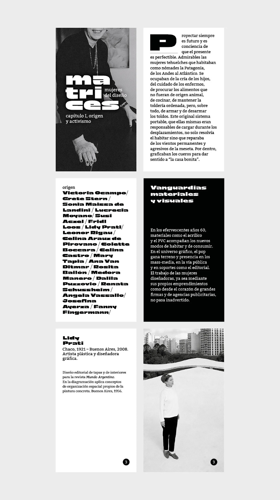
Bitter used as branding for a show about women in design. Source: FontsInUse
Design Idea of the Week
Art of Question
Did you know that, as children, we can ask an average of 40,000 questions between the ages of 2 and 5? But as soon as we grow older, we stop asking those questions publicly. This week, check out this helpful guide on the art of asking questions.
Color Inspiration
Yellowstone National Park
This week, enjoy colors from Yellowstone, USA.
Bronze #C86D04 | Sherbert #FEAF52 | Teal #02A790 | Egyptian #045396
Typography Jargon Buster!
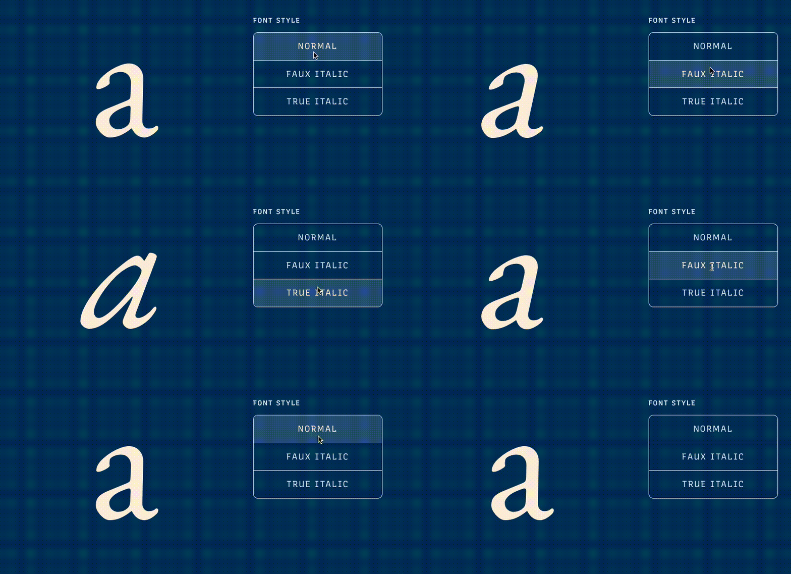
Font Style
Font style is a particular style of the font within a font family. For example, usually, there is the italic style within a font family - a group of letters with a degree of slant. Font style can come in normal, italic, and oblique. The Normal style is when the text is upright. The italic style is usually calligraphic, cursive-influenced, and slanted. The Oblique style is a slanted version of the Normal style.
Want more typography jargon buster? Check out this post!
Creative Prompt
Create something with Bitter.
Thank you
…for reading and hanging out here this week! Bitter is available here.

If you enjoy this series, you can subscribe here:
Have more questions about design and fonts?
Please email me hua@typogram.co or find me on Twitter at @HuaTweets.
You can also read the past issues on our brand new archive!.
