FontDiscovery 🖼️ 94: [From the archive] When branding fails
I'm Hua, a designer and bootstrapping founder building Typogram, a brand design tool. We just launched our pre-order, check it out!⭐
Hey Everyone 👋
Hope you had a fantastic week!
Last Friday I took a little break to enjoy a nice hike. Fall foliage is in full bloom, and there were beautiful colors everywhere. Here is my best attempt to capture and keep a little piece of what I saw.

Whatever you are doing this week, I hope you take the time to enjoy outside! And without much ado, here is our issue this week featuring a top rebranding piece from the archive.
A branding lesson from Tropicana’s failure
We regularly feature great examples of marketing and branding. Today is the day we venture to the dark side: branding (rebranding) that ended in pitfalls and catastrophes.
Failures of branding and rebranding are a tragedy that no one wants. Many hours went into the proposal, design, and research. Like life, markets and consumer behaviors can be unpredictable - even with many hours of research, focus group, alpha, and beta testing, no one can guarantee or predict how successful a (re)branding will be.
Do you have a friend who might enjoy weekly design inspirations? Share FontDiscovery!
Certainly, no one saw this coming for Tropicana, a leading American juice brand. Tropicana is a household brand with its founding dating back to 1947. In the beginning, Tropicana was a local, orange juice delivery company (freshly squeezed, of course) founded by Anthony T. Rossi, an Italian immigrant in Bradenton, Florida (source). It’s a classic, feel-good brand built upon decades of trust and credibility.
In 2009, Tropicana decided to rebrand to revamp its image. Sporting a new, more modernized flat logo, it debuted its new packaging.
Package redesign of Tropicana

The rebranded design features:
- The logo font changed from a more brushy, humanist sans serif to a simple, friendly sans serif.
- The packaging design had a make-over to a more flat and minimalist look, a clear departure from a classic style with predominantly orange imagery.
- The new packaging has simple color schemes (Green, Yellow, Orange, White), featuring an image of a large glass of orange juice that looks abstract when standing far from the shelves.
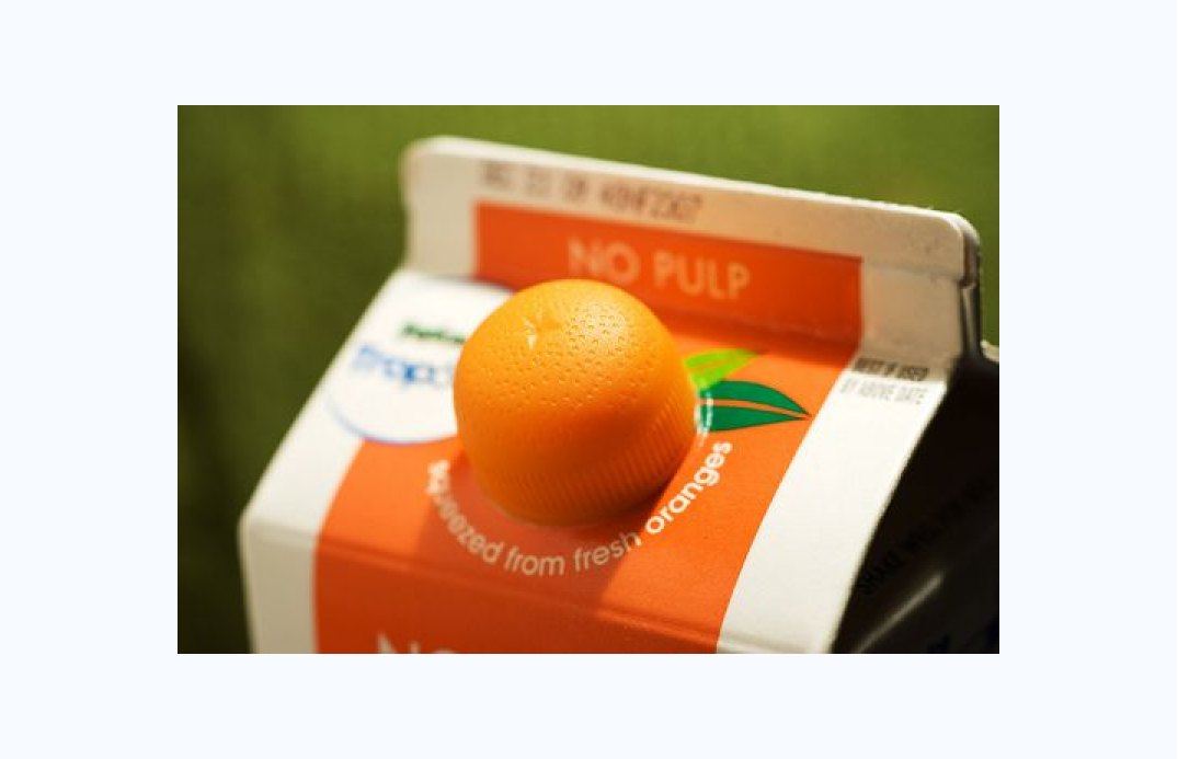
- Quirky orange cap - The new package featured an orange-shaped cap to replace the orange imagery on the original packaging.
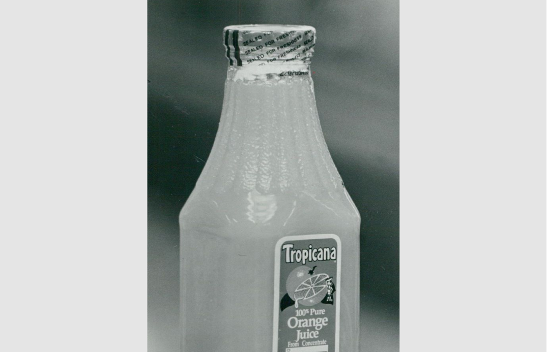
Vintage Tropicana packaging, source
Tropicana rebranded package with orange cap, source
What was consumer feedback?
The new minimalist design was received extremely poorly by the consumers. Tropicana lost 20% in sales because of this redesign. Admittedly, Tropicana said they “underestimated the deep emotional bond” their most royal fanbase had to the original packaging (source).
The orange with the straw was an iconic image that resonated with many consumers and spoke to Tropicana’s brand value of freshness. When the new package launched, consumers had difficulty recognizing the Tropicana product. In addition, the copy on the redesigned packaging – “100% orange” was confusing for some consumers. They had been seeing “Premium and Pure” in the old packaging. They weren’t sure if this “100% orange” was the same product they had been buying previously, losing trust and credibility.
After seeing the disappointing and depressing results, Tropicana reverted back to its original branding, just 30 days after the new branding debuted (source).
What can we learn from this?
If you think this was just a post about a rebranding catastrophe from an orange juice rebrand –you are halfway right. We examine failed branding to learn lessons from mistakes. Here are some grandeur things that we can take away as a starting point.
Brand trust takes a long time to build. Suppose you were considering rebranding, especially in a completely new direction (like Tropicana). In that case, it is crucial to test out your new branding ideas with the customer base, especially the most loyal fans. It might even be a good idea to transition into the rebrand slowly.
The most trendy design “look and feel” may not be suitable for your product and audience. Tropicana sought after a hip, simple and modern packaging design, and it didn’t resonate with Tropicana’s consumers. Its fan base loved the original classic design that spoke about freshness—changing this association cost Tropicana trust and sales.
If you enjoy this series, you can subscribe here:
Have more questions about design and fonts?
Please email me hua@typogram.co or find me on Twitter at @HuaTweets.
You can also read the past issues on Typogram's blog.
