Four chatbot widget patterns for websites and apps: from bubble to super app
Websites tend to embed chat in four patterns: a simple bubble, an inbox with history, a task-driven support bot, and a multi-tab hub.
This guide explains where each pattern fits, what it does well, and the least you need to configure to run it reliably.
(Acronyms: personally identifiable information (PII); service-level agreement (SLA).)
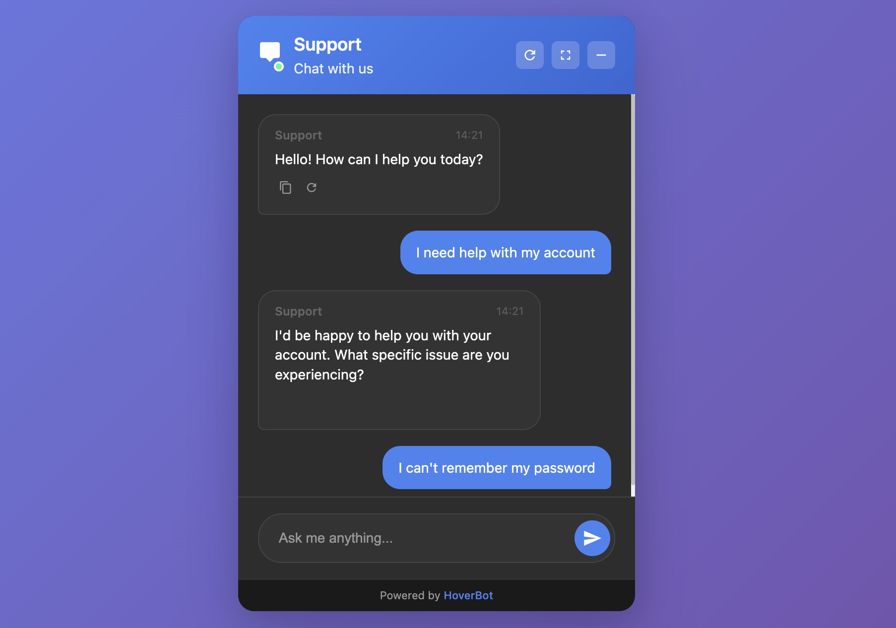
Figure 1: Simple chat bubble widget interface
1. Simple chat bubble
What it is:
The simple chat bubble is a lightweight, single-thread assistant that opens when you click, answers your question, and then closes. It has no inbox or account linking and only limited memory.
Best for:
Marketing pages and documentation landers
Lead capture ("ask a question → leave email")
Narrow, high-confidence FAQs
Strengths:
Fast to ship; minimal UI surface
Low maintenance and risk
Clear focus on the current question
Trade-offs:
No persistent history by default
Limited multi-step tasks without tools/actions
Harder to measure long-term outcomes
Minimum configuration:
Greeting and scope: short, explicit welcome (e.g., "I cover pricing, features, and demo requests")
Knowledge base: 5–20 curated docs; prefer explicit sources over web search
Guardrails: refusal policy, safe fallbacks, and topic blocks
Intent capture: 3–5 quick-reply buttons (Pricing / Features / Book demo / Contact sales)
Lead handoff: email form on low confidence or on request
Analytics: impressions, opens, first response time, resolved vs escalated
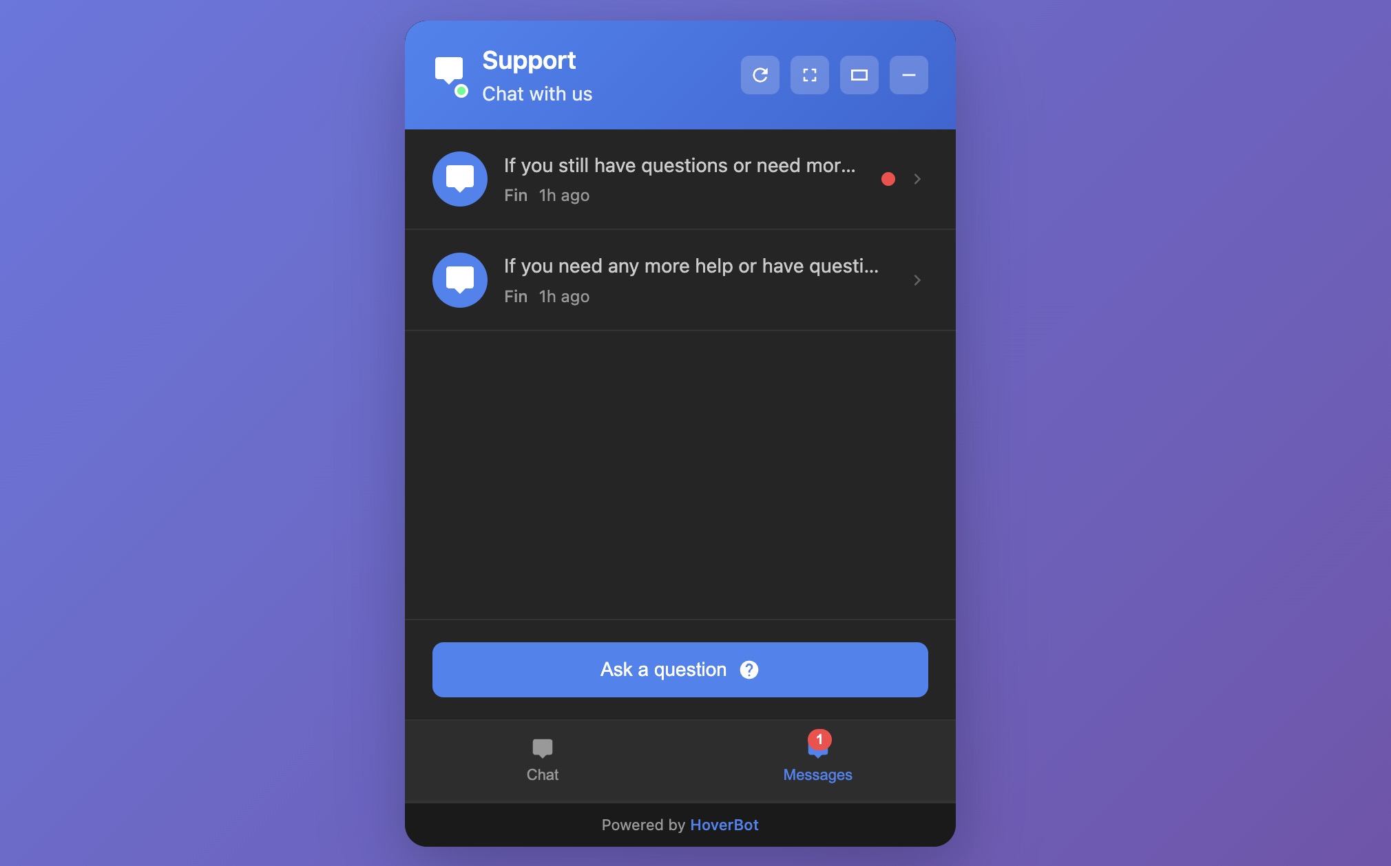
Figure 2: Messages list with history widget interface
2. Messages list with history
What it is:
An inbox-style widget. Users can open past threads, resume conversations, and see bot or agent follow-ups.
Best for:
SaaS apps and customer portals
Education and healthcare portals where continuity matters
Sales cycles that run over days or weeks
Strengths:
Conversation memory within and across sessions
Asynchronous support ("reply when ready")
Clear UX for escalations and status updates
Trade-offs:
Identity and storage decisions (who can read what, and for how long)
More compliance exposure (PII, retention, export)
Operational overhead: SLAs, routing, backlog management
Minimum configuration:
Authentication: attach user or session IDs; define guest vs logged-in behavior
Thread model: per-user threads, retention windows, deletion/export controls
Triage: intents and queues (billing, technical, sales)
Handoffs: routes to human inbox; status chips (Open / Waiting / Closed)
Notifications: email and in-app alerts on reply
Quality controls: schema validation of tool inputs, rate limits, profanity/PII filters
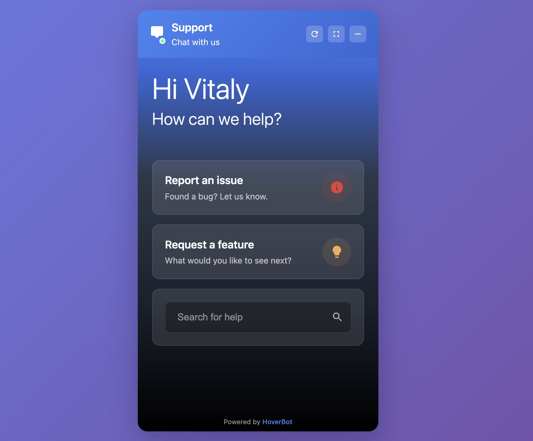
Figure 3: Product-support chatbot widget interface
3. Product-support chatbot
What it is:
A support-focused widget built for tasks: look up orders, reset passwords, file tickets, schedule, check refund eligibility. Think "chat + tools."
Best for:
E-commerce, logistics, fintech, subscriptions
Any product with a well-defined support taxonomy
Strengths:
Measurable deflection and faster resolution
Clear ROI when tools are reliable
Structured analytics (top tasks, failure points)
Trade-offs:
Integration work (CRM, ticketing, order and billing APIs)
Precision demands: weak tools create loops and churn
Ongoing maintenance of intents, prompts, and policies
Minimum configuration:
Task map: 10 launch tasks (e.g., order status, returns, billing address, plan change)
Tooling: API actions with strict input schemas and validation; test in staging with real edge cases
Authentication: secure account linking (signed JWTs or session tokens) and audit logs
Fallback ladder: ask for missing fields → retry → create a ticket with a clean summary → offer human chat
Policy book: refund limits, KYC checks, fraud flags, privacy rules
QA loops: review a 10–20% sample of failed sessions weekly; fix prompts, add examples, update tools
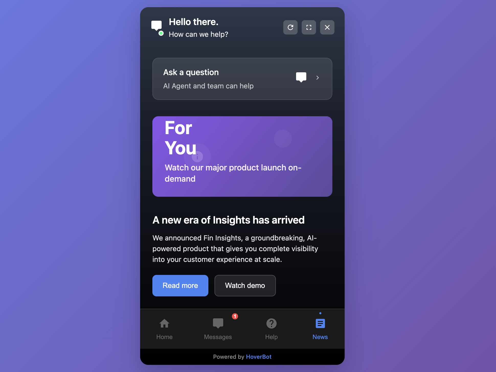
Figure 4: Multi-tab widget (super-app) interface
4. Multi-tab widget (the "super-app")
What it is:
A docked panel that bundles modules such as Home, Messages, Help, and News/Announcements; sometimes Tasks or Shortcuts.
Best for:
Multi-feature products and communities
Enterprise portals and intranets
Sites that need to surface announcements, docs, chat, and actions in one place
Strengths:
One entry point; reduces "where do I click?"
Space for progressive disclosure and growth
Can host both AI assistant and human workflows
Trade-offs:
Higher design and navigation complexity
Performance budgets and caching become critical
Feature creep risk; requires clear product ownership
Minimum configuration:
Information architecture: start with 3–4 tabs (Home / Messages / Help / News)
Permissions: define which tabs appear for guests vs logged-in users
Content pipeline: how News is published, expired, and archived
Search: cross-tab search that returns Help, Messages, and Docs
Performance: lazy-load inactive tabs; cache help articles; prefetch the first answer
Observability: per-tab usage, drop-offs, task completion
Picking the right pattern

Rule of thumb: Start with the simplest widget that delivers the outcome. Move up a level only when continuity, task depth, or surface area require it.
Bottom line
Pick the smallest widget that solves the user's job today. Add depth, such as history, tools, or multiple tabs, only when your product and users clearly need it. The gains come from clear scope, reliable tools, and disciplined measurement, not from the fanciest UI.
Disclosure: Our team builds chatbot widgets. This review focuses on patterns you can implement with any modern platform.


I think the concept is really strong. I tried out the widget on your site and asked it a few questions, but each time I got the same reply: “I’m sorry, I don’t have information about that…”, which I found a bit funny. Admittedly, some of my questions may not have been directly relevant to HoverBot itself, but it would be great if the bot could guide users toward the types of questions it can answer.
It might also help to show a few example prompts when opening the chat, just to clarify its purpose. For instance, should I use it for customer support, feature explanations, documentation, etc.? That context would make it easier to get value right away.
One last thing I noticed: some elements (like Figure 1 and Figure 2) seem a bit separate, even though they could be combined to improve usability. For example, when I started a new session, I couldn’t find a way to return to my previous conversation history. Having that continuity could make the experience much smoother and still keep the widget small and focused!
Nonetheless, good luck with your journey! I've dropped you a follow on X and I'm looking forward to keeping up with your development!
Thank you for the detailed feedback and for checking out the widget. To clarify, the bot on our site is the actual HoverBot assistant. We are rolling out a new model version this week with intent routing and more helpful responses when something is out of scope. Our assistants are intentionally scoped to specific products or features so they provide accurate answers within that scope. The update also adds a clearer greeting with example prompts to explain what the chatbot can do. Thanks again for the suggestions. We will keep improving.
Awesome to hear! Looking forward to seeing future updates!