From ugly MVP to awkward teenage phase
Here's our website link - www.usemuch.com
Please roast it so we can get better. We've already gone through a few iterations and no one on the team is a designer but we are building the plane on the way down.
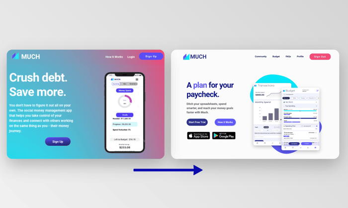
Proud to at least say we had early paying users at our ugly MVP phase (gradient screenshot) and still have our early adopters rocking with us during this awkward teenage (off-white screenshot) phase.
We would love to know what we can do to grow conversions and get more trialers in the door. So any feedback on copy, CTAs, overall design in general, what we are lacking or what we can do without would be great!
