Help! I'm not sure what to do next on my Landing Page
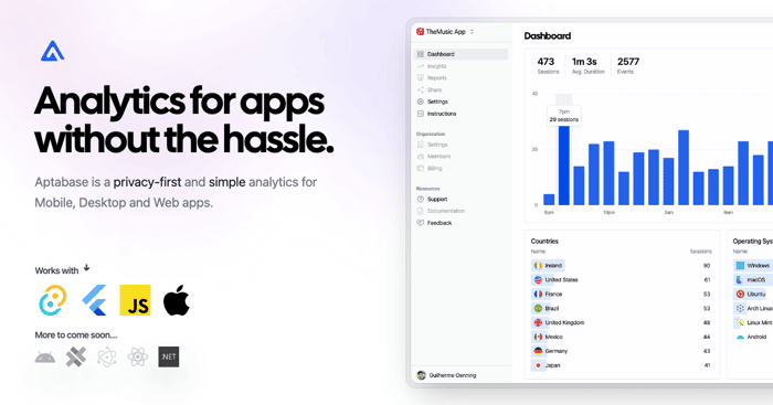
I launched this website 24 hours ago and I feel like there's a lot to improve on the landing page, but I just don't know where to start. This is the website https://aptabase.com
Is it clear what it does and who is it for? What would you recommend doing on it?

Hey, please consider adding your product to IH. Much easier for us to see your timeline, growth path.. how you tracking. Good, bad and ugly. it is what we are here for -- to help.
I am not a dev. I am business, in fact many SMEs.
When you say simple
what's simple about it?
I understand the privacy bit, but not sure what's simple about your product that should make me wanna use it.
There's a difference between Simple and Feature-poor...if you catch my drift? I hope it's Simple, rather than the latter...
It's really meant to be simple to use and get started. It's more about doing less things but doing it really well, rather than trying to do too much poorly
The landing page seems simple and as a developer, I immediately understood what this is about. It's missing one critical information, though: pricing.
As a Windows app developer, I'm also left wondering why there seems to be basically no mention about supporting Windows apps.
Right now, it's not really easy to fully see what your product can do. A live demo would be good to fix that.
We support Windows app built with Tauri and Flutter, support for Electron and .NET is coming soon. Which one are you using?
Good point on the live demo, will get one soon.
I just checked it out. Few critiques: 1. I didn't understand the services immediately (could reword some of the wording a bit). 2. The picture is much too large! Other than that, I think it looks pretty cool.
Thanks! I definitely need to improve on marketing copy.