Help me to chose our new logo?
Hi everyone,
At learnd we are currently doing our branding, with the team there is no consensus on which one to choose.
For context learnd is a customer experience management SAAS
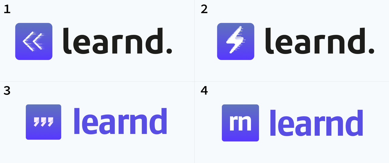
Please feel free to help decide which logo is the best =)
Comment the number of your favorite logo
Thanks Matteo

#4 is for me the best. Maybe it will be a good idea to modify the font, for example:
#2. It’s the most invigorating to me. I don’t understand the period, though.
Thanks for the feedback, much appreciated. Don't you think the speed effect is too much?
No problem. Yes, I do. It's unnecessary.
#2 & #1
I like #2, but would remove the period and "speed effect", and vertically center the icon.