🙏 Hero Text Feedback Please. 🅰️ or 🅱️?
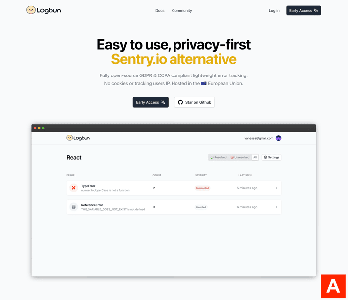
I like the yellow color on A, but I think the messaging might be clearer on B. I would appreciate some other perspectives.
I like the yellow color on A, but I think the messaging might be clearer on B. I would appreciate some other perspectives.

I second the opinion that B is the better option.
I'm afraid that having "We're like XYZ" isn't doing your brand any favors.
However, you can always use option A lower into your landing page.
Some time ago, we made a page comparing Zlipa to one of our larger competitors — Brandpa, and it got us some nice traction almost immediately. Here it is:
https://zlipa.com/brandpa-alternative/
So, in a nutshell, i think it makes sense to keep option A, but use it elsewhere.
good luck!
I remember hearing on the IH podcast how it's a good idea sometimes to call out a giant in your space because it informs people at a glance exactly what you are doing. For that reason I think A works better than B.
I'm no SEO expert and I think others made some great points against it, but I immediately understood what the tool was for when I read A because the Sentry callout and the different colour.
B
(B) but add a line break so that "error tracking platform" appears on one line together - makes it easier to digest that way. I shy away from (A) because it would make me want to go to Sentry and compare your offering with theirs, the price points, and how established they are. I imagine the only aspect you can compete with them on is price point. So it essentially introduces a competitor to a prospective customer, and if it doesn't it creates a brand voice of insecurity/inferiority. i.e. Pepsi Challenge.
Don't use mailto links to post your email address you open yourself to spam
Hide your email address behind a fun scratch card -- scratch to reveal your email address.
veilmail.io/yourname
Another vote for B. I think the messaging is much clearer and tells the user exactly what it does without limiting the user base to Sentry-aware users alone
To start out I like A. This counter position is a good way to speak to your very first initial audience and get early traction.
It reminds me of what supabase did early on as 'the open source firebase alternative'.
From a longterm branding perspective not a fan of A. As a growth marketer I obviously should be leaning towards what I think would convert more but I personally would save Sentry comparisons to a blog post optimised for "Sentry alternatives"
I prefer B!
I am sure some people do not know about Sentry.io
Solving the customer's pain point is better than providing an alternative in the first paragraph. You could add a badge on top saying "Sentry.io" Alternative
However, I prefer A's coloring.
I like A better. I assume your target audience is devs who already know about sentry and its pitfalls?
May I ask who does your design (landing page and the logo) and what your workflow is?
That is good feedback thank you. And I do my own design as well :)
A is better than B with the colour
But maybe look at some of the other competitors wording, there are a lot of software error services
Maybe you want to highlight privacy and error platform or similar I feel like better words could be chosen
Thank you for that feedback. That was actually the vast majority said on other platforms when i asked so now the wording on logbun.com highlights more about user privacy