How to Launch a SaaS Landing Page in One Day Using AI

In SaaS, the gap between idea and execution has always been the most expensive gap in the business. You can spend three weeks perfecting a product feature that nobody asked for, or you can spend one day launching a landing page that tells you exactly what your market wants before you build a single line of code. The founders who consistently win in competitive categories are the ones who close that gap first. Today the fastest path to a credible, conversion-ready SaaS landing page runs directly through AI. Tools that let you build websites with AI have reached a level of quality and speed where there is genuinely no practical reason to spend weeks on something you could launch today. This guide walks you through the entire process in a single day: from a blank page to a live, indexed, converting landing page.
Why Traditional Landing Page Creation Keeps Founders Stuck
Before explaining what works, it is worth being honest about why the old approach fails so many early-stage SaaS founders. The problem is not that the old tools were bad. It is that the process they demanded was completely misaligned with what an early-stage founder actually needs.
The traditional path looked something like this. You would decide you needed a landing page. You would spend half a day browsing templates, none of which quite matched your product category or brand direction. You would pick the closest one and spend several hours learning the editor well enough to make meaningful changes. The mobile layout would break every time you adjusted something on desktop. You would fix that; then the hero section would lose its spacing. You would ask a designer friend to take a look; they would suggest fifteen changes. You would implement seven of them and realize the copy was still vague and unconvincing. By the time the page was ready to show people, two weeks had passed, and your initial momentum was mostly gone.
The deeper problem is that traditional page builders put design execution ahead of your actual job, which is figuring out your message and getting it in front of the right people quickly. Every hour you spend adjusting column widths is an hour you are not talking to potential customers. AI-powered tools flip that dynamic entirely.
How AI Has Changed What One Day Can Produce
The shift that AI brings to landing page creation is not incremental. It is a change in the underlying model of how a page gets built. Instead of you making hundreds of sequential micro-decisions about layout, typography, section order, color weight, and spacing, the AI absorbs your intent from a plain-language description and translates it into a structured, responsive, visually coherent design in under two minutes. What used to take days of execution now takes seconds, which means your entire day can be spent on the things that actually determine whether the page converts: your message, your offer, your call to action, and your understanding of the person you are trying to reach.
This is the real promise of the current generation of AI landing page builders. Not that they do the thinking for you. They do not. But they compress the execution cost so dramatically that a solo founder with a clear idea and a focused day can go from nothing to a live, indexed, professional-looking SaaS landing page before dinner.
Let me show you exactly how that day unfolds.
Your One-Day SaaS Landing Page Launch Plan
The structure below is built around a realistic single-day schedule. It assumes you are starting in the morning with a product idea or early-stage product and want to be live by end of day. The time allocations are honest estimates based on what this process actually takes when you are prepared.
Validate the Core Message Before You Build Anything
The single most common reason SaaS landing pages fail to convert is not design quality or technical performance. It is message clarity. Before you open any tool, spend one hour working out three things in writing. First: What does your product do, in one sentence, for a specific type of person? Not a broad description; a specific one. Second: What is the most painful problem your target user has right now that your product solves? Third: What does success look like for that user after they start using your product? Those three answers become the spine of your headline, your subheadline, and your primary value proposition section. Everything else on the page supports those three answers. Write them down before you generate a single pixel of design.
Choose Your AI Tool and Prepare Your Generation Brief
Not every AI page builder produces the same quality of output. For a SaaS landing page specifically, you need a tool that understands product marketing structure: hero sections, feature callouts, social proof placement, pricing tables, FAQ sections, and conversion-focused CTAs. Readdy.ai is built specifically for this kind of output. Before you generate anything, write a structured brief in a notes document. Include your one-sentence product description, your three key features and a benefit-focused description of each, your target audience in plain terms, the tone you want (professional, friendly, bold, or minimal), your primary CTA text, and any design direction you have in mind. A brief like this turns a generic output into something that already feels tailored to your product on the first generation.
Generate Your Layout and Section Structure
Paste your brief into the AI generator and let it produce the initial site. Do not start editing immediately. Scroll through the entire generated page first and evaluate the structure: does the section order tell a logical story? Does the hero section lead with a benefit or a feature? Is there a natural flow from problem to solution to social proof to CTA? Most AI-generated layouts for SaaS landing pages are structurally sound on the first attempt. What typically needs work is the copy and the specific visual choices, not the underlying architecture. Identify what you want to keep, what you want to reorder, and what needs to be replaced entirely. Make a quick list before touching a single element.

Write High-Converting Copy and Replace Every Placeholder
This is where you will spend the most focused time, and it is worth every minute. The AI gives you a structural framework; your prepared copy fills it with something real. Start with the hero headline; make it specific, outcome-focused, and written for a real person rather than a search engine. Replace every feature description with a benefit statement that answers the implicit question: "So what does that mean for me?" Rewrite the FAQ section entirely using the actual objections and questions you have heard from real potential users. If you have not spoken to any real people yet, this is your next project after launch. The CTA copy deserves special attention; "Get Started" and "Try for Free" are fine starting points, but testing something more specific to your product's value will almost always improve conversion. Use the AI editor to make each of these changes inline; the selector mode in tools like Readdy.ai means you click the element and type your replacement without navigating away from the page view.
Add Visuals and Strengthen Your Call-to-Action Sections
Visuals on a SaaS landing page serve one primary purpose: they reduce the cognitive effort required to understand what your product does. A screenshot of the actual product interface, even an early version, is worth more than any abstract illustration because it makes the product real and concrete in the visitor's mind. If you have a product UI, use a screenshot in the hero or features section. If you do not have one yet, use a clean mockup or a simple diagram that shows the workflow your product automates. Avoid decorative stock imagery that adds nothing to comprehension; every visual on a SaaS landing page should answer the question "what am I getting?" more clearly than words alone can. Your CTA sections should appear at least twice on a full-length landing page: once above the fold and once near the bottom after the visitor has read through your value proposition. Make sure both CTAs are visually prominent and lead to the same conversion action.
Optimize for Mobile and Check Responsiveness
This step is non-negotiable. Depending on how you are driving early traffic, a significant portion of your first visitors will be arriving on mobile devices, especially if you are sharing your page through social channels or messaging apps. Check every section on the mobile preview inside your editor. Look specifically for hero text that overflows its container on small screens; feature cards that stack in an unreadable order; CTA buttons that are too small to tap comfortably; and images that are cropped in a way that removes the most important part of the visual. AI-built pages are generally responsive from the first generation, but always confirm manually before going live. Fix anything that looks broken on a five-inch screen because that is the screen your first users will probably see your page on.
Set Up SEO Basics and Connect Your Analytics
You do not need to be an SEO specialist to get the technical fundamentals right on day one. Fill in the meta title for your page using your primary keyword and your product name. Write a meta description that reads like a clear, honest summary of what the page offers; aim for something that would make a real person click if they saw it in search results. Customize your page URL to something clean and readable rather than accepting an auto-generated string. If the tool you are using generates a sitemap automatically, confirm it is enabled. Connect Google Analytics before you publish; even if you do not look at the data for a week, you want traffic data collecting from the moment the first visitor arrives. Two minutes of setup now saves you weeks of blind guessing later.
Practical note on SEO: The technical scaffolding, clean URLs, sitemap generation, robots.txt configuration, SSL certificates, and fast page load times are handled automatically by quality AI page builders. Your job is the content layer: keyword-informed copy, descriptive headings, and a meta description that reflects what real people searching for your solution would actually want to find.
Connect Your Domain and Go Live
If you already own a domain, connecting it takes about ten minutes. You will need access to your domain registrar's DNS settings to point the relevant records to your hosting. Most AI page-building platforms provide step-by-step DNS instructions; follow them exactly and allow up to an hour for propagation, though it is often much faster. If you do not yet have a domain, you can purchase one directly inside platforms like Readdy.ai without leaving the builder. Once DNS is confirmed, hit publish. The page is live. SSL is provisioned automatically. Share the link immediately to at least five people whose opinion on your product you trust; not to ask whether they like the design, but to ask whether the page made them understand what the product does and want to know more. That feedback starts your iteration cycle on day one.

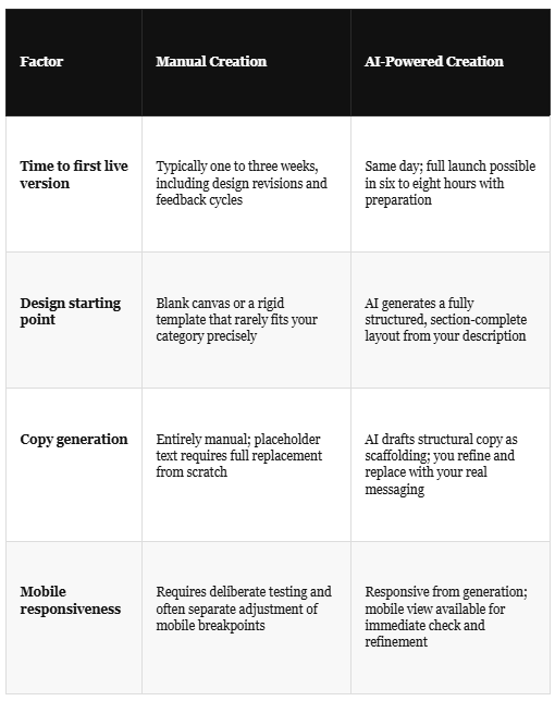
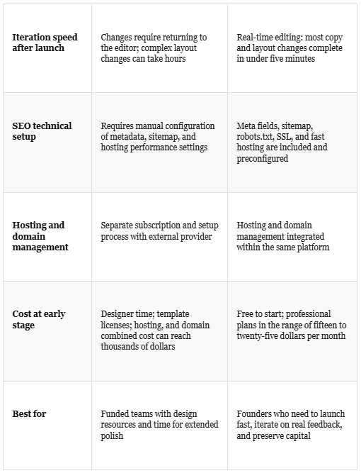
Manual Landing Page Creation vs AI-Powered Landing Page Creation
It is worth putting the two approaches side by side honestly. Both paths can produce a good landing page. The question is which one fits the constraints and goals of an early-stage SaaS founder.
Using AI Tools to Their Full Potential
Among the free and paid resources available for this kind of build, the no-code AI website builder tools available today cover nearly every step of this process without requiring you to touch a separate platform. Logo generation, color palette building, SEO copy refinement, business name testing, and favicon creation are all components of a single-day launch that can drain hours if you approach them ad hoc. Having them in one place means fewer context switches and a faster path from generation to publication.
One specific practice that makes AI tools significantly more useful is using a reference URL during generation. If there is a landing page in your category whose structure you admire, the way it handles social proof, or how it breaks down a complex feature into digestible sections, you can use that URL as a structural reference when generating your own page. You are not copying design. You are giving the AI a concrete example of the visual logic you are aiming for so it can interpret your brief with better context. Human designers do this constantly. The AI approach simply compresses the execution time from hours to seconds.

Common Mistakes to Avoid When Launching Quickly
Speed creates a specific set of failure modes. These are the ones I see most consistently when founders launch landing pages in a rush without the right preparation.
Launching with AI placeholder copy still on the page. This sounds obvious but it happens more often than you would think. Go through every section of the page on the live URL before sharing it anywhere. Every piece of default text needs to be replaced with your actual messaging. A single placeholder paragraph in the features section tells every visitor that the page is unfinished.
Writing features instead of benefits. The AI will generate feature descriptions that are accurate but abstract. "Advanced workflow automation engine" means nothing to a busy operations manager. "Cuts your Monday morning reporting from ninety minutes to ten" means everything. Replace every feature description with a concrete, outcome-focused benefit statement before you publish.
Skipping the mobile check entirely. Even if your AI builder handles responsiveness automatically, visual issues specific to your content can still appear on small screens. Images can crop badly; headline text can wrap in a way that breaks the rhythm; CTA buttons can shift out of the natural eye path. Check the live page on your actual phone before sending it to anyone.
No analytics connected at launch. If you publish without connecting Google Analytics or an equivalent tool, you have no way to understand where visitors come from, how long they stay, or where they leave. That data is how you make the second version of the page better than the first. Two minutes of setup before publishing is non-negotiable.
One CTA buried at the bottom. Your primary call to action should appear at least twice: once immediately visible when the page loads and once after your value proposition has been fully explained. Visitors who are ready to act early should not have to scroll to the bottom to do it. Visitors who needed convincing should find the CTA waiting for them once they have been convinced.
Not connecting a real email capture to the waitlist form. If your CTA is collecting email addresses, confirm that those addresses are actually being saved somewhere you can access before launch. Test the form submission yourself on the live page and make sure the confirmation appears correctly and the data lands in your backend or your email tool.
Conversion Tips That Actually Make a Difference
Once your page is live, the real work of improving it begins. These are the specific changes that consistently move the needle on SaaS landing page conversions in the early stage.
Sharpen Your Hero Headline with Real Language
The words your best customers use when describing their problem to a colleague are almost always better headline material than anything a founder writes in isolation. After your first twenty conversations with potential users, patterns in their language will emerge. The phrases they repeat, the specific frustration they name, and the outcome they say they want; those belong in your headline. A headline written in your customer's language will always outperform one written in your product's language.
Use Social Proof at the Earliest Possible Stage
You do not need a hundred reviews to create convincing social proof on a SaaS landing page. A single specific quote from one real beta user, attributed with a name and a job title, is more persuasive than a row of generic five-star icons. If you have five beta users who have said something specific about the product's value, use their words. If you have none yet, a "join the waitlist" count that updates as people sign up creates a different kind of social proof: momentum. People trust things that other people are already interested in.
Reduce Friction on the Primary CTA
Every field you add to your signup form reduces the conversion rate. For a SaaS landing page at the validation stage, the only field you need is an email address. Nothing else. You can ask for a company name, a use case, and a phone number later, after someone has demonstrated intent by submitting their email. The first interaction should ask for as little as possible in exchange for as much value as possible. Name the value explicitly near the form: what the person gets immediately after signing up, how quickly they will hear from you, and what the next step looks like.

Iterate on Copy Before Design
When early data shows low conversion rates, the instinct is often to redesign the page. Redesigns are slow and expensive, even with AI tools. Before changing any visual element, test a different headline. Then test a different subheadline. Then test different CTA text. In most early-stage SaaS landing pages, conversion problems are messaging problems, not design problems. The page is not failing because the button is the wrong shade of blue. It is failing because the headline is not connecting with the specific person reading it. Fix the message first; the design almost never needs to change as urgently as founders think it does.
Load Speed Is a Conversion Factor
A page that takes more than three seconds to load on a mobile connection will lose a significant percentage of its visitors before they read a single word. AI-built pages on modern platforms are generally fast by default because they use lightweight rendering and content delivery infrastructure. But if you add large uncompressed images, heavy video embeds, or multiple third-party tracking scripts, you can degrade that performance quickly. Check your page speed using Google PageSpeed Insights after launch and address any issues flagged as high priority. A fast page is not just good for SEO; it is directly good for every conversion metric you care about.
One thing worth saying plainly: The page you launch today will not be the page you are proud of in sixty days. That is exactly the point. Launching a version that is eighty percent good today and improving it based on real signals is a fundamentally better strategy than waiting for a version that is one hundred percent good in six weeks. The feedback you collect from a live page is irreplaceable. The polish you add to an unlaunched page is just guesswork at a higher cost.
What to Do in the Days After Launch
The twenty-four hours after your landing page goes live are some of the most information-rich hours in your early product journey. Share the link deliberately rather than broadly. Send it to people who fit your target user profile and ask them two specific questions: Did they understand what the product does after reading the page? And would they want to know more? Their answers and the places where they hesitate or ask for clarification are your first iteration priorities.
Check your analytics after twenty-four hours. Look at the bounce rate and average session duration. If visitors are leaving in under fifteen seconds, your hero section is not holding them. If they are spending time on the page but not converting, your CTA or offer is not compelling enough. If they are converting but not responding to your follow-up, your qualification and onboarding sequence needs work. Each of those is a specific, fixable problem. None of them require rebuilding the page from scratch. Most require changing between ten and fifty words.
Update the page based on what you learn in the first week. Add the first real user quote as social proof. Sharpen the headline based on the language your best early users used to describe the problem. Add a short video if you have one that explains the product in sixty seconds. The page should be getting meaningfully better every week because it has real signal to respond to, not theoretical feedback from a wireframe review.
Stop Waiting. Start Shipping.
The competitive window in most SaaS categories is not measured in months anymore. It is measured in weeks. The founder who launches a landing page today and starts collecting real user emails is already three feedback cycles ahead of the founder who is still debating template options. AI has removed the execution barrier that used to make "launch fast" advice sound easier than it was to follow.
The tools are ready. The process is proven. The only remaining variable is whether you sit down and execute it today. You have the brief to write, the page to generate, the copy to sharpen, and the domain to connect. All of that is one focused day of work. The SaaS founder who ships a credible landing page today and talks to ten real users this week will know things in seven days that no amount of strategic planning can tell you.
Take the day. Build the page. Go live before you feel completely ready. That discomfort is the feeling of real progress, and it is significantly more productive than the comfortable feeling of still planning.
Start your build at Readdy.ai and have a live SaaS landing page in your hands before the end of today.

Spot on. I took a very similar approach for Day 2 of my SaaS, LinkCover (an Open Graph image generator). I skipped the fancy tools, hooked a lean Next js frontend to a Supabase waitlist, and focused entirely on an instant live preview sandbox. My main focus was making sure the user answers your 5-second test with our headline: 'Never share a naked link again.'To answer your question: the hardest part wasn't the landing page itself, but fighting the developer urge to over-engineer the backend. I spent hours trying to make Satori and WASM work on Cloudflare Workers before stripping it all away and pivoting to a pure SVG template string generator. It's raw, it has 0 dependencies, but it works in under 3 seconds.For a V1, did you launch your raw HTML page with a payment button or just a simple email capture to test interest first?
launched my landing page in about 2 hours using raw HTML and cloudflare pages. no AI, no fancy tools — just a text editor and deploy. honestly for a v1 landing page the most important thing isn't how it looks, it's whether it clearly answers 'what does this do and how much does it cost' in under 5 seconds. i've seen beautifully designed pages with 0 conversions because the value prop was buried under animations. what was the hardest part of getting yours live in one day?