How You Can Use Contrasting Design To Boost Your Product's Website? 🤔

Hey community!
Hope everyone has had a good hustle this week!
I was going through couple of old posts where people have asked about how they can boost their website design. So, I thought of sharing my experience on the same! 😃
Contrasting Elements
Often while designing websites, I need to make certain elements stand out. Humans notice different things quickly which makes contrasting elements a great way to boost your design.
That's why I usually consider using contrasting themes to highlight the element and to get the attention of the user but there are many ways to do this.
Why you should try it out?
While designing the website of my productivity tool Brutask, I tried experimenting several ways of using contrasting design that would suite the brand personality. Here are the results -
-
Because of these experiments, the website was featured by leading landing page inspiration sites, such as LapaNinja, Onepagelove, Landingfolio and several others that in the end helped my with good user acquisition.
-
The website received massive footfall because of this and we got visitors upwards of over 1500 visitors per day! In fact I recently posted about how Brutask crossed 1000 users.
Since many of you might be designing your own product websites, I thought of sharing with you guys 3 main ways of using contrast to boost your design.
1. Colors
Colors are a great way to boost your design. But be careful while choosing them. You need to ensure they go along well, other wise you will just end up with a rainbow website without any particular color theme.
2. Size
If you have a CTA like the one I have on another of my product- ruttl's website (Request Early Access or Watch Demo), make that element bigger in size. It will naturally catch the attention of users.

3. Illustrations
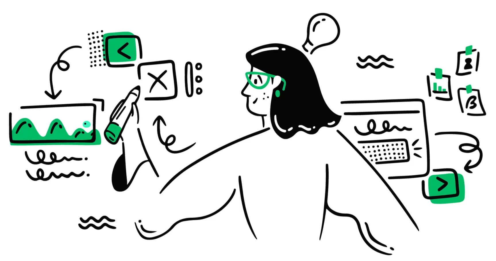
A great illustration never fails to spark the interest in the user. Combine your main element along with an illustration. In fact, you can even use animated illustrations to attract the attention.
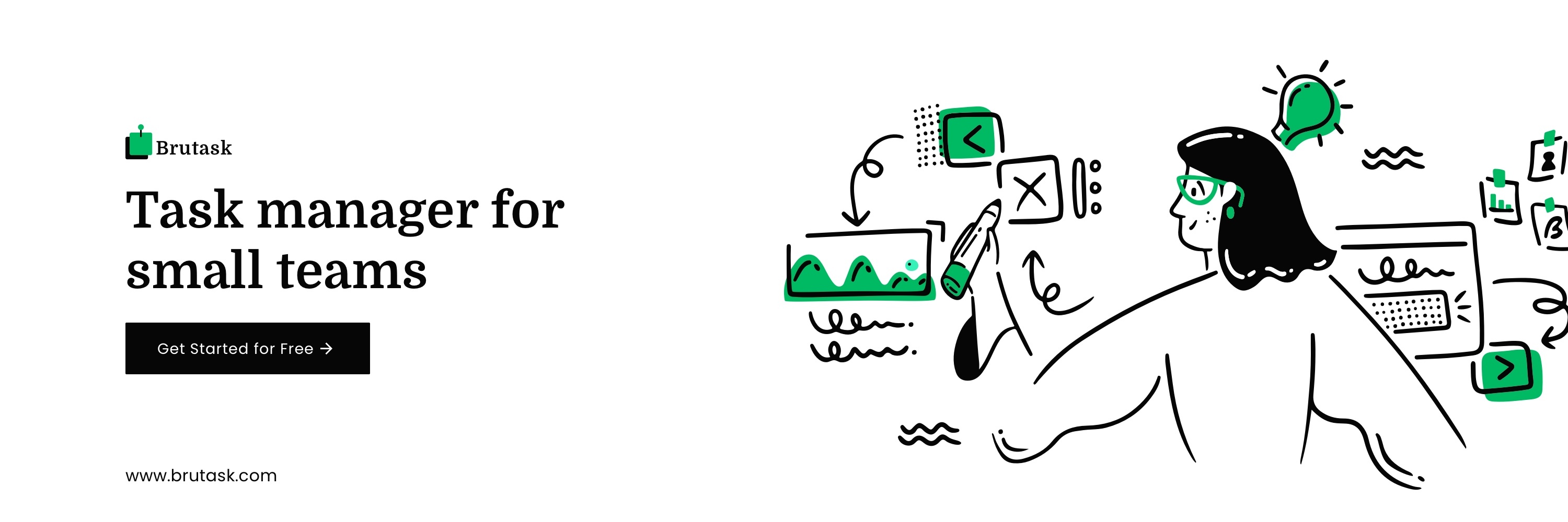
If you need an example of this, you can check out the main illustration beneath the "Get Started For Free" button on the landing page of my free productivity tool Brutask.
Although there are many other ways of using contrast, the main point is that you can exploit their power to boost your design quickly.
Got another idea to add to this list? Share it in the comments with others! 👇
Want me to recommend anything personally on your website? Just put your website in the comments and I'll try to help you out! 🙌
Hope you guys find this useful!
Love,
Siddhita ❤️
P.S My free to use productivity tool Brutask is finally out and ready to use! If you are a productivity freak, make sure to check it out as well!

Thanks for the post!
Great post!
Great examples. Love the animations on your site 😎