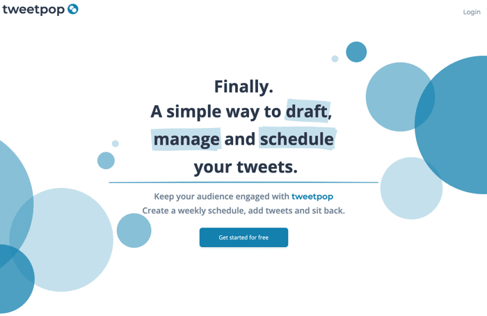
How's this for a landing page?
Hi!
I've just gone live with a landing page for Tweetpop - my first SaaS app.
I would love to get some feedback from fellow indie-hackers on the copy and UI.
Also, feel free to give the app a try - it's free to use!
Hi!
I've just gone live with a landing page for Tweetpop - my first SaaS app.
I would love to get some feedback from fellow indie-hackers on the copy and UI.
Also, feel free to give the app a try - it's free to use!

I love it, its very clean
Thanks! Good to hear... :)
I think this is a fantastic UI as well as an idea for a website. I know there is one site called Buffer that allows people to do similar functionality but this looks cool and promising!
It's clean and simple, I like it.
I'd only suggest you to center align vertical each text block to its section image.
Clean and simple is definitely the theme I'm going for. A few people have said that about alignment so let me try it out and see how it looks. Thanks!
Overall, it's not a bad page. I like that you use impactful words like "finally" and "simple." You've also done a good job of making it clear what the product does.
I think what's missing is more of a differentiator from other social scheduling tools. What makes this a better option than those?
You could also punch up the copy in the body copy a bit. Instead of generic statements like "Trying to keep track of your tweet schedule can be hard," and "Tweeting is a great way to build your audience," make the reader come to those conclusions on their own. Paint a picture of why it's hard so they feel that frustration. Give proof of how it can build an audience.
I'd also repeat your CTA in the middle of the page somewhere and make those buttons a color with more contrast so that they stand out.
Best of luck.
Thanks for all of this Sean.
I agree about differentiating from other tools. Now that I have a baseline to work with, I think that will be easier for me to think about. Let me think about this...
The statements you mentioned are a part of the 'pain, agitation, solution' marketing approach that I'm experimenting with. Maybe I need to expand the 'pain' part to be more specific like you say.
Will also test out brighter buttons and focus on the CTA.
Cheers!
I really like the design, although I would test it out on different device sizes. On my main monitor the hero text is very low and the button is half cut off. On my second monitor with a higher res the button is fully visible. Also, I would center the paragraphs next to the images on the features section. I would also put the pricing link and a signup link in the navigation at the top.
This is a good observation. Something so simple like testing on different viewports can be make-or-break between getting a new user.
Someone else also mentioned alignment so I will try that locally and see how it looks.
Pricing link will go up as soon as the page is ready. Good point about 'Sign up' - I didn't think of that!
Some insights...
Your headline and button are under the folder on my device.
I would consider to make sure it's above the folder, you loose clicks if they do not see the button...
consider adding padding on the X axis on desktop, so you find your white space, like 80px or with Tailwind as you have it, px:5 lg:px-20 should be good to go.
Then Too many bubbles.
Make sure to separate the sections with something more notable, like colors, play with it.
you are building with Tailwind, I made this sections for free blocks.wickedtemplates.com all you have to do is copy paste and includes centered headings.
Ask me anything, will be more than happy to help.
WoW really good UI..
congratulations on you SaaS Luanch
Thanks Gavin.
I see that you're building a Twitter audience. Good luck with that. Feel free to give Tweetpop a try - I'm always looking for feedback and would like to shape it based on the needs of people like yourself.
Sub
Looks really good! If I tweeted regularly, I would take it for a spin - but I tend to not tweet for really long periods of time
Thanks! I'm glad you like it.
I read your Master Plan blog post about Ikigai and achieving independence.
A lot of inspiration for this kind of objective comes from networks like Indie Hackers and Twitter. The good way to go is to parallelise building your idea along with building an audience. If you share what you're building as you go along, people will inevitably take interest and by the end of it you might have a line of people waiting to use your product!
I've been following this technique by sharing on Twitter as I go ("building in public"), and I use Tweetpop to help me manage that. Once you get your idea going, I highly recommend sharing with the community on there and making a habit of it. It can be very powerful.
I'd also like to add a resource to your list:
Zero to Sold by Arvid Kahl (book)
All the best!
I agree. Though most of mine came from Elon Musk, jpa and Steve Jobs. I started with IH because I love the developer community and want to be an IH myself (I recently quit my job!).
Ha! this is exactly what I just said to someone round about the same time.
I respect people who work in public - i'm still on the edge about doing it. You can inadvertently promote the competition if your note too careful, and encourage competition, too[0]. But there are a lot of upside too, which you mention.
I have read it! Its a good book! Its been a while though so I might have to dust it off.
[0] Pieter Levels made his QR Code app in public, which sparked a wave a comp.