I added 10 sections to my tools homepage… how many are actually needed?
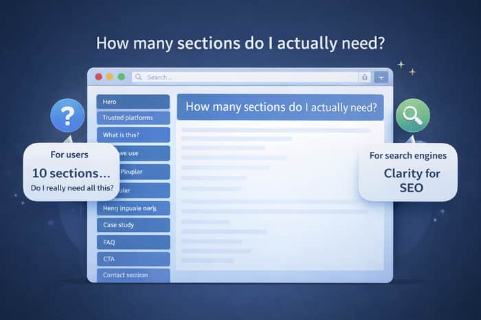
While building AllInOneTools, I didn’t design the homepage randomly.
I added sections one by one, based on what I thought users needed to trust and understand the site.
Right now, the homepage has:
- Hero section
- Trusted platforms
- What is All-In-One Tools
- Tools categories
- How to use
- Most popular tools
- Case study
- FAQ
- CTA
- Contact section
But after watching real users, I started questioning this.
Do people actually go through all of this?
Or do they just scroll, find a tool, and start using it?
As builders, we often add sections thinking:
“This will help users understand better.”
But maybe it adds more scrolling than clarity.
So I’m curious from both users and builders here:
- Which homepage sections do you actually notice?
- Which ones do you completely ignore?
- What makes you feel “okay, I can use this right now”?
I’m seriously considering simplifying things.
My own realization
As a user, honestly — I don’t read sections.
I just want: open → find tool → use → close.
But as a builder, I realized something important:
Search engines don’t think like users.
They need to understand:
- what this site is
- who it’s for
- how it works
- why it’s trustworthy
That’s why sections like What is this, How to use, FAQ, Trusted platforms exist.
They’re not really for users.
They’re for search engines — so users can find the site in the first place.
So the homepage becomes a balance:
- For users → simplicity
- For search engines → clarity
Right now, I’m trying to keep only the minimum sections needed — not to add noise, but to stay discoverable and trustworthy.
Curious how others handle this.
Do you design homepages for users first…
or search engines first?

Cold outreach scales linearly - same effort per reply every week. It's necessary for early traction but the founders who get to $10k+ MRR almost always layer in a compounding channel underneath it. SEO, community, partnerships, or product-led growth.
What's the channel you're betting on to build independently of your outreach?
The idea is simple: people search for a small task, land on a tool, use it instantly, and come back when they need it again.