I Built a Beautiful Product Page That Killed Our Sales
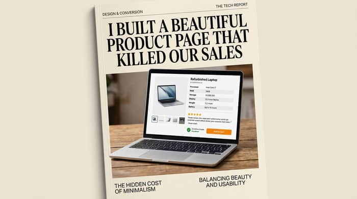
About four months ago, I redesigned our product pages.
I'd been staring at our old listings for too long. They felt cluttered — spec tables, multiple photos showing wear marks, a long return policy paragraph, condition grade descriptions, customer review snippets, and a thick black "Add to Cart" button stuffed somewhere in the middle.
Looking at competitors' sites, I noticed how clean Apple's product pages felt. Lots of white space. Big hero image. Minimal text. Confident, premium typography. The buy button sitting alone at the bottom of a beautiful page.
So I redesigned ours in that direction.
Three weeks later, our conversion rate had dropped from 0.41% to 0.18%.
Sales were down more than 50%.
What I Built (The "Beautiful" Page)
The new design had:
A full-width hero image of the product (no other photos visible without scrolling)
A clean product title in a stylized serif font
The price in big, confident numbers
Three short bullet points highlighting the product's best features
A minimal "Add to Cart" button with lots of white space around it
Everything else — specs, condition details, photos of actual wear, customer reviews — moved into collapsible accordions further down the page
It looked beautiful. It loaded fast. It worked on mobile. Lighthouse scored it 96/100.
And it killed sales.
What Actually Happened
For the first week, I assumed it was just a transition period. People would adjust.
By week two, our cancellation rate had also climbed — from around 30% (already high) to over 45%. The people who did buy were cancelling at a higher rate.
By week three, I had to admit something was wrong.
I started reading session recordings on Microsoft Clarity. What I saw was depressing:
Customers landed on the new product page
Scrolled fast looking for something
Couldn't find it
Opened the collapsibles, read briefly, closed them
Spent 60-90 seconds on the page
Left
Some of them clicked "Add to Cart" but cancelled within an hour. Others bounced entirely.
The common pattern: they were searching for something to convince themselves to buy. The beautiful page wasn't giving it to them.
Why I Was Wrong
Here's what I missed.
I sell refurbished laptops. The customer who lands on my product page is suspicious by default. They've heard horror stories about refurbished electronics. They're not sure I'm a real business. They're not sure my photos are real. They're not sure what condition the laptop will arrive in.
What they need from a product page is evidence.
What I gave them was aesthetics.
A "beautiful, minimalist" product page is a confidence statement. It says: trust the brand, you don't need details. That works for Apple — a company nobody questions. For me, a refurbished electronics seller in a market full of scams, it was exactly the wrong message.
My old "cluttered" page was actually doing critical work:
The spec table answered the buyer's first question (is this the right laptop?)
The condition photos showed wear honestly (built trust)
The grade description set expectations (reduced returns)
The customer reviews proved I was real
The return policy paragraph reduced purchase anxiety
I'd removed all five of those trust signals in the name of "looking professional."
What I Changed Back (And the Numbers After)
I didn't go back to the old design. I rebuilt it differently — keeping the cleaner typography and faster loading from the redesign, but adding back the trust signals above the fold.
The old version had a cluttered spec table at the top, eight product photos visible without scrolling, the condition grade clearly stated, customer reviews placed mid-page, and a long return policy paragraph.
The "beautiful" version hid almost all of that. Specs went into an accordion. Only one hero image was visible. The grade was buried below the fold. Reviews disappeared into another accordion. The return policy got hidden too.
The current version keeps the cleaner design but restores what mattered: the spec table is visible at the top in a cleanly formatted layout, four photos are visible including condition close-ups, the grade is shown at the top with a link to our grading system, a star rating plus two customer reviews appear above the fold, and there's a single visible line — "30-day return policy" — linked to the full page.
The results were significant. Conversion rate climbed from 0.18% on the "beautiful" version back up to 0.39% on the rebuilt one. Cancellation rate dropped from over 45% down to around 28%. Average session time jumped from 65 seconds on the beautiful version to 2 minutes 40 seconds on the rebuilt one.
Conversion rate didn't fully recover to the original 0.41% level we started at. But cancellation rate dropped significantly, so net revenue actually improved.
The lesson became clear: for trust-dependent purchases, every "ugly" element on a product page is probably doing more work than I realized.
The 5 Trust Signals I Now Refuse to Hide
If you're selling anything where buyers are suspicious by default (refurbished, used, no brand recognition, high-ticket, unfamiliar category), keep these visible above the fold:
-
Real photos of the actual unit
Not stock photos. Not staged perfection. The actual item, including any wear or imperfection. Buyers trust honesty more than aesthetics. -
Specifications in a clear table
Not as a long paragraph. Not in an accordion. A scannable table buyers can verify against what they searched for. -
Condition / quality grade
If you have a grading system, show the grade prominently. If you don't, describe condition specifically. Vagueness creates doubt. -
Social proof
Star rating + at least one customer review snippet visible without scrolling. People trust other buyers more than your product page copy. -
Return / refund language
Even one line: "30-day return policy" links to your return page. Removes one of the biggest objections to clicking buy.
What I Was Optimizing for vs What I Should Have Been Optimizing for
I was optimizing for design awards.
I should have been optimizing for buyer doubt.
Those are different jobs.
A product page in a category where buyers feel safe (Apple, Nike, Amazon basics) can afford to be minimalist. The brand carries the trust.
A product page in a category where buyers feel suspicious has to do the work the brand can't. That means visible trust signals everywhere, sometimes at the cost of visual elegance.
For founders selling anything with even slight buyer hesitation: the ugly elements on your page might be your conversion engine. Don't remove them in the name of design.
The Broader Insight
Looking back, my mistake was that I was designing for myself (someone who already trusts the business) instead of for the suspicious buyer (someone meeting us for the first time).
When you've been close to your own product for too long, you stop seeing it through new-customer eyes. You start optimizing for aesthetics that please you, not signals that convince strangers.
Every visual change to a product page should be tested against one question: does this make a suspicious first-time buyer more confident or less confident?
If less, put it back — even if it looks "messy."
Has anyone else done a redesign that hurt rather than helped? I'd love to hear your version of this — what you removed that you had to put back. The mistake feels really specific to me but I suspect it's common.
Author:
Exact Solution
https://www.exactsolution.com/collections/laptops
