I built a free website that teaches languages through interactive 3D environments
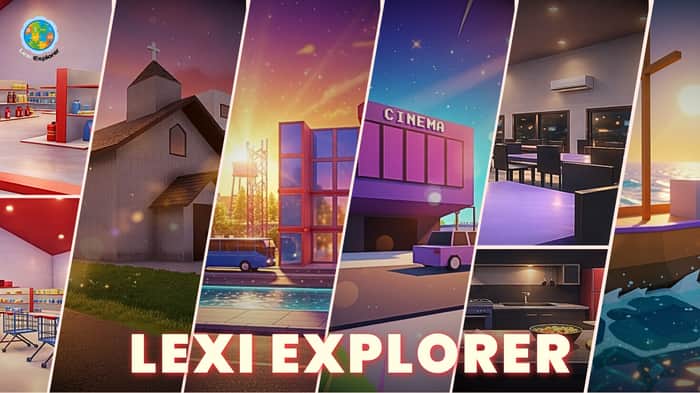
I’ve been building Lexi Explorer, a free language learning web app with immersive 3D environments.
The idea is to make learning feel less like studying and more like exploring. Instead of flashcards, you move through places like a city, restaurant, or classroom and pick up vocabulary in context.
What’s in it right now:
-Spanish, French, German, Italian
-Interactive 3D environments
-Vocabulary + sentence practice
-Mini games and flashcards
-No login, no subscription
I built everything solo, including the 3D worlds and frontend. It runs on both desktop and mobile.
Current situation:
Just launched. No users yet, no revenue. Still very early.
What I’m trying to figure out:
How to get the first real users and meaningful feedback without spending on marketing.
If you’ve been in this stage before, I’d really value:
-Honest product feedback
-What you’d improve or cut
-Any early traction strategies that actually worked for you
🎬 Launch Trailer: https://www.youtube.com/watch?v=I1DQWOsabZI
🌐 Try it free: https://lexiexplorer.com

This is genuinely one of the more creative language learning ideas I’ve seen lately — the 3D exploration angle feels much more memorable than another flashcard app.
One thing I’d really pay attention to though: your biggest challenge might not be traffic yet, but making sure users hit the “aha” moment fast enough.
If someone lands and spends too much time figuring out:
– what to click
– how learning works
– whether this is casual/fun vs serious learning
they may leave before experiencing the cool part.
I’d optimize heavily for getting people into the first “wow, this is actually fun/useful” moment as fast as possible.
Curious how first-time users are reacting so far?
That’s a really good point, and honestly something I’ve been a bit worried about too.
Right now, there’s almost no onboarding, so users have to figure things out on their own. I wanted it to feel like “just explore”, but I can see how that might delay the aha moment.
I’m thinking of adding a very quick guided intro or first-task flow to get users into that immediately.
As for first-time user reactions, I literally just launched, so you might be one of the first people to actually try it! Which makes your feedback even more valuable. I'd love to hear what your own experience was if you got a chance to explore it.
I actually tried it properly now and I think I found the biggest friction point.
The landing flow is pretty clear:
pick language → pick location → choose activity
That part felt easy.
The confusion happened once I entered the 3D environment.
A few things I noticed as a first-time user:
– I didn’t immediately realize movement was keyboard-based
– the mouse lock/cursor behavior felt confusing at first
– I didn’t know how to exit (figured out ESC later)
– once inside the city, I wasn’t fully sure what my first objective was
The concept is genuinely cool — but that first 30–60 seconds inside the world feels like where users could drop.
Right now it feels a bit like:
“this is impressive”
before
“this is helping me learn”
A tiny onboarding layer could solve a lot here:
“Use WASD to move”
“Press ESC to unlock cursor”
“Complete your first word challenge”
That would probably get people to the learning payoff much faster.
Thanks a lot for this detailed feedback, I really appreciate it. This is exactly the kind of insight I needed at this stage. I’m grateful you took the time to test it properly, and I’ll definitely be implementing these improvements. I’m also thinking of adding a simple tutorial layer right after entering the 3D world to guide first-time users.
That sounds like the right move.
And honestly — I think you’re closer than it probably feels right now.
The hard part (building something genuinely differentiated) is already done. Most language apps feel interchangeable, and this definitely doesn’t.
Now it’s mostly about reducing first-session friction so more people actually reach the moment where the product clicks.
Would be happy to take another quick look after you iterate — curious to see how it evolves.
I really appreciate that, thank you. That’s encouraging to hear. I’ll share an update here once I’ve made some improvements.
This feels less like a “how do I get users?” problem at first, and more like a “why does this format need to exist?” problem.
The 3D environments sound interesting, but the first-time user may need to understand very quickly what the 3D world does for learning that flashcards don’t.
If the environment feels impressive before it feels necessary, people may admire the build without knowing why they should come back.