I built an AI movie finder and learned that one search box is not a product
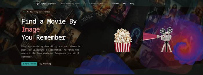
I built AiMovieFinder because I kept running into the same annoying problem: I could remember a movie clearly, but not its title.
I would remember a scene, a line, an actor's face, or the feeling of the ending. A normal search engine was usually useless because I did not have the exact words it needed. My first instinct was to build one general-purpose AI search box. That was the first mistake.
Failure #1: I treated every memory like the same kind of input
The first version focused on a description and an uploaded image. It looked simple. In practice, “I remember a movie” was not a single use case.
Sometimes the strongest clue was a quote. Sometimes it was only one scene. Sometimes the user knew the plot twist but not the actors. A screenshot was a completely different problem from a vague childhood memory.
The lesson was uncomfortable: a clean interface can hide a bad mental model. I had designed the product around how I wanted the search to work, not around the different ways people actually remember films.
I split the experience into separate paths: Find by Description, scene, plot, quote, line, image, picture, clip, and song search. Later I added actor and director search. The product became larger, but the decision at the start of a search became much easier.
Failure #2: I trusted the top AI guess too much
The early experience encouraged a single-answer mindset: give the model a clue and show the answer. That was a poor fit for movie identification. A half-remembered scene is often ambiguous, and language models can sound confident even when several films are plausible.
I changed the result experience to show a ranked shortlist of five candidates, with a short explanation of why each candidate matched. The goal was not to pretend the model was certain. The goal was to help the user recognize the right title when they saw it.
That changed how I thought about AI features. When the input is incomplete, “best guess” is often less useful than “small, explainable set of possibilities.” The interface should expose uncertainty instead of hiding it.
Failure #3: I underestimated everything around the AI call
The model was not the only source of failure. Metadata could be missing. Posters could fail to load. An image could be too large or in an unexpected format. The AI or movie-data service could be slow. Duplicate or near-duplicate results made the output feel unreliable even when the underlying search was reasonable.
I spent a later iteration on validation, error messages, poster fallbacks, missing metadata, and duplicate removal. None of those changes looked impressive in a launch announcement, but they improved the actual experience more than another clever prompt would have.
The lesson: an AI product is a chain. If any link is fragile, users experience the whole product as unreliable. Reliability work is product work, not cleanup work.
Failure #4: I designed for desktop and checked mobile too late
Uploading a screenshot and scanning several movie results feels fine on a large screen. On a phone, the same flow is much less forgiving. Small controls, unstable scrolling, and dense result cards made the tool harder to use exactly where many people discover movie clips.
I redesigned the mobile input and upload flow, made the result cards easier to scan, and added examples for each search method. The examples also exposed another problem: users often did not know what kind of clue to enter.
This taught me that onboarding does not always need a tour. Sometimes a good example placed beside the input is enough.
Failure #5: I assumed the first search path would stay correct
A user may start with a plot description, realize they remember a quote instead, and want to switch methods. If every tool is isolated, that change feels like starting over.
I eventually connected the tools so users could move between them. The current version has eleven ways to search, but the important change was not the number. It was accepting that memory changes while someone is searching.
What I am taking forward
I still do not have a neat success story with a big revenue number. What I have is a product that became more useful by repeatedly failing in small, visible ways.
The main lessons are:
- Model the user's input, not just the underlying technology.
- Show uncertainty when the input is genuinely ambiguous.
- Treat fallbacks, validation, and loading states as core features.
- Test the real task on mobile, not just the landing page.
- Make it cheap for users to change their mind.
If you have a movie title stuck on the tip of your tongue, you can try the live version at AiMovieFinder. I built it to solve a narrow problem, but the more useful lesson has been broader: the first version of a product is often wrong in ways only real usage can reveal.
