I created Beezle Social, asocial media app for iOSand looking for feedback!
Hello there 👋!
🐝
I am excited to introduce Beezle Social, an app available for iOS, iPadOS and Android that enables users to connect with others nearby. Beezle is a free to use, ad-free messaging app that allows you to participate in conversations nearby happening right now.
🗺️
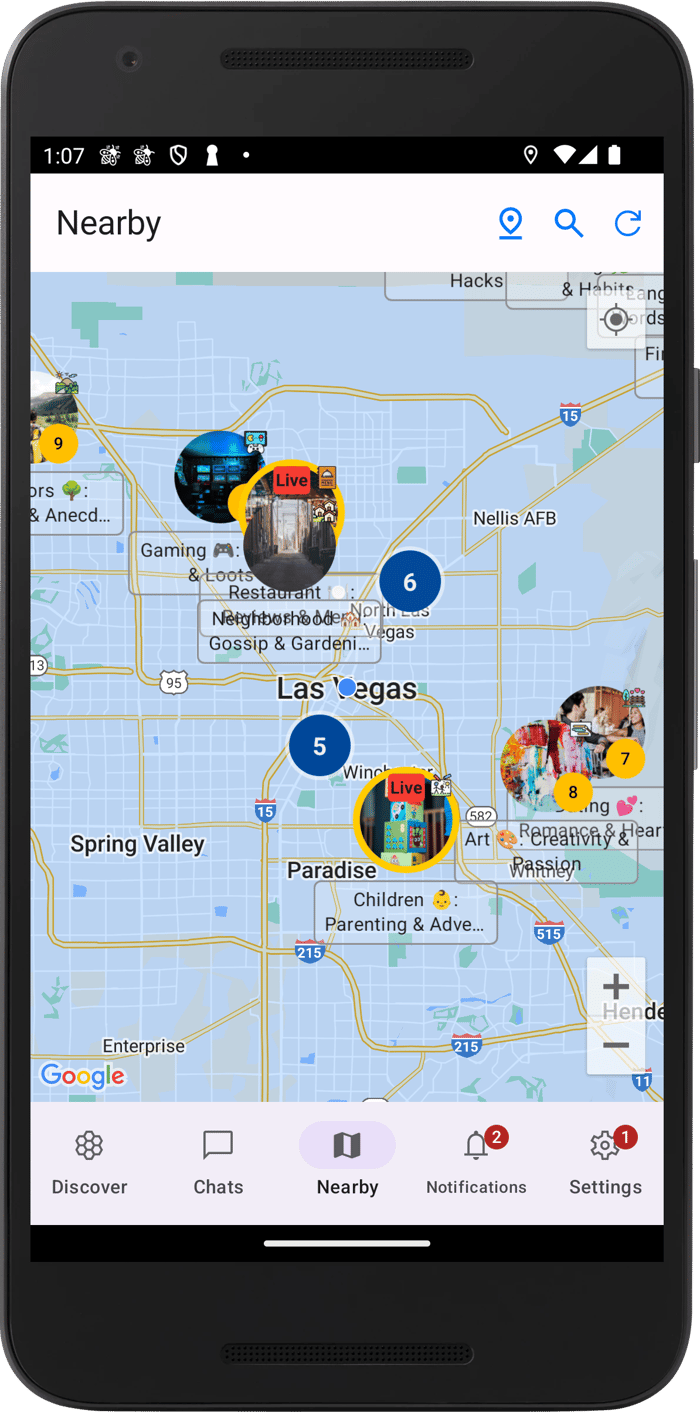
Beezle Social includes a helpful map feature that displays nearby group chats called "conversations" that anyone can create. Using location data (which is not stored on the server), Beezle Social will connect you with other users who are physically close to you, whether you're interested in making new friends or simply chatting with people nearby.
🕵
You can also remain anonymous with Beezle Social's account creation feature. The app doesn't save any user data, except for the data you intentionally share, such as messages and your username.
⚡
Check out our website: https://beezleapp.com and download the app. Please let me know your thoughts!
Here's the link to the App Store: https://apps.apple.com/us/app/beezle-social/id1661982809
And Play Store: https://play.google.com/store/apps/details?id=com.beezleapp.beezle
🖥️
During the development phase, I gained extensive knowledge of Swift and Rust, the primary programming languages used, as well as deploying the app via AWS. I have written a few open source libraries to support Beezle which can be found in my account: https://github.com/Jasperav.
I am looking for general feedback:
What do you think of the UI?
Are there any features missing?
Did you encountered a bug?
I am very grateful for any feedback, thanks!

Hey man, I'd like to offer some honest feedback from someone with a design background. All my feedback is based on the screenshots you've shared, as I'm unable to log into the iOS app due to an infinite loader problem.
Nearby Screen:
The page heading, content area, and bottom nav bar all need more breathing room and space. Everything feels too jampacked.
I'm not entirely clear on the functionality of the top navigation. Does the user need to refresh manually every time they zoom in?
Discovery Screen:
It's not a common pattern to use two icons on the left side of the top navigation bar.
Having three bell icons in the UI could confuse users.
The yellow color used for updated list items seems to lack contrast.
Messaging:
Consider removing background colors from chats and limit them to a maximum of two.
Try to adopt similar patterns used by other apps, such as placing message reactions below the message.
The bottom input bar lacks proper side margins.
Create a Conversation:
This screen looks really good.
Control Access:
There's too much copy explaining the feature. If extensive explanation is needed, it's not good UI design.
Avoid center aligning so much text; default to left alignment instead.
If you need more extensive design help I'm up to collaborate on a couple of cool projects! :)