I did a video analysis of Jon Gardner Voice-Overs’ copywriting, a “signature voiceover service” made by Jon Gardner
Below you can read the textual analysis or you can watch the video analysis.

Jon Gardner Voice-Overs is a “signature voiceover service” made by Jon Gardner for clients that include software companies, advertising firms, zoological gardens, educational institutions, and fitness centers.
Summary
He’s addressing businesses that need a voiceover professional to help advertise their services.
That’s the most generic description of his offering that I could think of because Jon makes it hard for me to understand who he’s targeting.
His already small homepage can be reduced even further because the copy that I found didn’t bring me closer to the dotted line to sign.
The structure of his page
1st part - Header
- Hamburger menu icon
- Call-to-action: Get A Quote (which leads to a “page not found”)
2nd part
- Logo (has 3 parts: 2-letter monogram, the full name of his service, tagline)
- Call-to-action: Contact Jon (the contact information is missing)
- Commercial demo reel as an embedded VoiceoZam player incl. “Connect with Me”
3rd part
- Recent clients list (logos)
4th part
- Text about his voice, his signature, and his business
5th part
- Testimonials (as a slideshow)
- Call-to-action: Get A Quote
6th part - Footer
- Copyright information
- Social media links (LinkedIn, Facebook, Twitter)
And a slide-in popup that is a short quiz.
What could be improved?
Quite a lot, and it starts with functionality. But there’s one thing I REALLY liked (see below).
Jon should fix the “Get A Quote” call-to-action. It’s telling when the first thing to click on doesn’t work.
Downsizing the logo would also be good. It’s a massive logo and it doesn’t communicate much to me.
Providing actual contact information after a call-to-action that says “Contact Jon Gardner Voice-Overs” would be nice.
While his portfolio with clients like Apple, Disney, and Coke is impressive, the VoiceZam player didn’t allow me to properly swipe down. I had to reach for the edge of the site to continue swiping. Not good, and not convenient for the visitor.
I also don’t understand why you would want a “Connect with Me” call-to-action inside the VoiceZam player when I’m already on Jon’s website. Doesn’t make sense to me. But I’m also not the biggest fan of VoiceZam’s way of embedding a massive player on people’s websites.
Jon’s list of logos from recent clients is nice, and I’m not only saying that because there are two German companies among them. But it would be even nicer if he added a testimonial to each logo so that it’s not only a logo to brag about but something that adds value—a great testimonial usually does.
The following copy including…
- The Voice
- The Signature
- The Business
…didn’t move me in any way. It’s generic text with no soul and “realness”. Underwhelming. In fact, the copy could be turned into one compact paragraph.
Something like…
Voice ages well. When I deliver real voices, I integrate 25 years as a radio personality and 50 years of life experience as a loving father, a good friend, and a caring husband.
Being a good businessman, I sign off every contract with the assurance of high quality and excellent customer service. That’s what I stand for, and that’s why I sign every piece I send out. Yours too.
For this example, I came up with the numbers (25 and 50 years). So, I don’t know this data from Jon but I know he has a background in radio.
However, the slide-in quiz is nice. Only the call-to-action is lame. See what I’m suggesting instead at point 9 in my takeaways.
And here’s a before and after screenshot of what I rewrote for Jon’s about section.
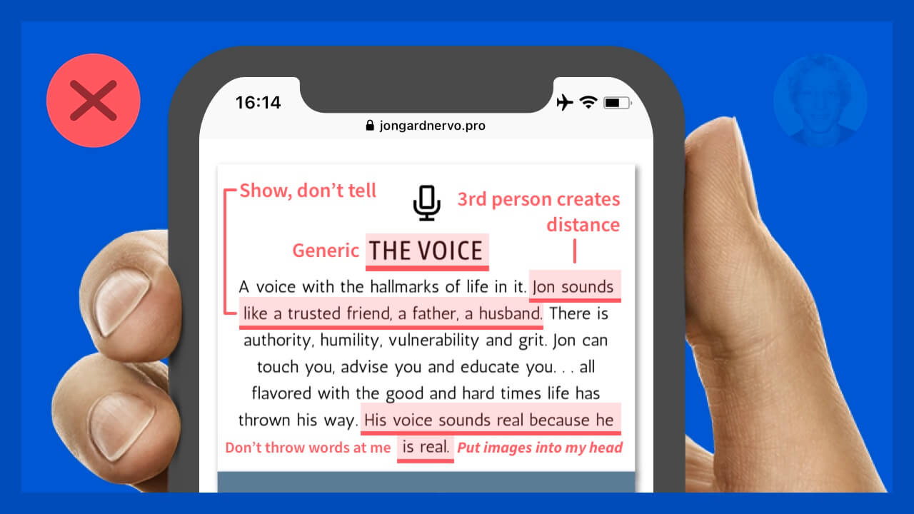
Jon’s VO homepage - original
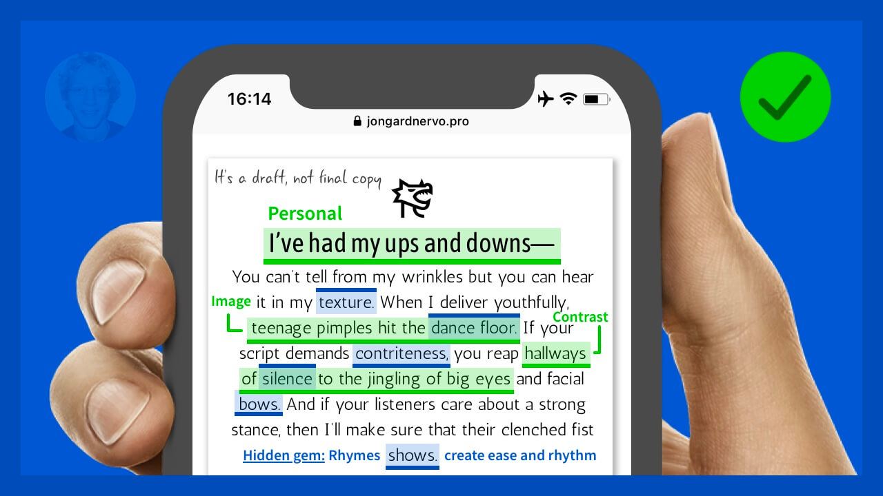
Jon’s VO homepage - my revision
You can see that I made the copy more personal. I also added mental images for the reader, worked with contrast, and use rhymes as a rhetorical device to make it a fun rhythmic read.
It’s not a final text but it’s something Jon can work with.
Takeaways from Jon Gardner Voice-Overs
- Check your links. It needs to work first, then make it pretty and make them feel good. It’s… form follows function, not the other way around.
- Scale your logo so that they see where they are and what it means to be with you. But don’t try to walk into their face.
- Care about every single detail of the experience, specially if you talk about a “customer-focused mindset”.
- Complete the client’s story. It starts with their logo, continues with your work, and ends with their words of appreciation (and great results).
- Avoid generic text like the pest.
- Get real by talking like a (real) person. You don’t need 3rd-person corporate bullshit lingo.
- Show yourself. If being real is your deal, add a nice headshot of yours so we all connect to your wrinkles and dimples. That’s what being real means.
- Don’t tell me about a “real voice”, show me that you’ve been through glory and defeat, and tell how that story went.
- It’s not “Do I Really Need A Pro?” but “Why you need a Pro?”.
- Test your site on every common device. It’s reasonable (even desirable) to adapt your copy and design to different devices, especially when what works on the computer doesn’t work as well on the phone.
