I had two signup forms on my landing page. Deleted them. Now I have only one.
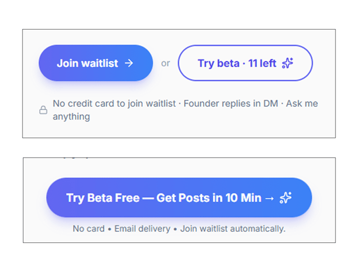
I posted here to get feedback about why my beta version wasn't converting. A user commented: "You offer two options. Which one should I use? Just choose one."
I explained: "One is for those who wish to try it immediately, while the other is for those who prefer to join the waitlist."
The user responded: "These are essentially the same. You're causing confusion among users."
He were right.
What I did wrong?
I assumed giving people options would increase conversions. More entry points = more signups, right?
WRONG!
Every founder posting across Twitter, LinkedIn, and Reddit faces the same problem: one message doesn't work everywhere. You need to adapt it.
I built a tool for exactly this. Then made the same mistake on my own landing page by giving people multiple paths instead of one clear one.
THE FIX:
Removed the middle form completely.
Kept only the bottom one with a clear explanation of what happens:
- Submit your idea
- Get posts for 5 platforms via email
- Takes about 10 minutes
That's it. One path. One ask. One outcome.
Traffic stayed the same but submissions actually started happening.
Why it worked?
Inability to make choices is real. When you give someone two identical options, they choose NOTHING.
Founders trying to post everywhere face this too. "Should I write for Twitter first or LinkedIn? Should I adapt it manually or use a tool?"
The answer: pick one system and commit.
SO, WHAT WE GOT:
Multiple options = overthinking
One clear path = action
Applied to landing pages:
- One CTA per page
- One clear outcome
- One reason to act now
Applied to content:
- One tool to handle all platforms
- One idea adapted five ways
- One submission, five outputs
I'm running the beta at https://trytov.vercel.app for founders who post across platforms - you submit once, get Twitter/LinkedIn/Instagram/Reddit/Telegram versions adapted to each platform's format and audience.
Question: How many CTAs does your landing page have? And are they actually different or just confusing?

This is timely — I just checked my own landing page after reading this and I have the same problem. Two buttons that essentially say the same thing in different ways.
The 'inability to choose = choose nothing' point is something I knew intellectually but hadn't actually applied to my own product. Classic founder blind spot.
IronCaption if anyone wants to roast it — genuinely curious how many CTAs people count when they land there for the first time.
The 'Paradox of Choice' kills more startups than bad code does. Glad you simplified the landing page—one clear path is always the winner.
Since your tool helps founders post across 5 platforms at once, you should enter TryTov into the Validation Arena (tokyolore.com).
It’s a 30-day sprint where founders compete to see who can get the most real sales and traction.
It’s $19 to enter, and it forces you to pick one path and run with it.
The winner takes the grand prize: a trip to Tokyo! 🏆
Classic paradox of choice problem. Two options that are essentially the same path to the same destination creates decision friction, not optionality. The commenter gave you exactly the right diagnosis.
The "try it now vs join the waitlist" split is one that trips up a lot of founders because it feels like you're reducing commitment anxiety by offering a softer path. But in reality you're just making people wonder which one they actually want, and most will pick neither.
What conversion change did you see after simplifying to one CTA?
this is a classic one, and yeah the “more options = more conversions” trap gets almost everyone at some point
what’s interesting is that it’s not just about the number of CTAs, it’s about where the decision actually happens
we had something similar where even with one CTA, people still didn’t convert because they weren’t sure what would happen next
so technically “one option”, but still friction
what helped more was mapping the whole path from first click to outcome, not just the button itself
like:what they think they’re getting → what actually happens → what they expect next
i laid that out once in something like stackely (just to visualize the steps), and it made it obvious that the real problem wasn’t multiple CTAs, it was unclear transitions between steps removing options works, but making the next step obvious is what actually converts
That’s a great example of how “more options = better” sounds logical but usually does the opposite.
We’ve seen similar where the issue wasn’t the offer, it was just too many decisions too early. Especially with cold traffic, people don’t want to think, they want to be led.
The interesting bit is when you do introduce a second path later.
We’ve found one clear CTA works best upfront, then you can branch once someone is already engaged.
Did you test keeping both options but making one clearly primary, or was removing it completely the thing that made the difference?
I completely removed the second choice and just combined these two choices into one. there were two: beta test + waiting list, which became: beta test, after testing which you are added to the waiting list.
What kind of experience do you have?
That makes sense, combining them removes the decision without losing the intent.
We’ve seen similar where even small differences in wording can create hesitation, especially when people aren’t fully convinced yet.
The simpler the path, the easier it is for someone to just move forward instead of stopping to think.
Happy to answer any questions!