I improved my landing page with visible pricing and product demos
I’ve been building Sheeto, a web app that helps teachers create printable worksheets through AI chat and a dedicated editor.
After updating the pricing structure, I reviewed the landing page and found two problems:
Pricing was hidden inside a popup
There was no section showing complete examples of what users could create
This update focused on making both easier to discover.
Moving pricing out of a popup
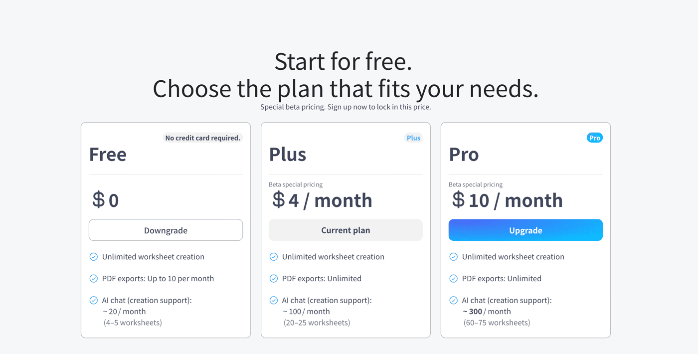
Sheeto’s pricing table was already available on the landing page, but visitors had to click a button to open it in a popup.
The information was there, but users could read the entire page without seeing the plans.
I moved the pricing table into the page itself.
The landing-page flow is now:
Learn what Sheeto does
↓
See worksheet examples
↓
Compare the plans
↓
Read the FAQ
↓
Start for free
The new section shows the Free, Plus and Pro plans side by side.
The main differences are limited to:
Worksheet creation
PDF export limits
Approximate AI chat usage
I also added a Pricing link to the header.
The pricing information did not change significantly. The important change was making it visible at the right point in the page.
Adding a demo section
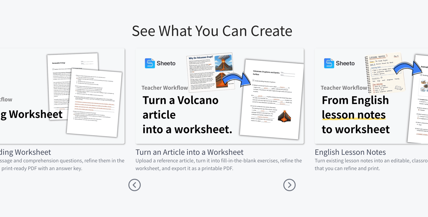
The previous landing page explained Sheeto with screenshots and feature descriptions, but it did not show complete workflows.
I added a new section with seven examples, including:
Creating a reading worksheet
Turning an article into a worksheet
Creating a review worksheet from a textbook page
Generating different difficulty levels
Turning a word list into a vocabulary quiz
The goal was to help teachers recognize their own materials and imagine how they could use Sheeto.
I also added an Examples link to the header.
My first video layout was too busy
My first implementation placed a Bubble Video element in every cell of a horizontal repeating group.
It worked, but each YouTube player displayed its own title, channel name, play button and other controls.
With several videos visible at once, the YouTube interface became more prominent than the worksheet examples.
I replaced the Video elements with static thumbnail images.
Each card now shows only:
A thumbnail
A title
A short description
This made the section much cleaner and avoided displaying multiple YouTube players before the visitor selected a video.
Playing the selected video in a popup
When a visitor clicks a thumbnail, Sheeto now opens one shared video popup.
Each demo stores a YouTube video ID. Bubble passes the selected demo to the popup and loads the corresponding video into a responsive 16:9 player.
This creates a clear separation:
The list helps visitors choose a demo.
The popup lets them focus on one video.
Interestingly, I removed the pricing popup but added a video popup.
Pricing should remain visible while visitors evaluate the product. A video is temporary, focused content that works well in a popup.
Horizontal scrolling without a carousel plugin
I wanted the demo list to work as a horizontal carousel without installing another Bubble plugin.
The repeating group supports swiping and trackpad scrolling. I added previous and next buttons using JavaScript’s scrollBy() method:
repeatingGroup.scrollBy({ left: distance, behavior: "smooth" });
I considered pagination dots, but the number of visible cards changes between desktop and mobile. Keeping the dots synchronized with manual scrolling would add unnecessary complexity.
I kept the interaction simple:
Swipe or scroll
Use the previous and next buttons
Show part of the next card as a visual cue
Current result
The landing page now includes:
A visible pricing section
Free, Plus and Pro comparisons
A new demo section
Seven worksheet workflows
Static video thumbnails
One shared YouTube popup
Horizontal scrolling with navigation buttons
Desktop and mobile layouts
The biggest lesson was that showing more information does not always make a page clearer.
Multiple playable videos technically showed more, but static thumbnails made the examples easier to understand.
This update did not add a new core product feature. It made the existing product easier to evaluate, which is becoming just as important as building the product itself.

