I’m a brand designer tired of seeing great SaaS with terrible UI, so I built a 100% free toolbox for devs 🎨💻
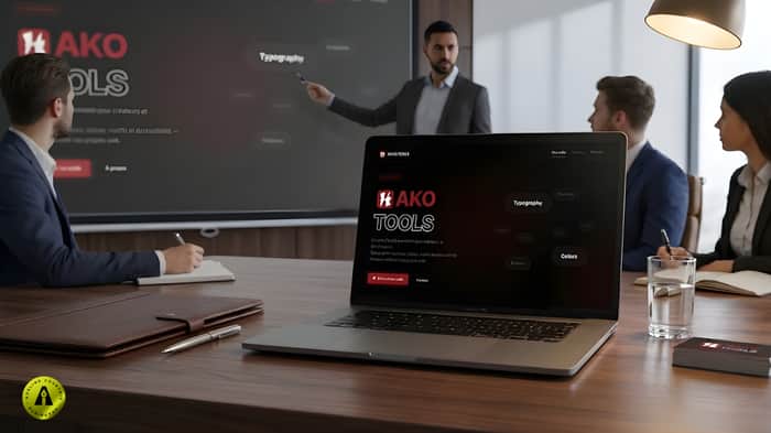
Hi! 👋 I'm Adeline, a SaaS brand designer. Devs write great code but struggle with UI. I built HakoTools: a 100% FREE, no-signup toolkit!
✔️ Fonts & SVG icons
✔️ WCAG contrast checker
✔️ CSS patterns
✔️ Illustrator extension
No ads. Let me know if it helps your workflow!

Adeline, this is genuinely useful — the WCAG contrast checker alone is something most solo devs skip entirely and then wonder why their product feels off.
But I want to add something to the problem you're solving, because I think it goes deeper than UI.
Most SaaS with "terrible design" isn't actually a design problem. It's a clarity problem. The layout is messy because the thinking behind the product is messy — they haven't decided who it's for, what the main action is, or what should be the first thing a visitor feels. Design can't fix that. It just makes the confusion prettier.
The devs who get the most out of tools like yours are the ones who already know what they want their product to say — they just don't know how to make it look that way. The ones who don't know what their product is saying end up cycling through fonts and palettes and still feeling like something's wrong.
Worth thinking about whether HakoTools eventually adds something that forces that clarity before the design decisions — even just a "what's your one-line value prop?" prompt before someone picks a color scheme.
Anyway — solid launch. The no-signup part is the right call.
Thank you very much for this feedback; it’s extremely insightful — and I completely agree with your analysis.
You’ve highlighted something I see every day when working with SaaS founders:
most ‘confusing’ interfaces aren’t a design issue, but a problem of product clarity at the planning stage.
When the target audience, the main action or the value proposition aren’t clearly defined, the interface automatically becomes disorganised.
And as you quite rightly say, design doesn’t fix that — it merely masks the confusion temporarily.
That’s precisely why my approach is never limited to aesthetics.
Even in my branding work, I always start with a strategic understanding phase (product, market, users) before making any visual decisions.
HakoTools currently focuses more on the ‘execution’ side (accessibility, readability, visual consistency), with tools such as the WCAG checker or favicon tests.
But your point is spot on: there’s still a layer missing further upstream.
The idea of integrating a “clarity layer” is particularly interesting — something simple yet structuring, such as:
What is your value proposition in one sentence?
What is the main action the user needs to take?
What is the first impression your product should convey?
Even before choosing a colour or a typeface.
This type of checkpoint could avoid a great deal of unnecessary iteration and reposition HakoTools not just as a design toolkit, but as a product decision-making tool.
This is definitely a direction I’m going to explore.
Thanks again for this feedback — it’s exactly the kind of thinking that helps a tool evolve into something much more strategic.
This is exactly the kind of thinking that separates a designer who makes things pretty from one who actually moves the needle for founders.
The "clarity layer" framing is spot on — and what's interesting is that the founders who skip it don't just end up with messy interfaces. They end up with copy that doesn't convert either. The same undefined thinking that creates a disorganised UI creates a homepage that says nothing to anyone.
It's the same root problem showing up in two different places.
Which means the founders who'd benefit most from HakoTools' clarity checkpoint are also the ones whose copy is leaking conversions before anyone even notices the design. They fix the colours. The headline still doesn't land. They fix the layout. The pricing page still doesn't convert.
The two problems are almost always traveling together.
Worth keeping in mind if you ever find yourself working with a founder who's done the brand work but still isn't seeing traction — sometimes the next bottleneck is the words, not the visuals.
A confusing product thinking will naturally lead to:
a disorganised UI
but also messaging that doesn’t resonate or convert
So yes, both issues are deeply connected.
That said, I make a fairly clear distinction in my own work and in HakoTools.
As a designer, I focus on identity, perception and visual clarity
I also run logo audits, where I often uncover issues that go beyond aesthetics, but I address them through a visual and strategic lens.
HakoTools follows that same philosophy:
it’s built to improve execution quality on the visual side — accessibility, contrast, readability, scalability — and to make sure that when a message is clear, the design doesn’t become the limiting factor.
Positioning and copywriting are absolutely critical, but they’re not the core purpose of the tool.
So the idea of a “clarity layer” still makes sense to me —
but more as a lightweight checkpoint to guide better upstream thinking, not as something that replaces product strategy or copywriting work.
The goal is really to stay focused:
help founders translate clarity into strong, reliable visual decisions.
And your point reinforces that boundary in a very useful way — so thanks again for that.
"HakoTools is such a needed gift for devs—love that it’s no-signup and focuses on accessibility. Solving the 'terrible UI' problem for great code is a killer mission!
Since you're helping founders level up, you should enter this competition--
“Prize pool just opened at $0. Your odds are genuinely the best they'll ever be.
$19 entry. Winner gets a real trip to Tokyo — flights and hotel booked by us.
Round 01 closes at 100 entries. tokyolore.com”