I made $7K without a landing page with these products. I just made one. Can you give me your opinion
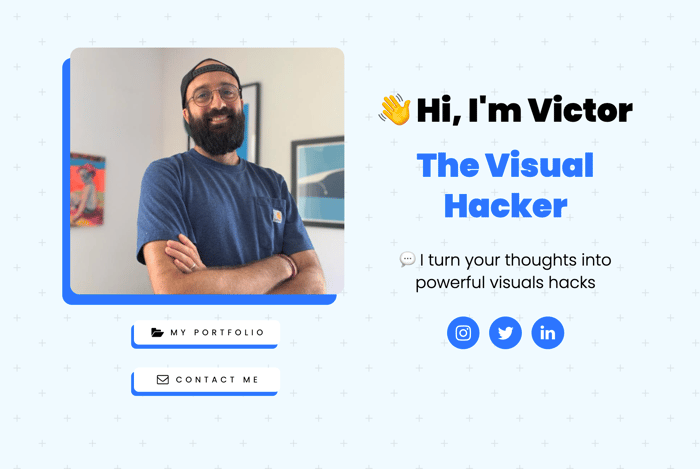
I made $7K without a landing page with these products
My landing page
How did I make $7K without a landing page?
Simply because the content I share on the networks is the content I sell.
Now that I've validated an offer.
I'd love to get your feedback on my landing page.
thanks for your feedback
And if you want to follow my journey, I'm on Twitter every day.
my DMs are open
See you soon

Hey Vic!
Looks great, and clearly there's at least some product-market-fit :)
I just noticed, the instagram-button, only links to the IG homepage :)
Thanks Man
Love the example illustrations, and they match the landing page. One thing I am thinking is, how to cater for clients who want a different style of illustration?
The good thing: Would be great to let other clients know you also do other styles?
The bad thing: It takes a lot of to and fro to communicate the style the clients have in mind.
Oh, and thanks for the twitter playbook. I just started my twitter yesterday... 😂
Nice.
hi victor,
I love it very al looks very professional. The only thing is, I did not immediately realize what it is you are selling. Maybe I should have but the term visual hacker did not ring any bells and I do not tend to read through all the text. maybe you could have an example at the top of the page of what you do, and say in big bold text that this is what you do. haha, that might be the only way people like me realize what is.
Thanks, I'll fix that to make it clearer.
For example:
I turn complex thoughts and concepts into powerful visual illustrations.
And I amplify creators' content with engaging visual illustrations.
What do you think?
that does sound clearer, however, I still think it would be better if you say as well as that "this is what I do" BAM visual hack example at the top of the page. because the first example you have with the 2 brains was for me not yet clear that that is what you are selling it looks like it could just be there to make a point. it is not until you scroll completely to the bottom to see your portfolio that it is truly clear.
Thanks !!!!!!!!!!!
I hate to ask, but do you mind following me on twitter. I only started tweeting 2 days ago so you would be my first follower haha. My twitter is linked to my indie profile, it would mean a lot. Thanks!!
I just followed you.
Here is my playbook to level up your Twitter game.
It may help you.
I'm offering this for free
Cheers!!!!
I just had a quick look at the playbook. It looks great I am going to start reading it tomorrow😁.
What a great idea. This is super inspiring. Thanks for sharing.
Well, I read many articles on how to make a good landing page and here are my tips from what I learn.
Let's do this you have a strong social media following ok. so add social media icons to the footer. As people are coming to a landing page from your social media. So it makes no sense to add our hero section.
Now you can add two CTA to your hero but align them inline. With carrd, you can do that. By decreasing size.
Now you give extra attention to your name. But if I'm your customer I know who you are, because I follow you. So make it little small and make the description the value you are going to give bigger. & both descriptions are of the same don't size make the first little big.
I think you can also try describing CTA in your hero section as Turn my thoughts to visual.
Like this https://victorportfolio.carrd.co/ for hero as people read left to right.
Like this ?
thanks a lot for your tips !!!!!!!!!
what did you use to build your website?
Carrd
Would be wonderful to see a before and after.
Before - Only text v/s After - text with illustration (99x faster processed?)
Good idea. thanks !!!!
Huge fan of your illustration Víctor 🙂
Thanks my friend.