I need UX tips to design a "Upgrade to access this feature" flow
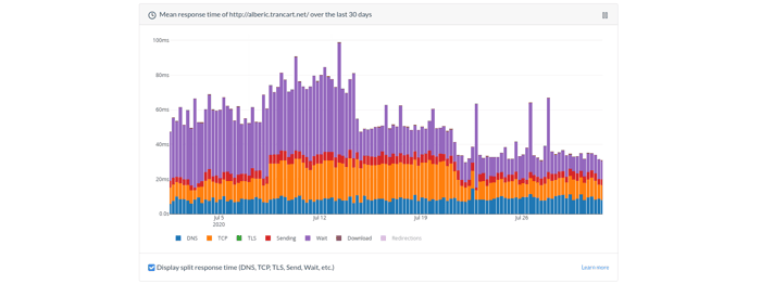
I work on https://www.howfast.tech/, a server response time monitoring tool, on my spare time and just invested a couple hours into displaying the historical response time over the last 30 days. I was already displaying the recent performance data (last 60 minutes, and last 7 days), and the 30-days view gives more insights on long-term tendencies.
This is the kind of feature that adds enough value to make me think I should only offer it to paid customers, and I'm struggling to come up with a nice way of telling users "you have to pay to access this feature":
- blur the graph and overlay some kind of block with a big CTA button?
- just display a banner somewhere on the page?
- something else, completely different?
I'm wondering if there are guides on how to do this right, or if you have good examples in mind from which I could get inspiration (maybe your product)?
Thanks a lot for the help!
