I realized showing problems isn’t enough — so I rebuilt my homepage around fixing them
Most ecommerce tools tell you what’s wrong.
But I kept noticing the same thing:
showing problems doesn’t actually change anything.
Store owners see issues… and then do nothing.
So I started shifting everything toward one idea:
not just “here’s what’s broken”
but “here’s how to fix it — right now.”
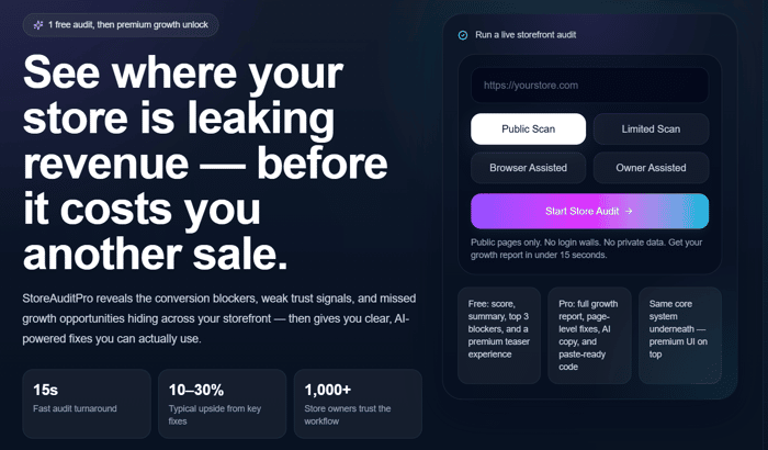
Just redesigned the homepage to reflect that.
Curious if the value is clearer now:
www.storeauditpro.com
Would really appreciate any feedback.

problem + fix in the same view is the formula. we learned this building SEO audit tools — v1 showed a list of issues. people looked at it and thought "great, now what?" v2 showed each issue with a specific fix: "your title tag is 78 chars, google truncates at 60, heres the rewritten version." engagement went way up because people could act immediately instead of having to figure out what to do with the data. the homepage change from diagnosis to prescription is exactly the same insight. curious how the conversion rate changed before vs after the redesign — did you see a measurable difference?
Yeah, that’s exactly the shift.
The moment users don’t have to figure things out themselves, everything changes — they just act.
I’m seeing the same pattern with stores: once you show what’s wrong + what to fix + how to fix it, it removes that hesitation.
Still early on my side (just launched recently), so don’t have solid before/after conversion data yet — but early usage already feels very different compared to just showing issues.
If you’re up for it, would actually be super interesting to get your take — you seem to have gone through a similar evolution. It runs a free audit, no signup/paywall.
Hi, yeah it's not bad but it could be simpler. The less words the better!
Also, the page has many boxes scattered here and there and it's hard to figure out which one is the most important to focus as because they all look the same.
Good luck!
That’s really helpful — appreciate it.
Totally agree that it should feel simpler and more focused. Right now there’s probably too much visual weight across sections.
Going to keep refining the hierarchy so it’s clearer what matters first.
Thanks for the honest feedback 🙌